We were asked to help with the global implementation of Alitalia’s new brand identity across 22 international locations. A wide variety of brand touchpoints were identified and replaced across different locations such as ticket offices and airports, helping to create a consistent customer journey.

THE BRAND TEAM

We assigned a global team to Alitalia to support their daily needs, offering technical advice, in addition to project managing the implementation programme. Our team very quickly became brand gurus!

Our role also included detailed site surveys which ensured that every element was designed and specified correctly and subsequently, produced and installed to the required standard.

TRANSPARENCY AND CONTROL

With 24/7 access to our project management tool, real-time updates were available throughout the rebrand, helping the Alitalia brand team to track and monitor progress at all times.

By setting up standard procedures and adhering to a structured approvals process, we ensured that all sites and brand touch points were delivered on time and to the right specification.

We were commissioned to revitalise this 1990s mixed-use city centre destination in Liège, Belgium. The refurbishment programme was driven by a strategic repositioning exercise that aims to attract a new tenant mix, increase footfall and time and spend per visitor.


Creating a sense of place

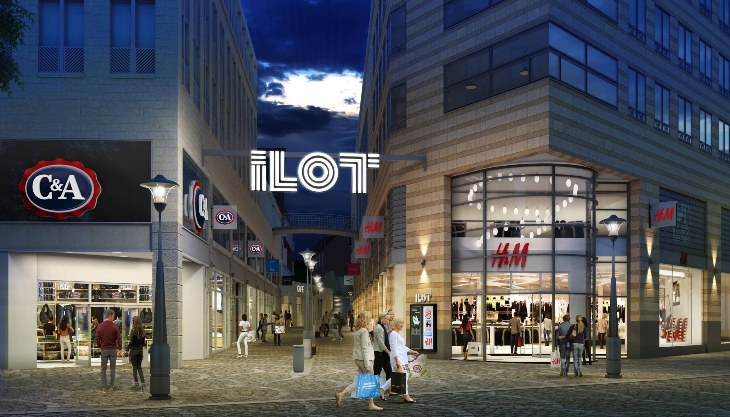
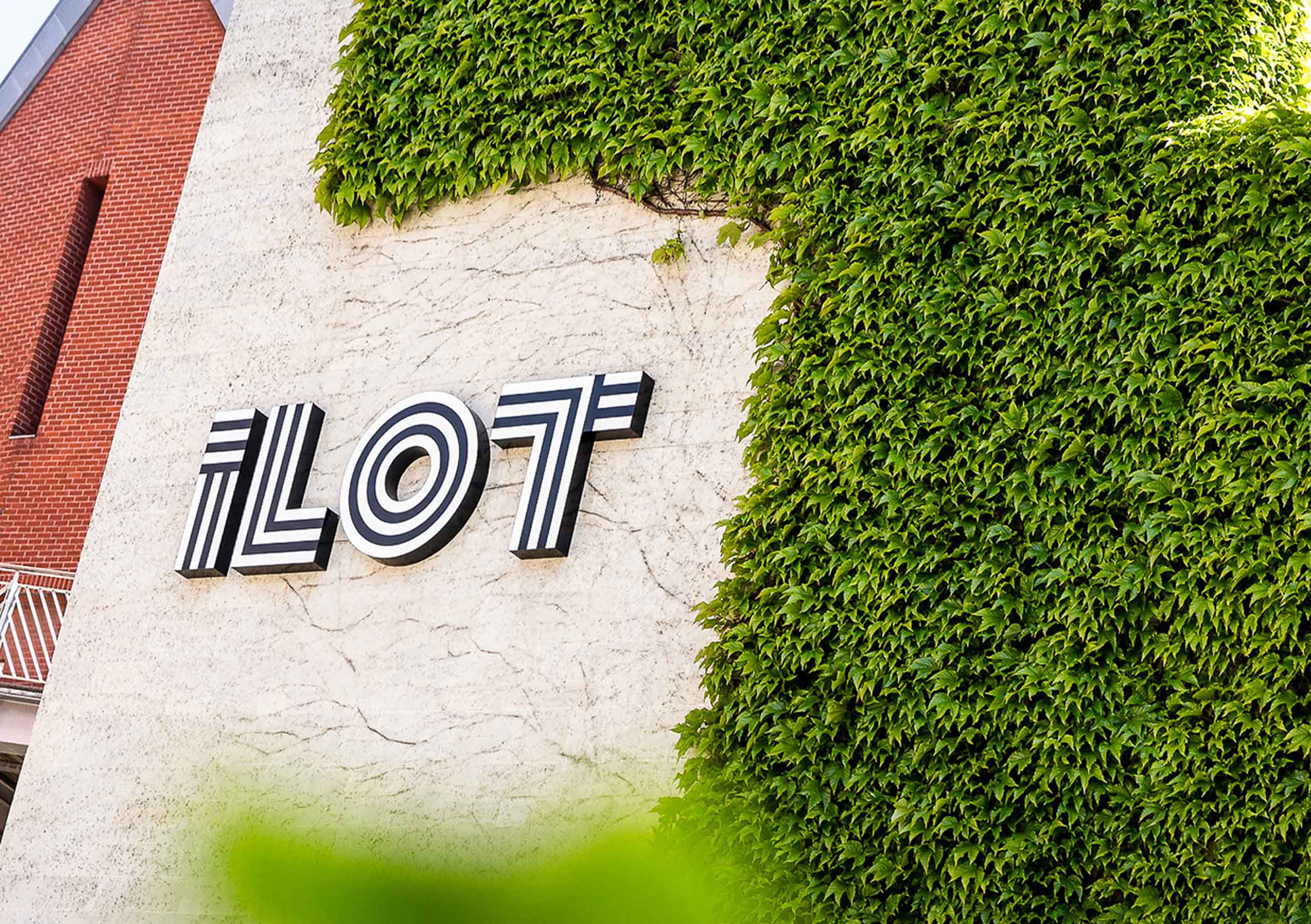
The name ‘Ilot’ (Little Island) reflects its location in the middle of the city centre. Comprising four separate buildings across three busy pedestrian streets, there was little to unify the space and create a sense of community and belonging. A strategic review by the mall owners identified the need for a full repositioning exercise. This included a strategic review of the indoor and outdoor space to attract the right retail mix.

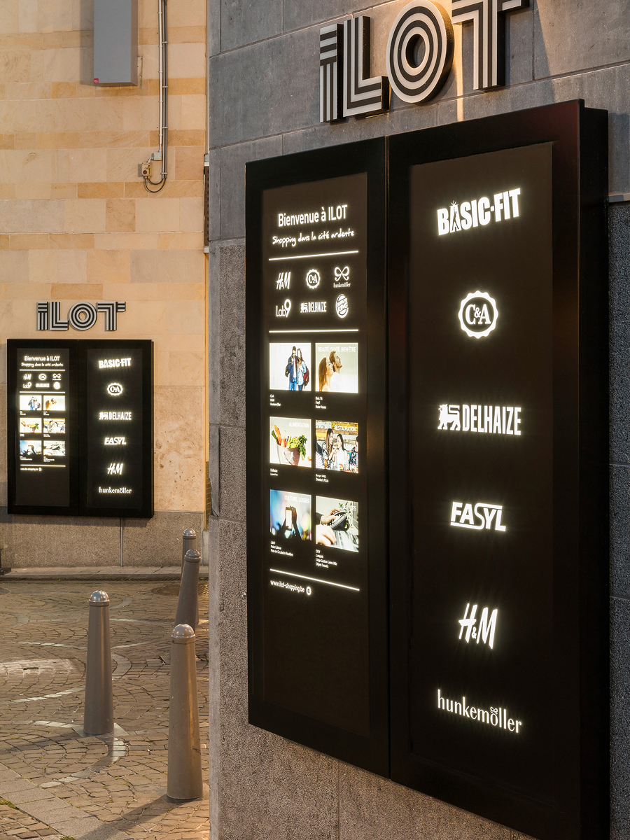
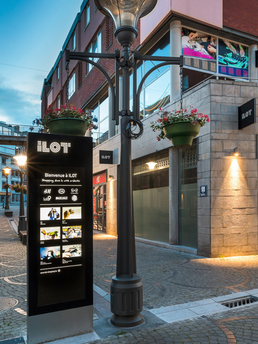
We helped to develop the new brand proposition, working with the locally created brand identity, to develop a suite of on-brand wayfinding, signage and environmental solutions.

'The GLIMMA team is a valued design and implementation partner for our retail and entertainment centres. They understood the strategic changes needed to revitalise and appeal to a new target audience. Most importantly, they have the knowledge, experience and skills to practically translate these changes into an engaging customer experience. Through the right choice of lighting, street furniture, way finding and brand signage, they have helped transform ILOT into a much more vibrant and safer visitor experience.'

Jonathan Ratnage
Benson Elliot

Improving the customer journey

During the initial site appraisal we identified circulation as a key issue and located the hot spots. Our wayfinding solutions have improved circulation from the basement levels and car park and improved general people flow throughout.

The suite of modern and complementary signs have improved the overall customer experience, successfully linking the internal and external spaces and creating a sense of place.
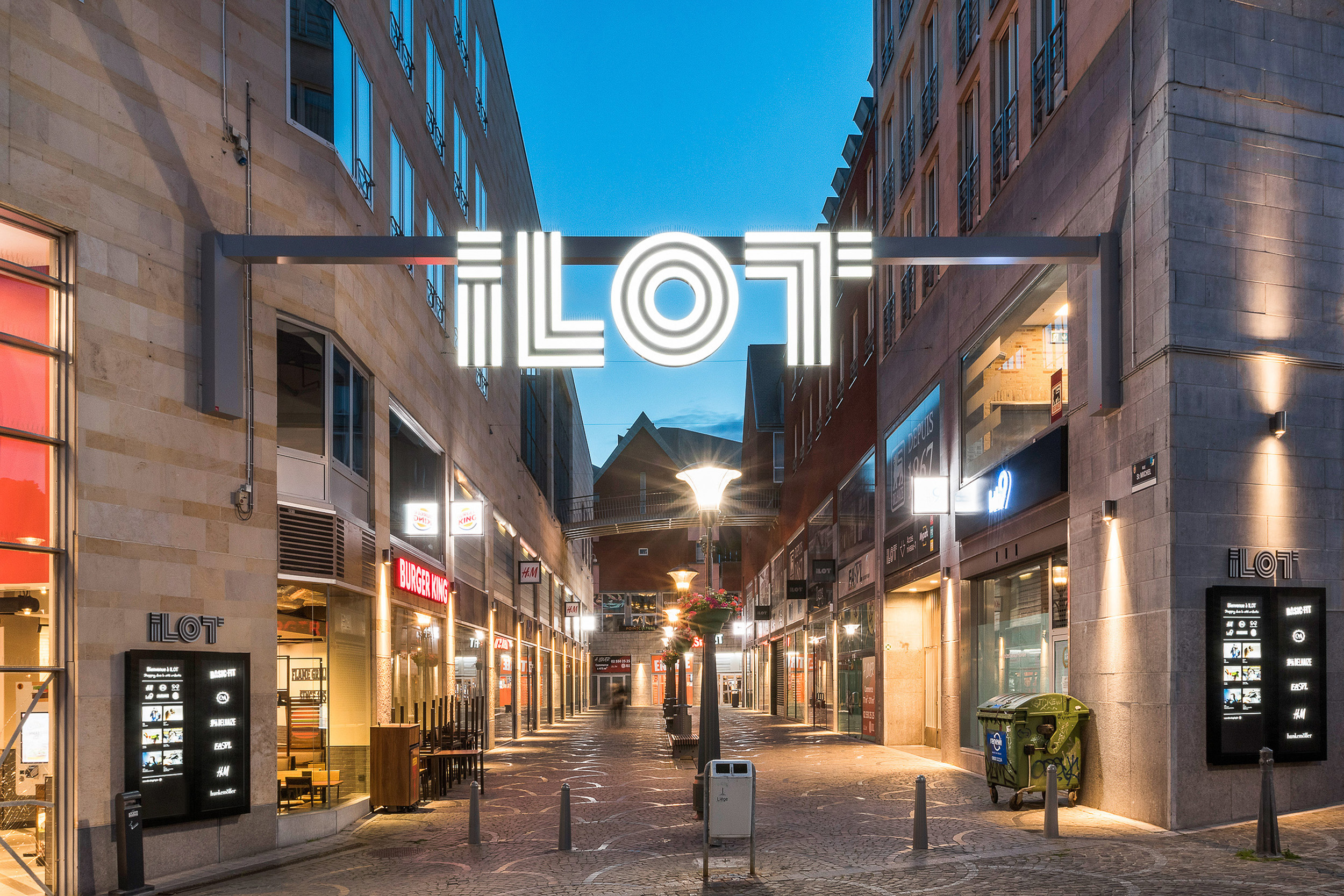
Creating the right ambience

Skilful use of exterior lighting, using up and down lights on the building facades, has significantly improved the ambience. It has also helped to extend the shopping day and tighten security.

Leadenhall Market began life as a forum in the centre of Roman London and there has been a market on the site since the 14th century. The Victorian-built arches of today’s market are filled with reminders of bygone eras.

Situated in the centre of the City of London’s financial district, the current Grade II listed Market building, designed by Horace Jones, dates back to 1881. Its airy and light wrought iron and glass structure replaced the stone market previously created by Lord Mayor of London, Dick Whittington in the 15th Century. Leadenhall Market is owned and managed by the City of London Corporation.

Today Leadenhall Market is a unique cultural destination as well as a place to eat, drink and shop.

We were asked to create an engaging brand identity which would look and feel modern, but would tap into and celebrate the deep history of Leadenhall Market.

The typeface and typographic treatments as well as colour scheme were developed to emphasise the spectacular Victorian setting with the roof, cobbles and buildings preserved.

We were appointed by the town of Kingston Upon Thames to create a brand and suite of campaigns to position the town and its range of visitor attractions, history, heritage in a modern and contemporary style.

To complement this consumer facing brand, we created a business brand for the town to reflect its modern future forward ambitions to create new history. The work covered brand identities, guidelines, creative art direction, shoots, production, post production, video editing and social media. We also recruited and trained the Head of Marketing for the client.

We were commissioned to develop a brand identity and campaign style that capture the ‘duality and essence’ of Beaudurof – Modern Minds/Traditional Values, Analytical/Creative, Corporate/Artisan, Work/Leisure. We created a new brand identity, guidelines, campaign styling and creative art direction for the product, stationery and stores.

Borough Yards is the capital’s most exciting cultural and retail-focussed regeneration. This unique social, cultural and shopping hub is woven from historic urban fabric. A lost medieval street system has been revived. Once-forgotten warehouses and railway arches house dramatic, double-height retail spaces, all embodying the district’s unrivalled feel of intimacy and welcome, regardless of size.


SCOPE OF WORK

We were asked to brand this vibrant new London destination to inspire and provide a unique experiences for visitors and retailers in a beautiful raw-brick, cathedral-scale spaces.