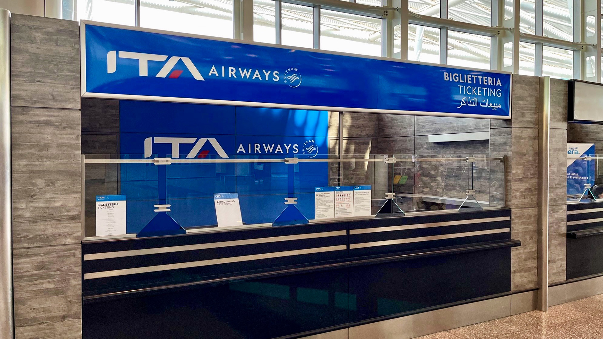
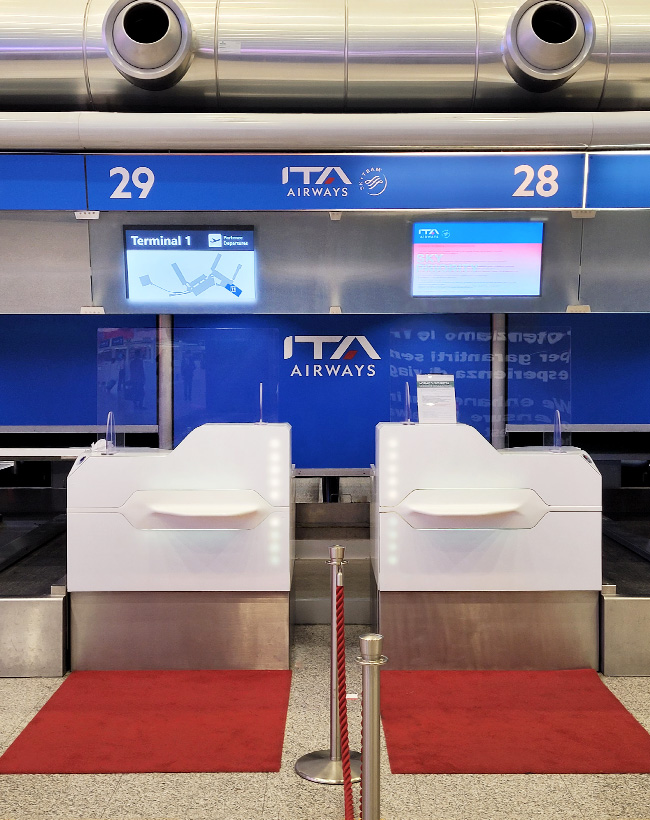
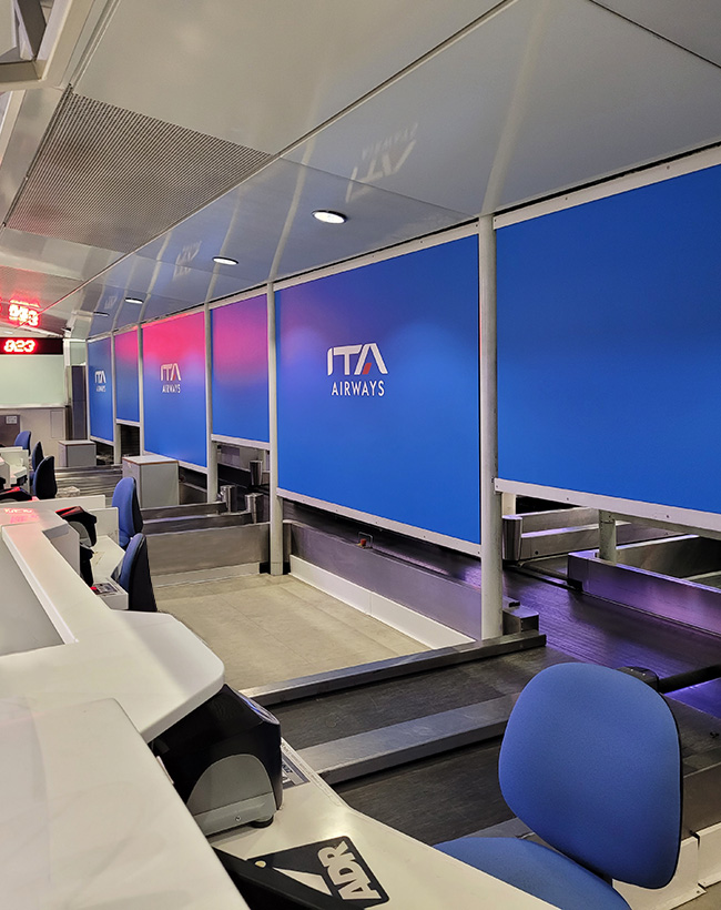
ITA Airways, the result of a bold endeavor following the crisis of former Alitalia, emerged as a new air transport company under the name Italia Trasporto Aereo. Despite securing the brand Alitalia, the company chose to enter the market with a fresh identity, ITA Airways.
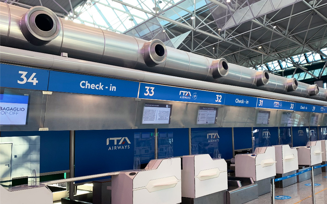
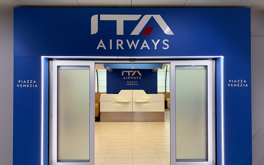
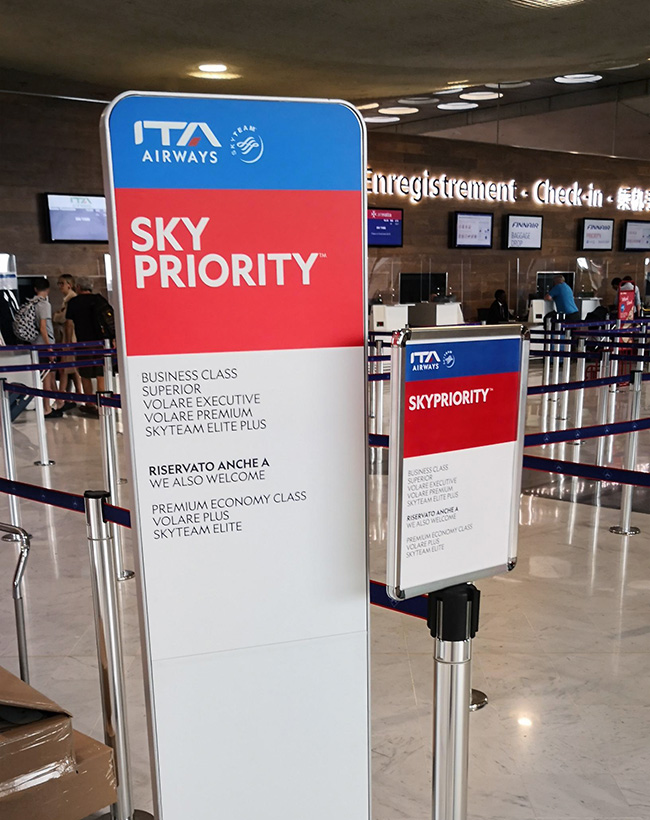
In this transformative journey, GLIMMA, in collaboration with our Gold Partner DB Ingegneria dell’Immagine (Italian-based large-format print solutions company), undertook the task of replacing all previous Alitalia logos with the new ITA Airways branding across various touchpoints at international airports.
Our Rebranding Journey Encompassed:
Re-branding locations included:
Algiers (ALG), Amsterdam (AMS), Athens (ATH), Barcelona (BCN), Bruxelles (BRU), Cairo (CAI), Paris (CDG), Dusseldorf (DUS), Frankfurt (FRA), Geneva (GVA), London (LHR), Madrid (MAD), Malta (MLA), Munich (MUC), Nice (NCE), Paris (ORY), Tirana (TIA), Tel Aviv (TLV), Tunisia (TUN), Zurich (ZRH), Brindisi (BDS), Bari (BRI), Catania (CTA), Fiumicino (FCO), Genoa (GOA), Linate (LIN), Napoli (NAP), Palermo (PMO), Pescara (PSR), Reggio Calabria (REG), Lamezia (SUF), Torino (TRN), Trieste (TRS), Venezia (VCE).
Throughout this rebranding project, GLIMMA and DB Ingegneria dell’Immagine executed the project with precision, showcasing our expertise in delivering impeccable brand management solutions.
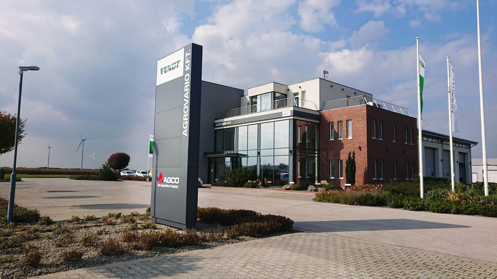
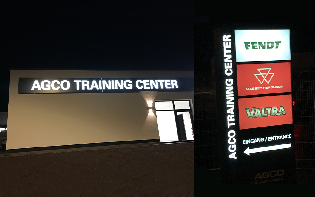
AGCO Corporation, a renowned provider in the agricultural industry, empowers farmers worldwide with cutting-edge solutions through their esteemed brand set: Fendt, GSI, Massey Ferguson, Precision Planting and Valtra. Offering an extensive range of tractors, combine harvesters, hay and forage equipment, seeding and tillage implements, grain storage, protein production systems and replacement parts, AGCO has been committed to sustainably feeding global communities for over 30 years.
AGCO made a strategic decision to overhaul its corporate and branding structures, which led to the development of a new visual identity for its dealerships across EMEA. With 868 dealers responsible for 59% of AGCO’s global sales, this corporate redevelopment required GLIMMA’s Gold Partner Beflex to have meticulous attention to detail and hyper-focused collaboration with AGCO’s global brand team (headquartered in Germany), who carried out the project client-side.
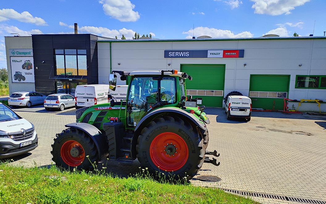
Beflex in collaboration with GLIMMA crafted a holistic end-to-end web-shop solution tailored to AGCO’s specific needs.
Our Bespoke Strategy Included:
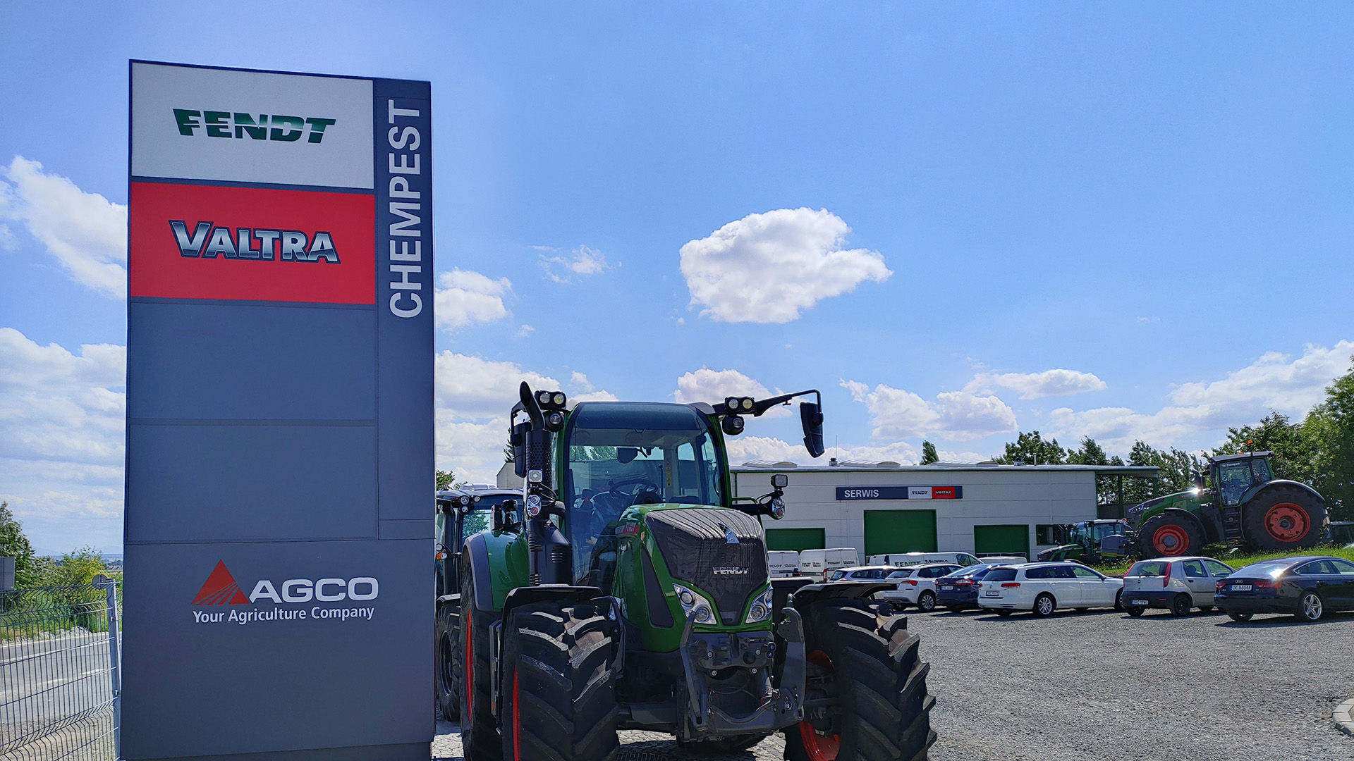
The online ordering system (webshop) we devised for AGCO has allowed total control over the brand’s visual identity across Europe. This includes precise color matching high-quality material usage assurance, adherence to warranties project-wide, alongside detailed project costings maintenance. The webshop guarantees dealerships can seamlessly order signage that adheres to AGCO’s top-level corporate guidelines. Additionally, our dedicated Beflex/GLIMMA team was readily available to support dealerships with permit acquisition, installation and product integration management throughout the transitionary period.
Our timeline for this global strategic transformation began with detailed concept development and product wireframing in 2020, followed by A/B-tested prototyping in 2021. By 2022, the webshop was successfully launched and implementation across AGCO’s dealers had commenced. Today, every AGCO dealer in Europe operates within the implemented webshop – ensuring brand consistency across all of AGCO’s European dealerships.
At GLIMMA, we take immense pride in propelling brands like AGCO to new heights, empowering them with effective brand management solutions. Our dedication to quality, consistency, and efficiency aligns seamlessly with our clients’ visions. Trust GLIMMA to redefine your brand’s journey, transforming it into a powerful force that stands out in the global market.
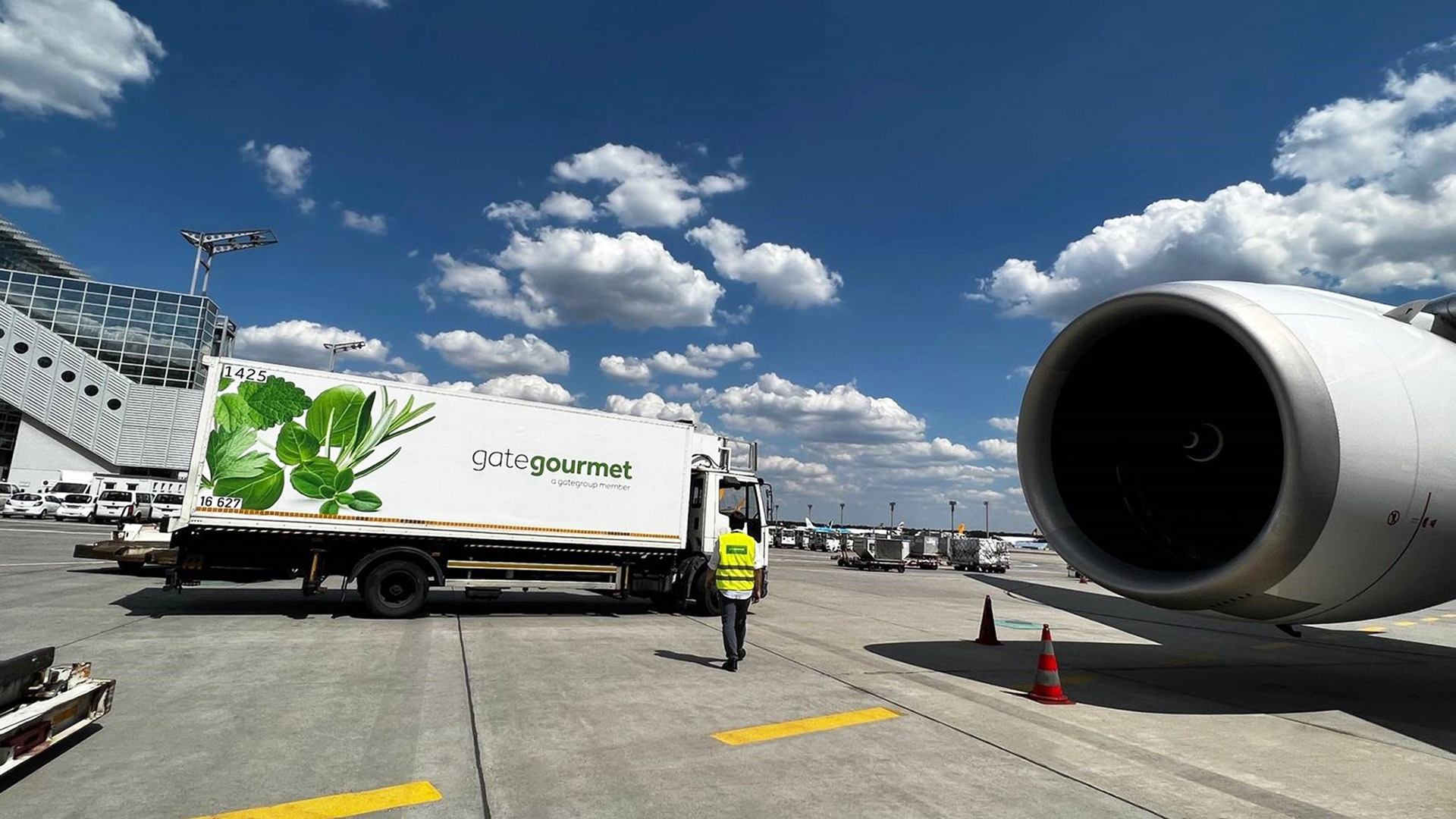
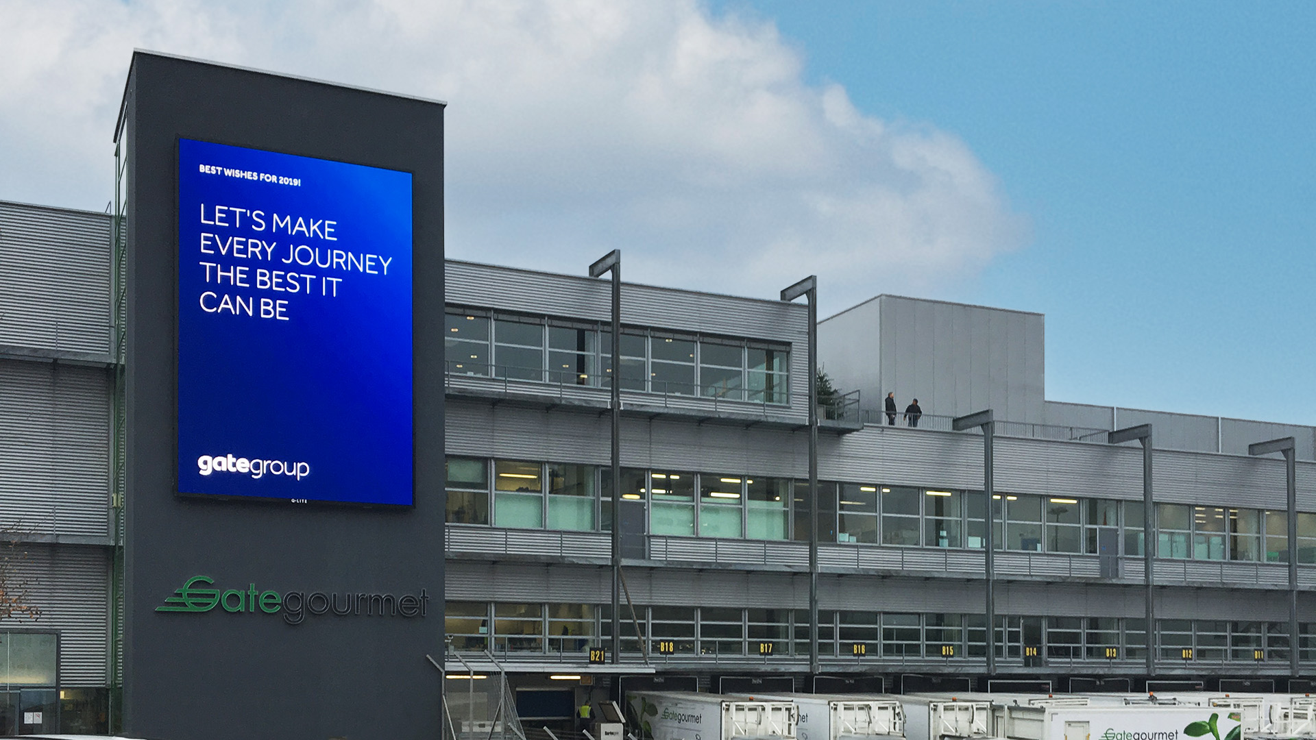
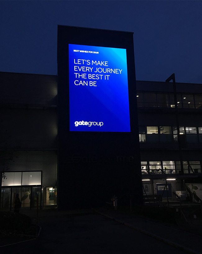
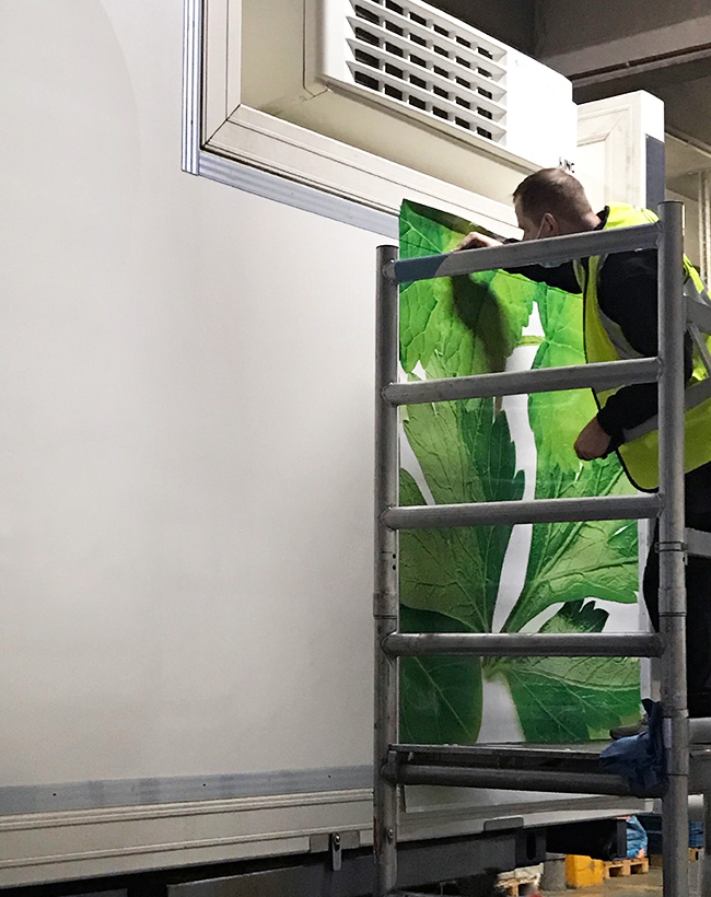
Our partnership with Gategroup (Gate Gourmet) dates back to 2007, and as proud partners with GLIMMA’s global network, we have successfully rebranded over 1,500 high-loader trucks across the world since then. Our collaboration with the Swiss onboard catering company has also extended to workplace branding projects in Europe and Latin America, including noteworthy exterior signage installations at London Heathrow and Zürich CH airports (where Gategroup’s headquarters are situated). One of our proudest achievements was delivering a large LED screen (670x1000cm) with a cloud-controlled media player platform, enabling Gate Gourmet HQ to have full, 24/7 access to updating the display.
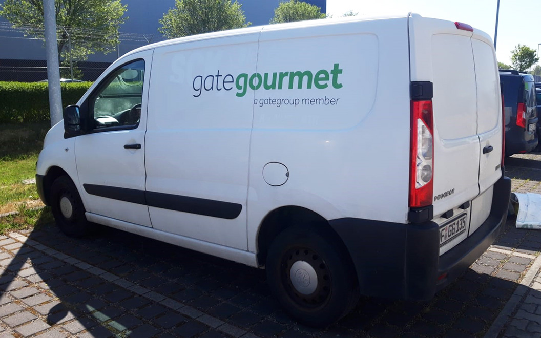
Not only has GLIMMA worked with Gate Gourmet on their signage rebrands, but we have also assisted in rebranding hundreds of vehicles when the company acquired Lufthansa’s aviation catering operation in Europe. In a remarkable feat, GLIMMA managed the rebranding of over 500 high-loader trucks, vans, and cars across Germany, Switzerland, the Netherlands, Belgium, and Spain – a mammoth task accomplished in under 10 months, starting in October 2021. The project involved close collaboration with the global company and its management at numerous Gate Gourmet kitchen units throughout Europe. GLIMMA centralized and oversaw prototyping, production, removal of old LSG Sky Chefs branding, new Gate Gourmet branding installation, vehicle transportation, and a variety of additional services (i.e., spot repair on lightly damaged truck bodies) – with the help of our expert European gold partner network.
To provide the Gate Gourmet fleet managers with real-time insights into the de-installation process and the required spot repairs on truck bodies, we utilized our dedicated online platform, BrandEye. Our unique platform allowed de-installers to report their work directly from their mobile phones to the central GLIMMA portal. As a result, Gate Gourmet’s management gained an instant overview of the entire rebranding process that wouldn’t have been possible without BrandEye.
Even today, we are actively engaged in a new project for Gate Gourmet, encompassing the branding of new trucks supplied by the company’s trusted truck suppliers in Germany and Northern Ireland, along with additional truck rebranding work in Switzerland. We have also ensured seamless brand maintenance through BrandEye’s bespoke ‘brand asset store’, offering Gate Gourmet the ability to promptly repair damaged branding across their global fleet.
As we embark on this journey of transformation with Gate Gourmet, we remain steadfast in our commitment to excellence, empowering them with effective brand management solutions that elevate their fleet’s visual impact across the globe.
The Brief
To develop and deliver a global branding program across 85 countries, including workplace branding, wayfinding and external signage.
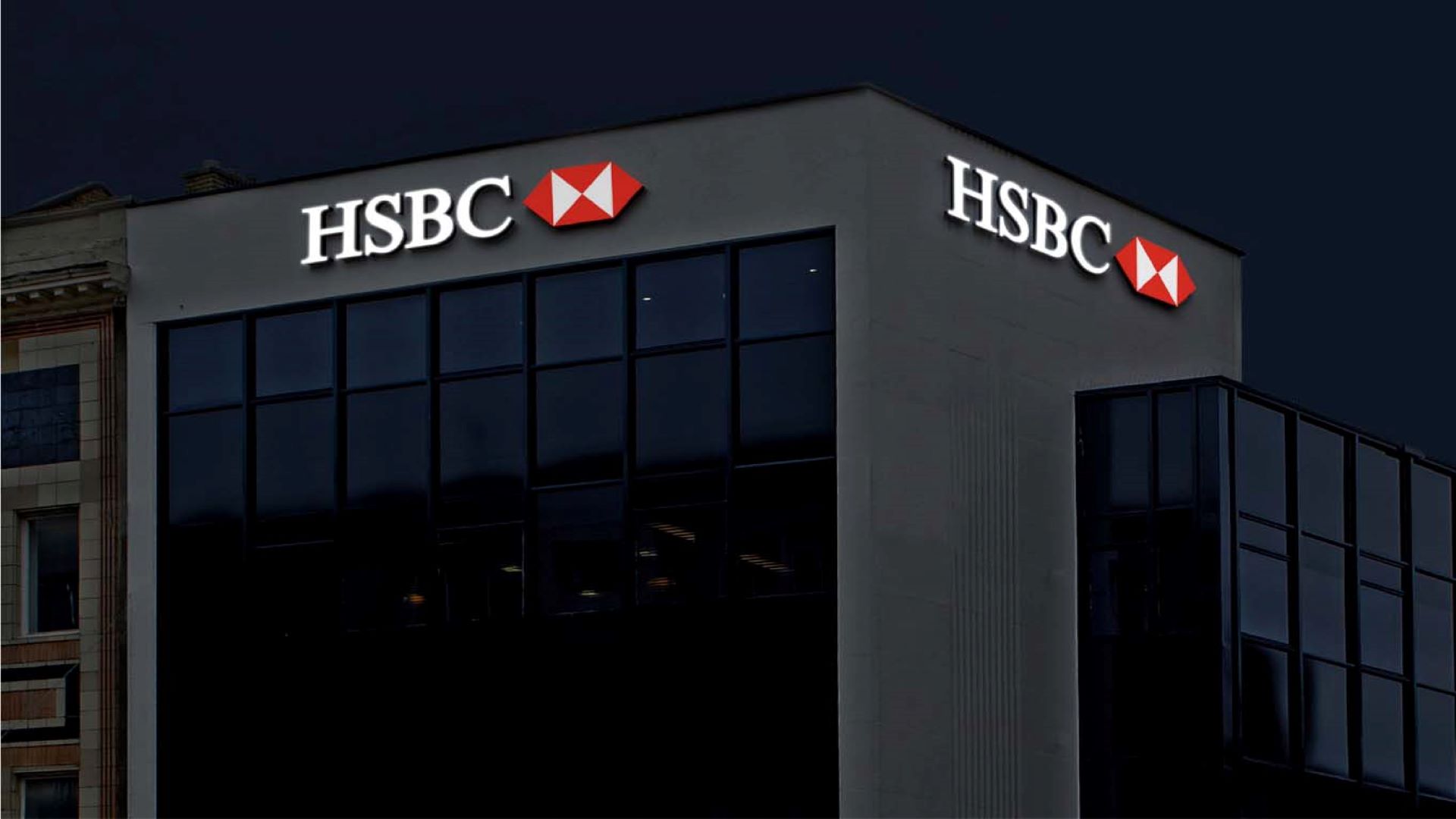
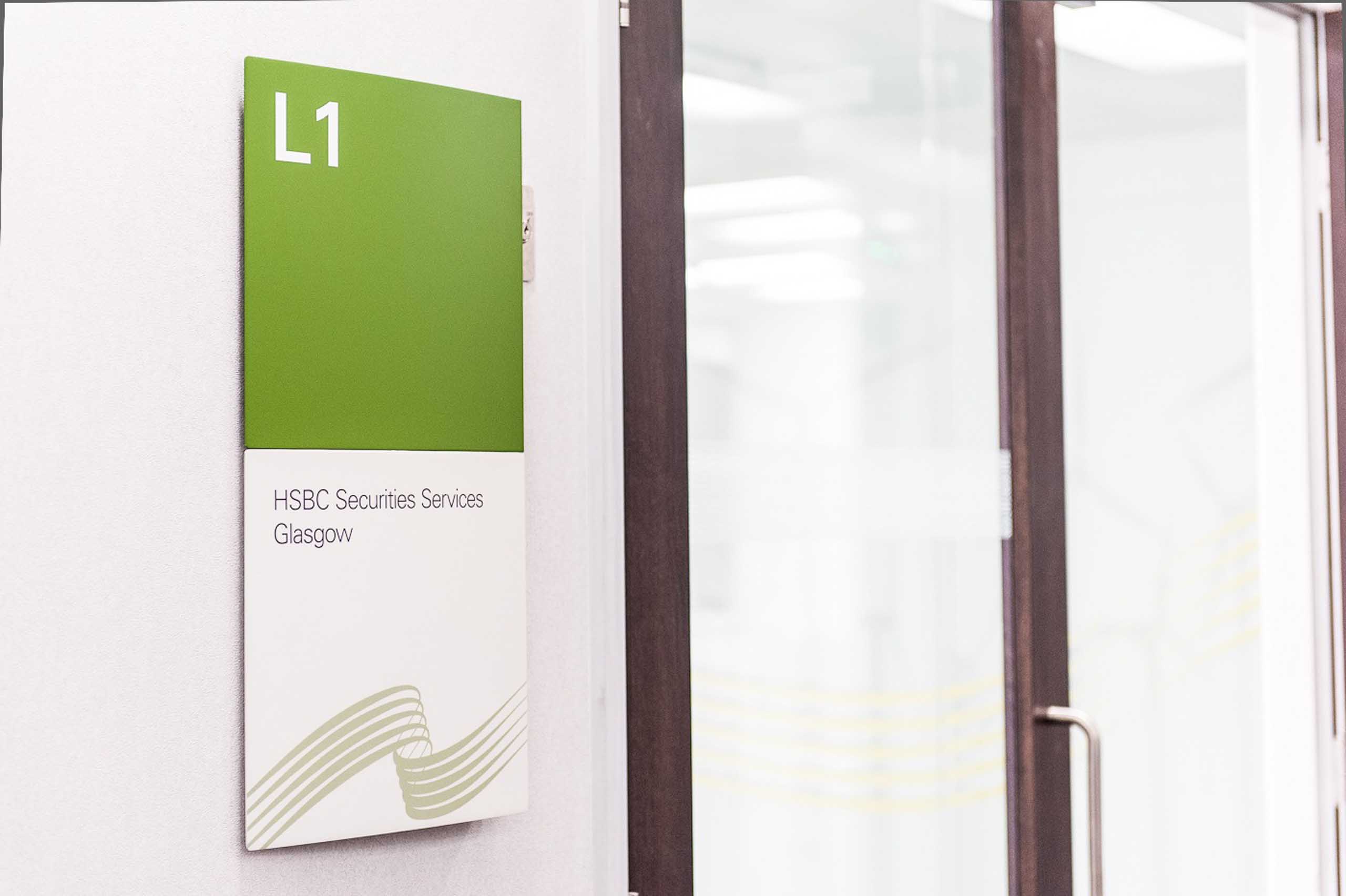
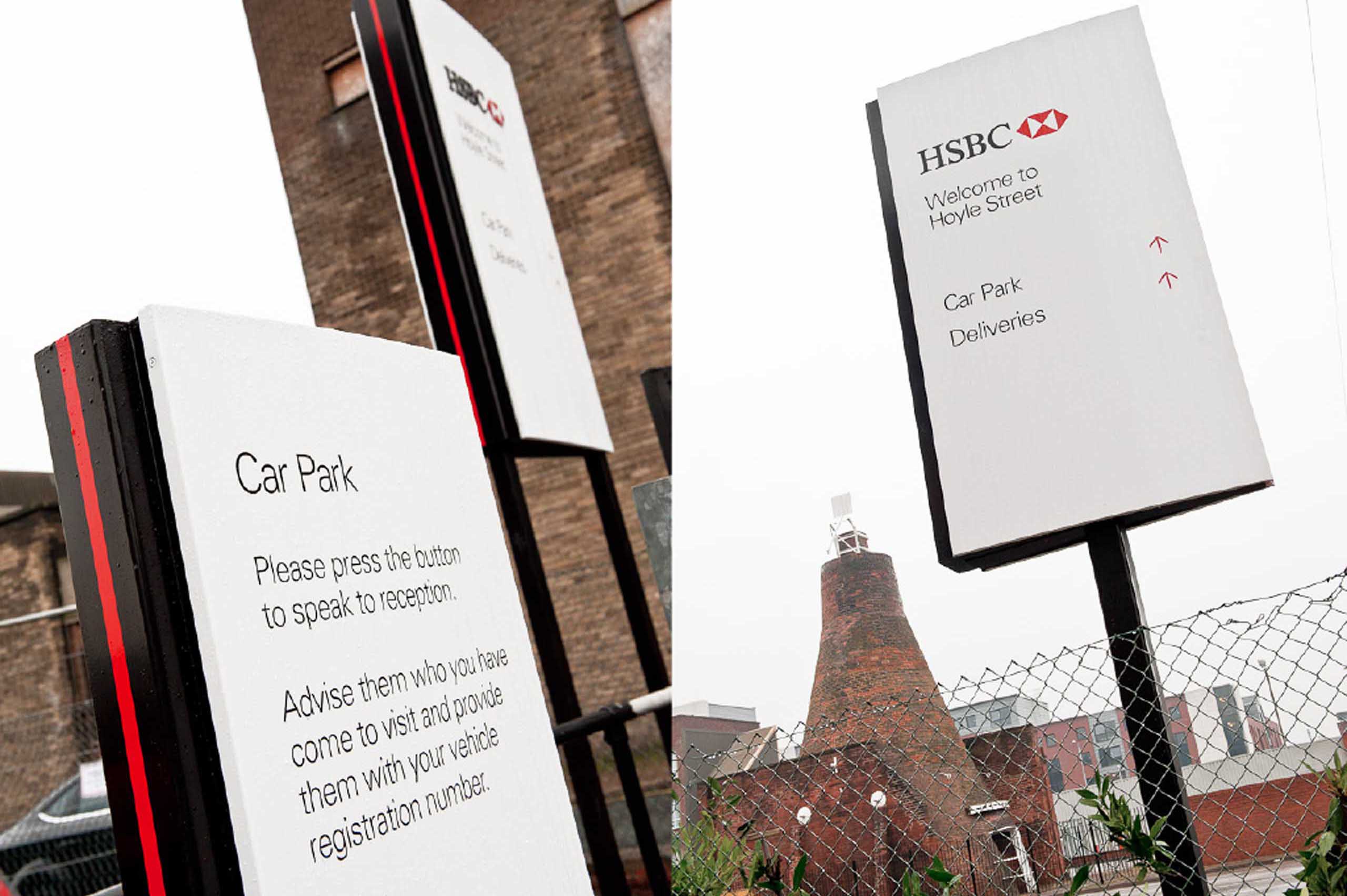
HSBC Group Design sought to create individual designs for their workplaces around the world, to reinforce the Employer Brand and to enrich the workspace.
Developing and delivering the HSBC Employer Brand
We worked with HSBC to develop, design and implement a global branding program that brought brand consistency to their work spaces but at the same time, allowed for local customization.
At the hub of this large-scale and award-winning program, we provided central control and input in terms of design, rollout, material specification and installation.
The implementation strategy was based on central control but delivered by our local project managers and our local network.
This provided HSBC with the scope to deliver consistent but customized designs internationally, resulting in better engagement, lower costs and quicker delivery times.
The environment’s important
An environmental approach to signage was adopted. To minimize costs and carbon footprint, all the specified materials were sourced locally, environmentally friendly and recyclable.
Through careful choice of innovative mechanical sign designs, we helped to reduce the on-going cost of ownership by allowing maintenance staff to easily carry out day-to-day additions, moves and changes.
We’re proud to have won three international awards for our global branding program for HSBC.
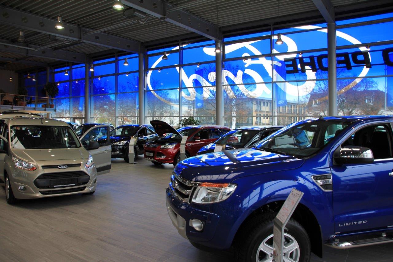
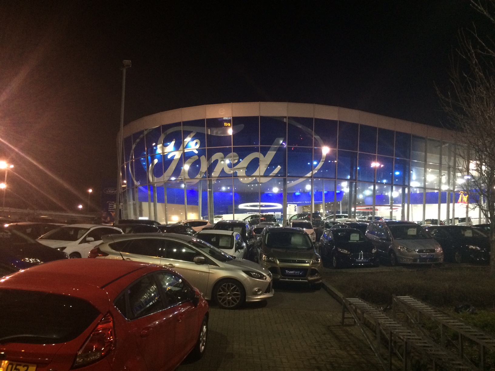
The Brief
As part of Ford’s European Network Showroom Upgrade Program (ENSU), we provided strategic input and managed the rollout of Ford Europe’s new branding at more than 350 Ford showrooms across 20+ European countries.
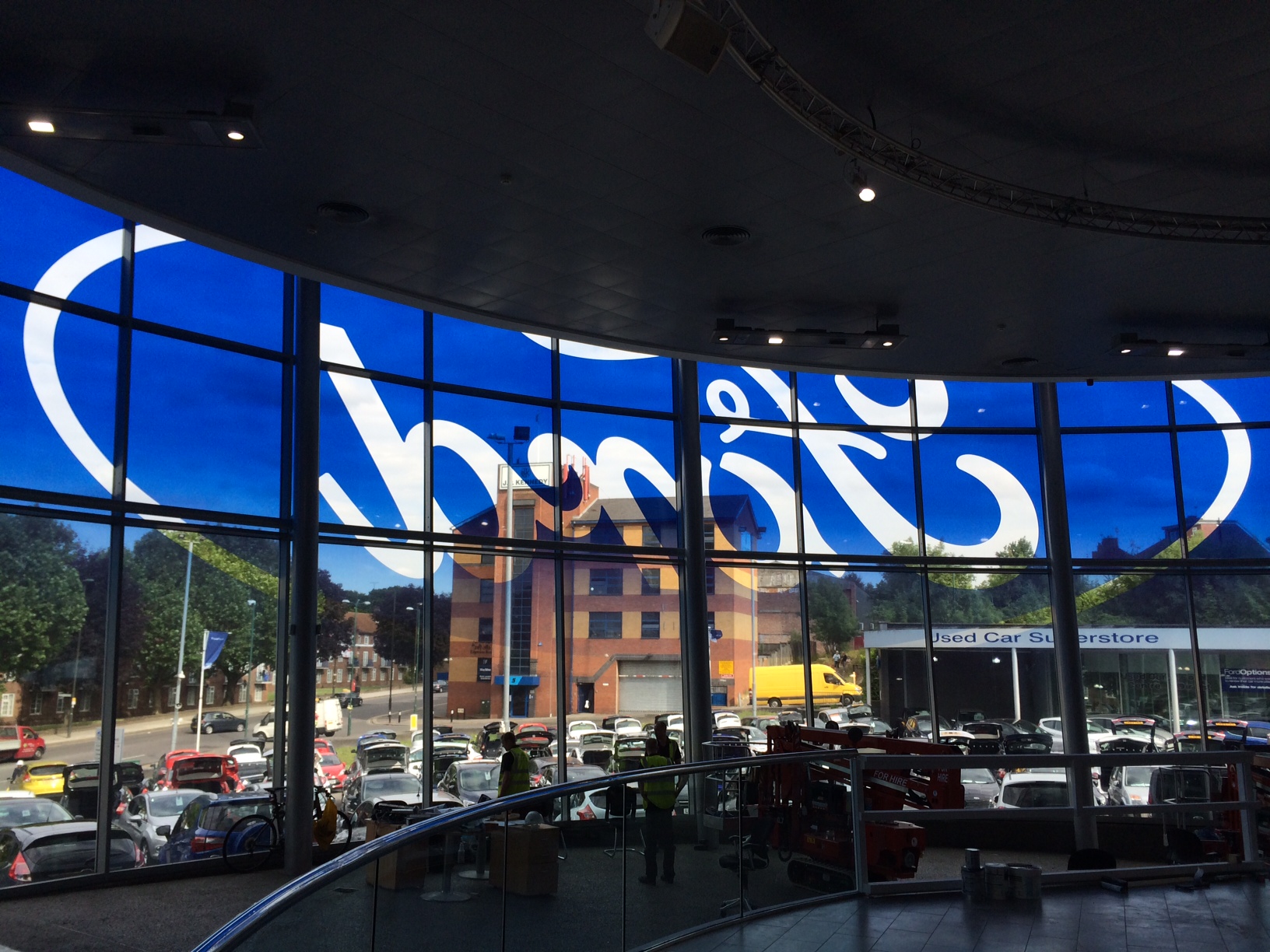
From design through to implementation
We worked hand in hand with Ford of Europe, their design agency, Imagination, and 3M to develop the optimum branding solution for their large-scale graphics.
Drawing on many years of experience and technical knowledge, we recommended a 3M Clearview solution, one that could be delivered at a local level right across Europe.
It provides durability and high visual impact and also offers economic and environmental savings in the short to long term.
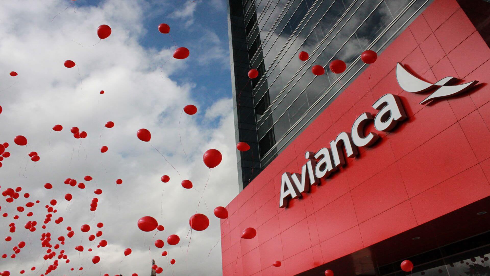
THE BRIEF
To implement Avianca’s new brand identity across airports and ticket offices globally.
When Colombia’s national airline took over TACA airlines and expanded their coverage in Latin America, they decided to rebrand.
'Speed was essential and GLIMMA really rose to the challenge. They succeeded in delivering our new branding in 29 countries across four continents, rebranding more than 80 airports and 220 ticket offices within just 180 days.'
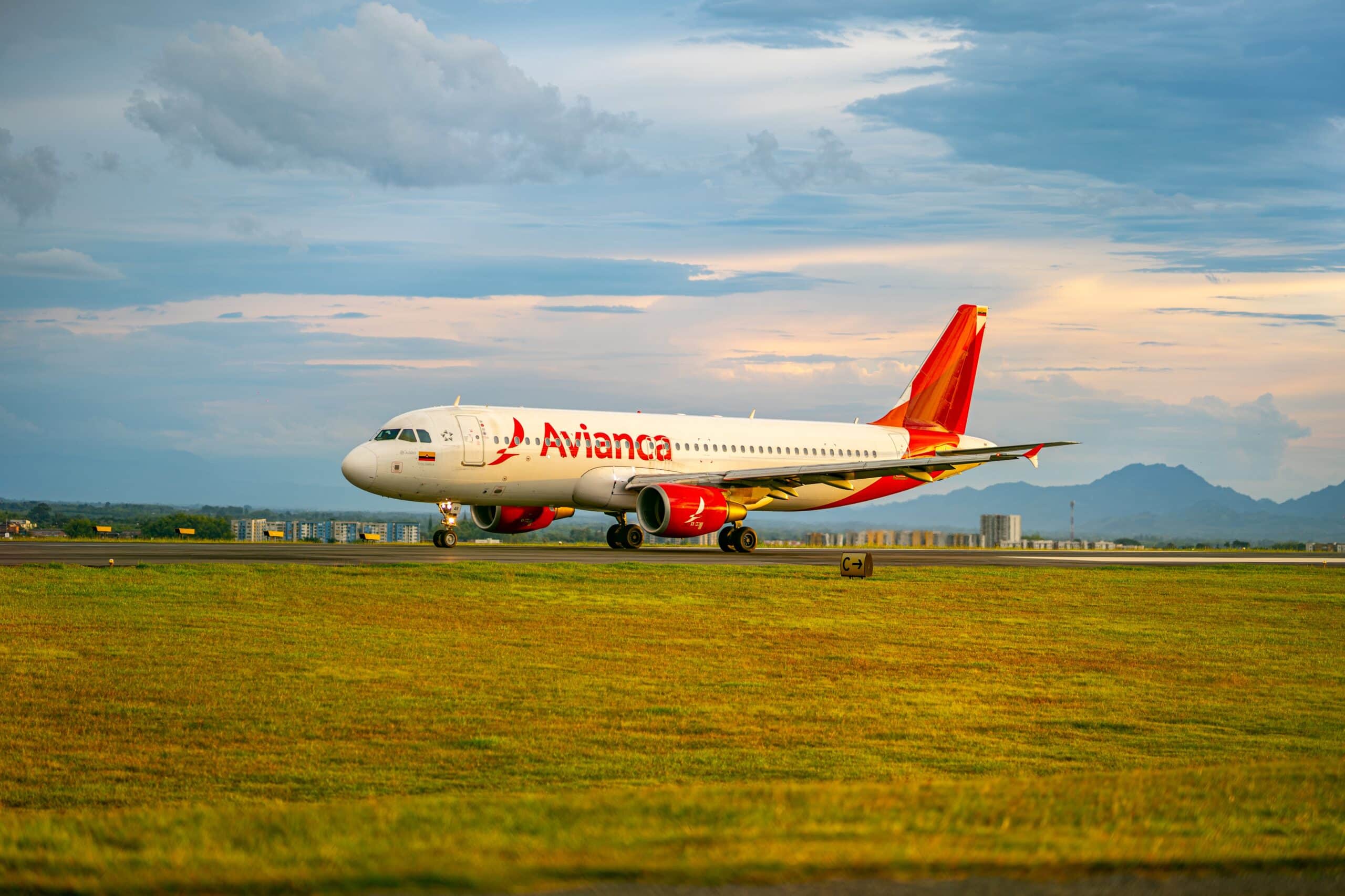
HOW DO YOU DELIVER A REBRAND IN 84 AIRPORTS IN JUST 180 DAYS?
Their new brand identity was created by Lippincott. Our role was to fully rebrand over 300 locations in the new brand identity, whilst keeping the design under wraps until launch day.
Working closely with their designated Rebrand team – HR, Marketing and Corporate Affairs – we started by undertaking a full audit of all their branded assets. This included real estate, fleet air, ground fleet and every brand touch point (including digital).
The rebrand covered every possible element – paint, digital screens, graphics, signage, point of sales materials, office branding and their entire ground fleet.
LOCAL KNOWLEDGE
We project managed the implementation of the rebrand from our offices in Mexico and Colombia.
The local knowledge of our network was critical in understanding cross-border restrictions, particularly given the sensitive nature of airport environments. It also helped in providing multi-lingual signage solutions.
Avianca’s award winning rebrand and our role was featured in the UK’s top branding publication ‘Communicate’.
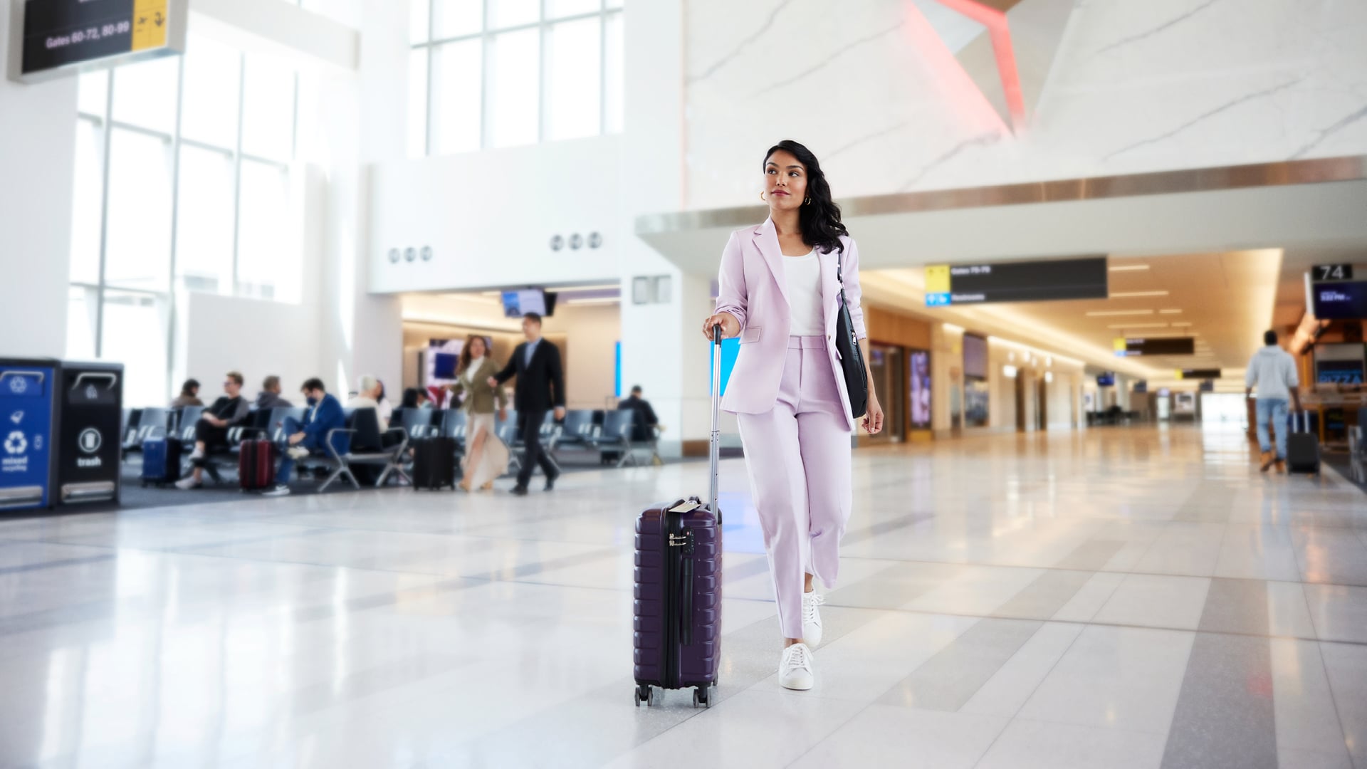
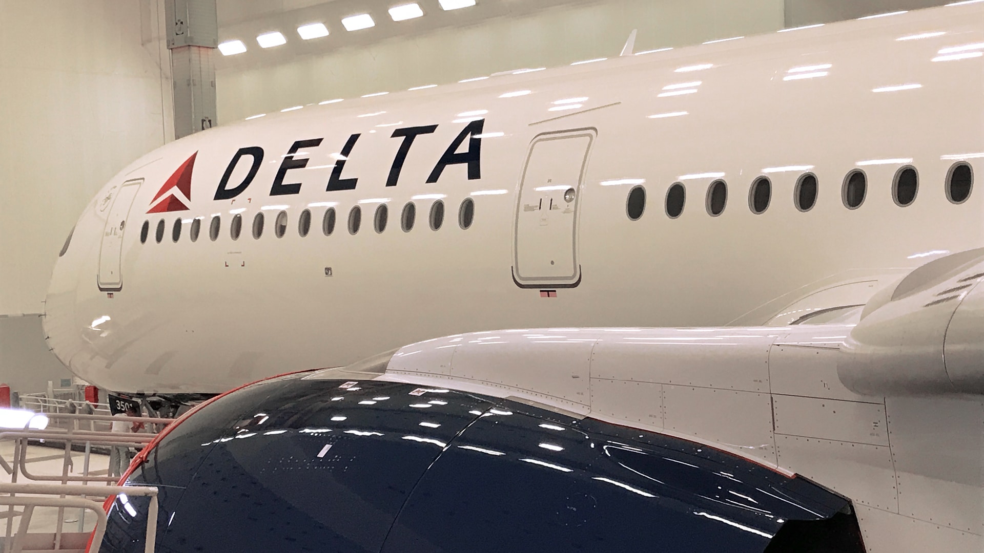
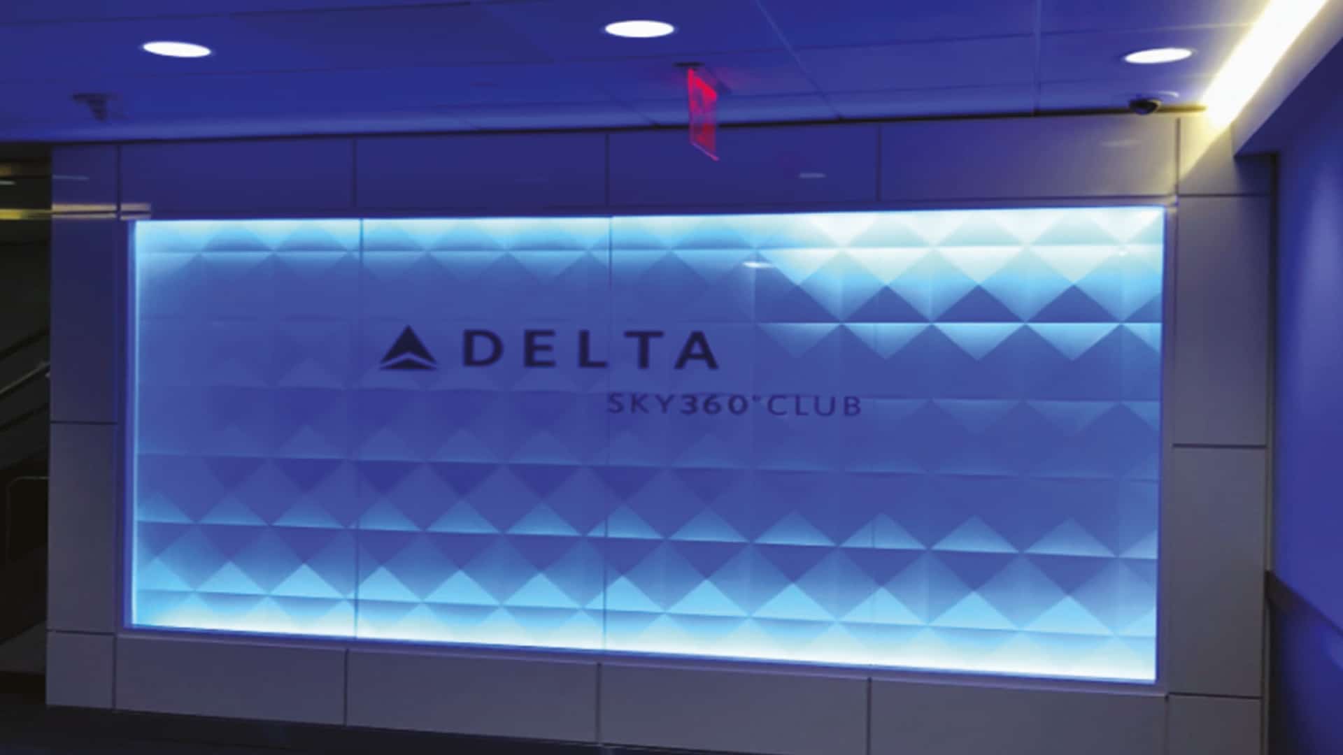
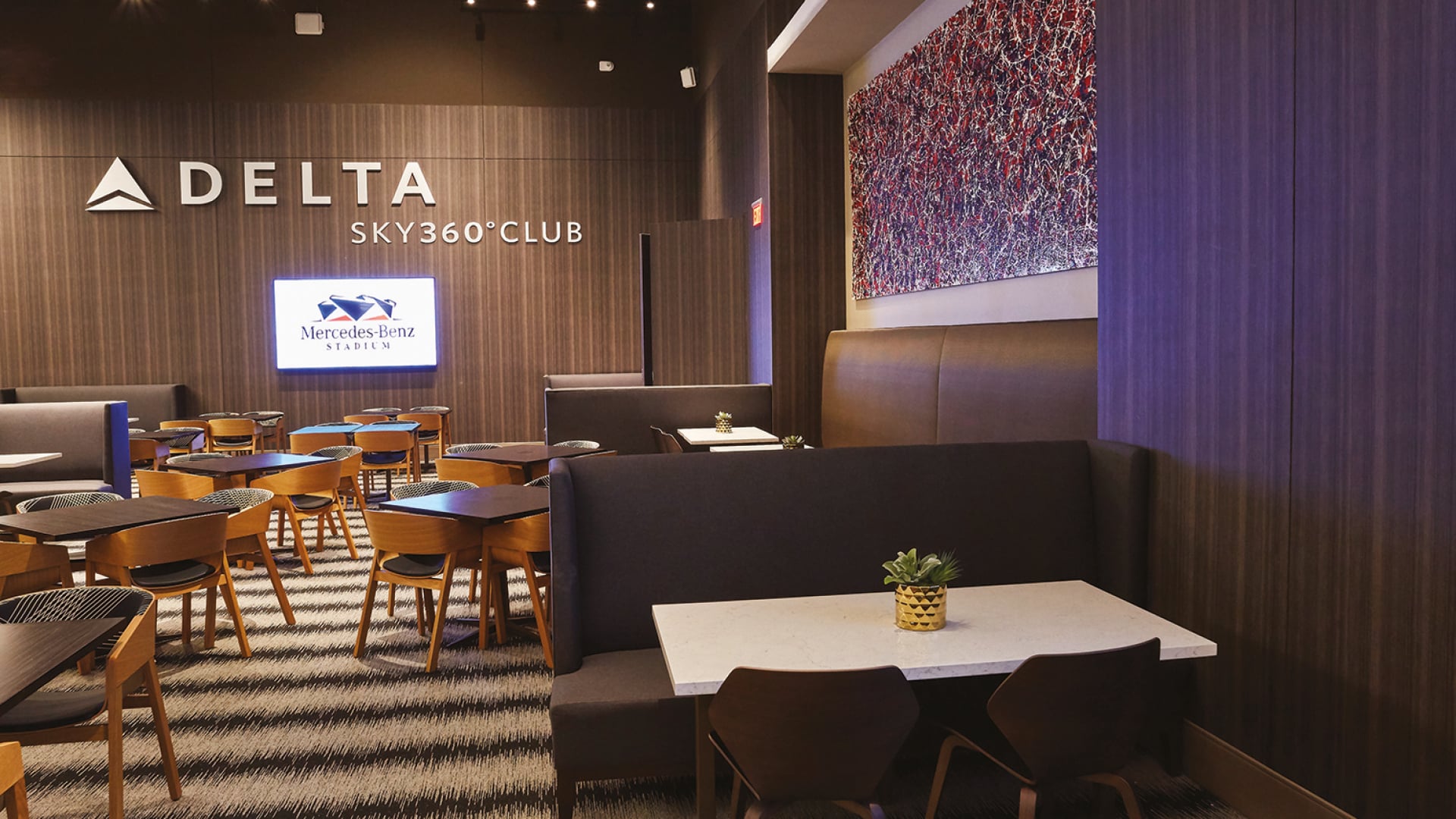
We created brand experience that is rich in quality, impact and emotion across the entire customer journey on behalf of Delta Air Lines in over 275 airports worldwide.
More than 4,000 Delta Air Lines flights take off every day, connecting people across more than 275 destinations on six continents. Delta’s 80,000 employees serve over 200 million customers annually.
'We worked collaboratively to design, produce and install visual brand assets in all 275 airport destinations around the world.'
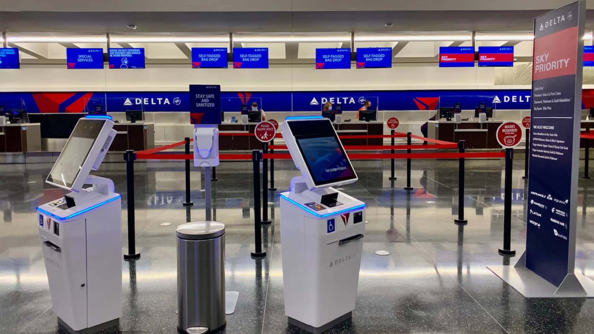
Delta Check-in
We manage an extensive range of brand assets for Delta globally and frequently complete on-site surveys, track completed projects and gather specific brand data to feed it into our brand asset database to help track Delta’s branding and in-market messaging for their teams.
Our design team interpret Delta brand guidelines to create consistently effective visual signage, wayfinding, and marketing communication assets across the entire customer travel journey and we are constantly innovating with the Delta teams adding new services to the solution portfolio, including vendor network management, technology services, fleet services and product specification,
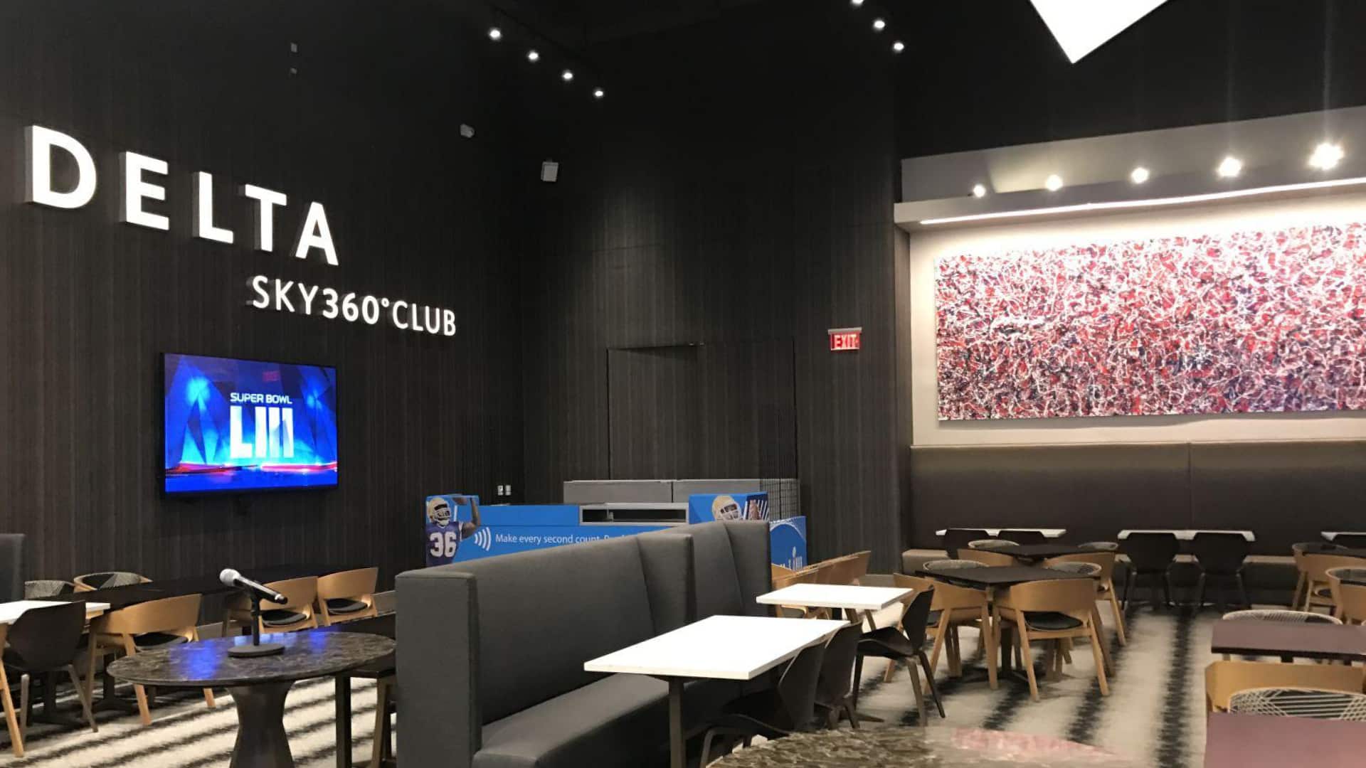
Delta Sky Lounge
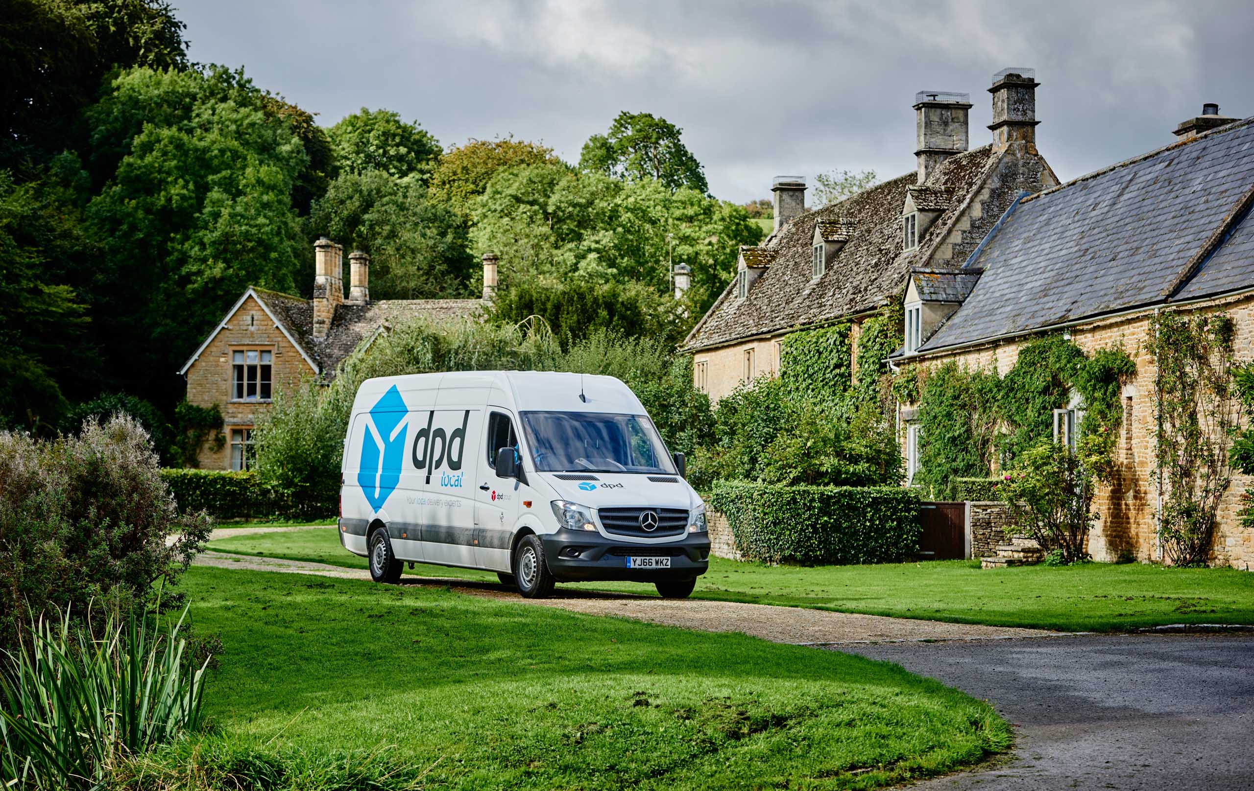
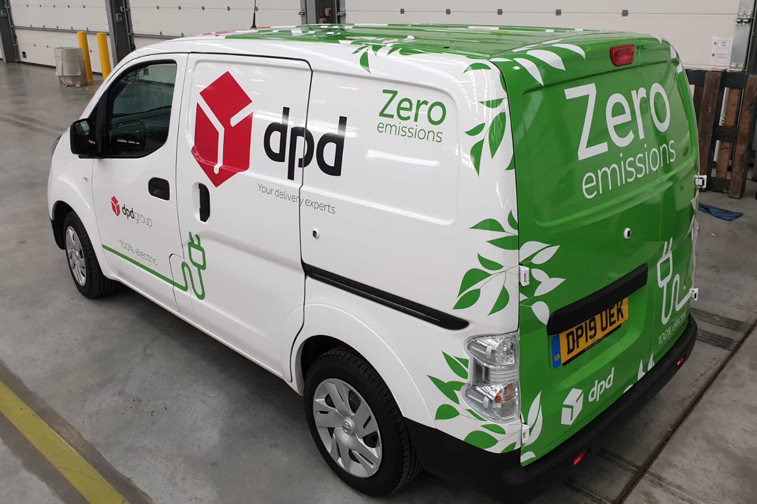
Aura Brand Solutions represents our operation in the UK. Commissioned by DPD to rebrand their entire fleet in the United Kingdom, our team also drew upon its international expertise, as part of the GLIMMA network, to develop a specification for the rollout of the rebrand across the rest of the European fleet.
The rebrand was prompted by the need to consolidate the branding of 4,500 vehicles across multiple markets.
Given the international nature of the project, we started by examining the product options available in all markets.
Working closely with DPD’s creative design team and our global partners, our technical team helped to develop the optimum product solution – one that would guarantee consistency in all markets.
Once agreed, we advised on the different implementation options for the most efficient pan-European rollout in terms of quality, time and cost.
'Working closely with DPD’s creative design team and our global partners, our technical team helped to develop the optimum product solution – one that would guarantee consistency in all markets.'

UK Fleet Rebrand
For the UK fleet rebrand, our team was responsible for managing the design, manufacture and installation of the new livery designs nationwide, across a spectrum of different vehicles.
A full audit of the UK fleet was undertaken and prototypes were developed to ensure the most appropriate technical design. Significant prototyping and color profiling was carried out to reach a final graphics specification.
This provided full warranty cover, achievable only thanks to Aura’s status as a manufacturer approved converter and installer.
The variety of vehicle types was matched by the variety of vehicle owners, adding a layer of complexity to the project. A large part of the project management role being liaison with the company-owned fleet managers, the franchise-owners and the individual owner drivers, to ensure brand consistency across the entire fleet.
To minimize the time that vehicles were off the road during the rebrand, we also undertook any existing accident damage repairs at the same time.
'This is a testament to the collaborative relationship we enjoy with both the DPD team and our Partners in Europe. We worked closely with their creative agency and various fleet owners to create tried and tested product solutions that were centrally managed but implemented locally and available across multiple markets.'
Maintaining the UK fleet
The ongoing management and maintenance of the DPD fleet also falls to our team.
With a continuous churn of new and old vehicles, an online ordering system and a bespoke accident management service has been developed, ensuring that vehicles remain in tiptop condition and remain on the road.
Extending the DPD brand
Interlink Express also operates in the UK but focuses on providing a more local service for shippers with smaller volumes.
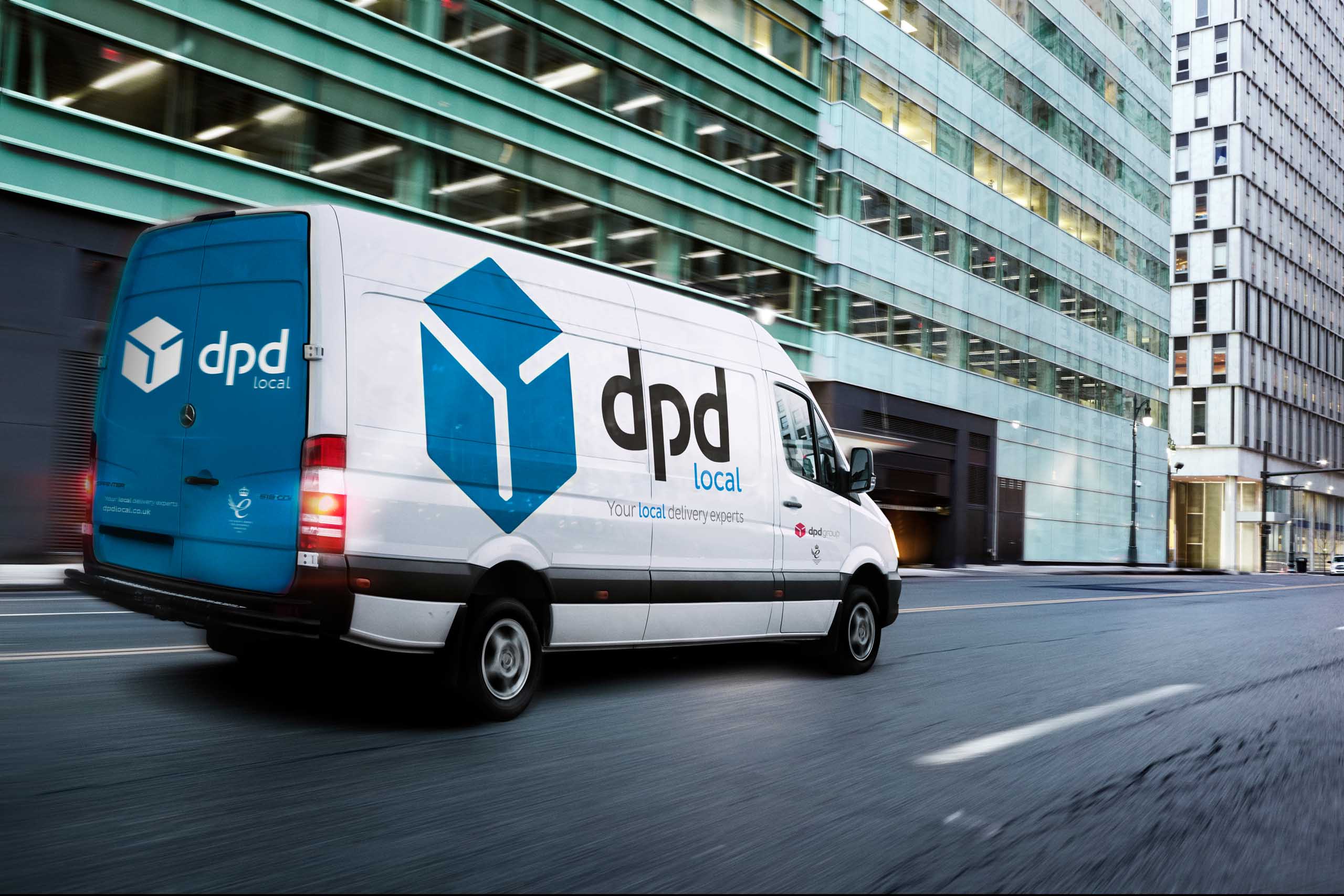
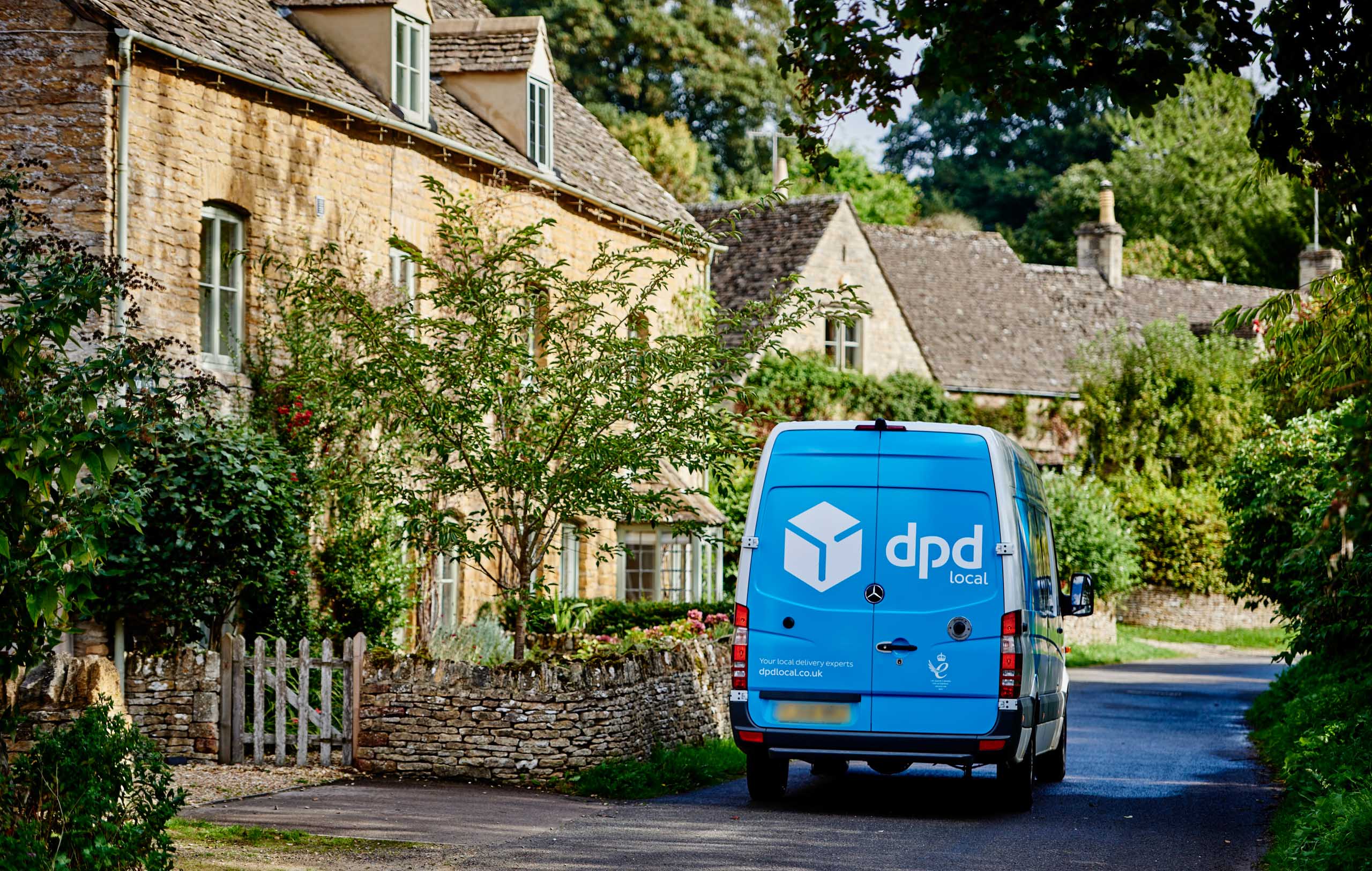
Our team has also rebranded their fleet of 1,500 vehicles to DPD Local, using a blue variant of the now familiar DPD box design.
The Brief
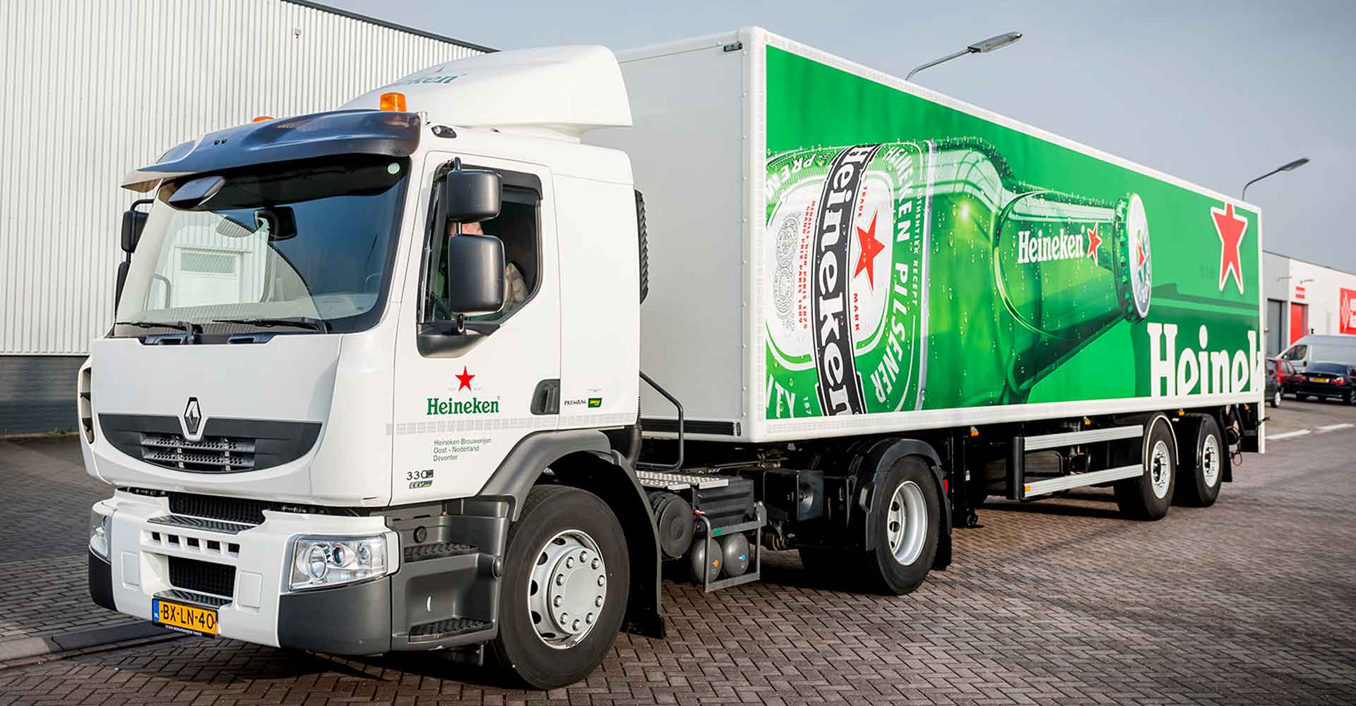
A long-standing client; we’ve worked with Heineken over many years to deliver various branding programs, including a rebrand and to support their sponsorship programs.
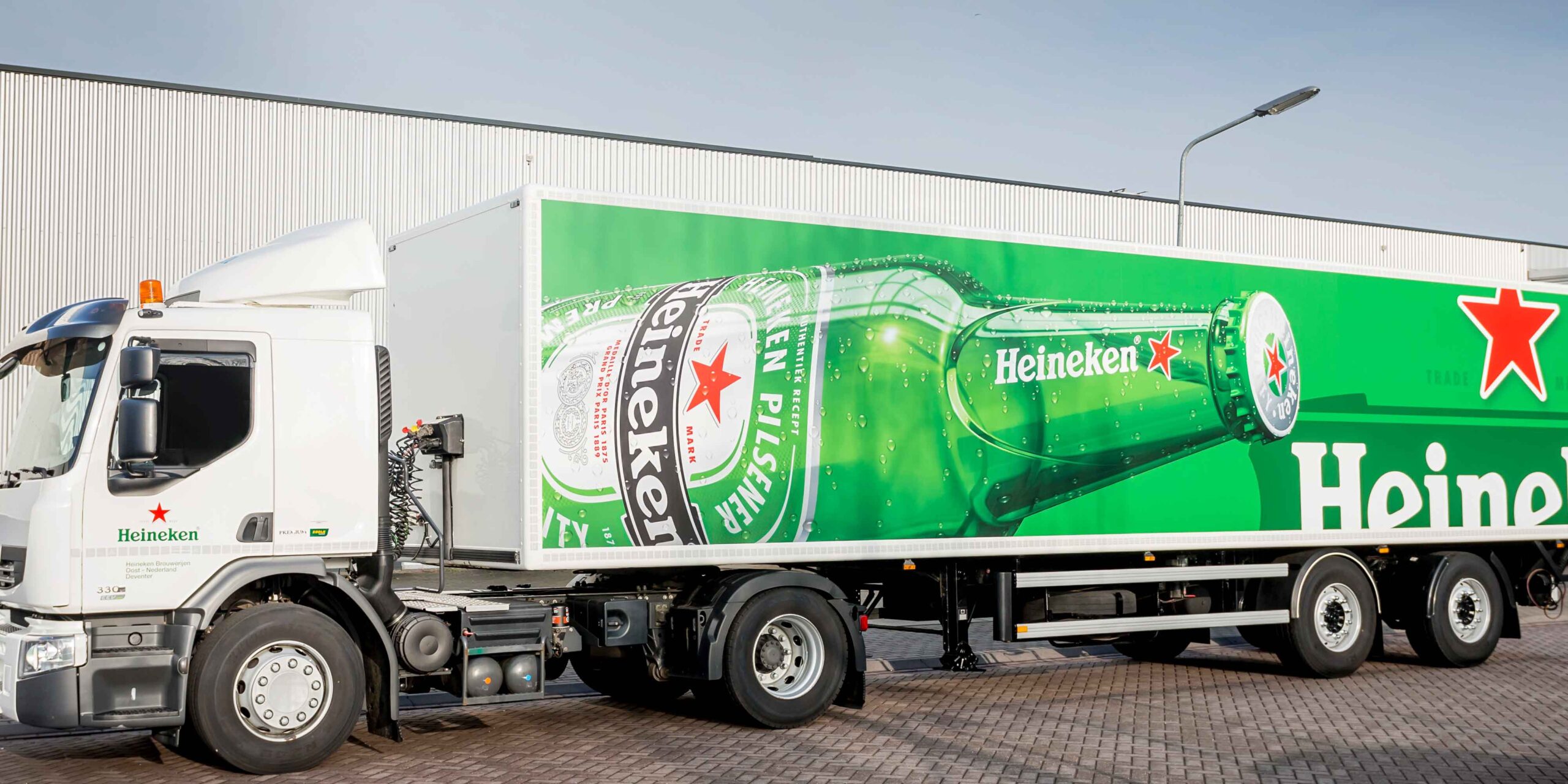
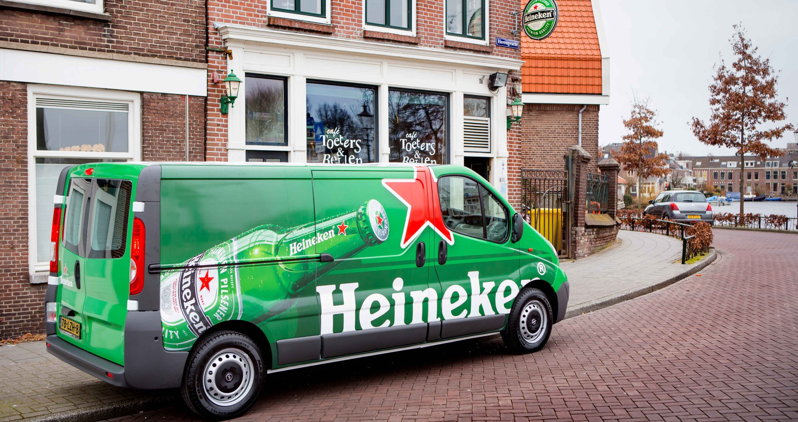
Fleet Rebrand
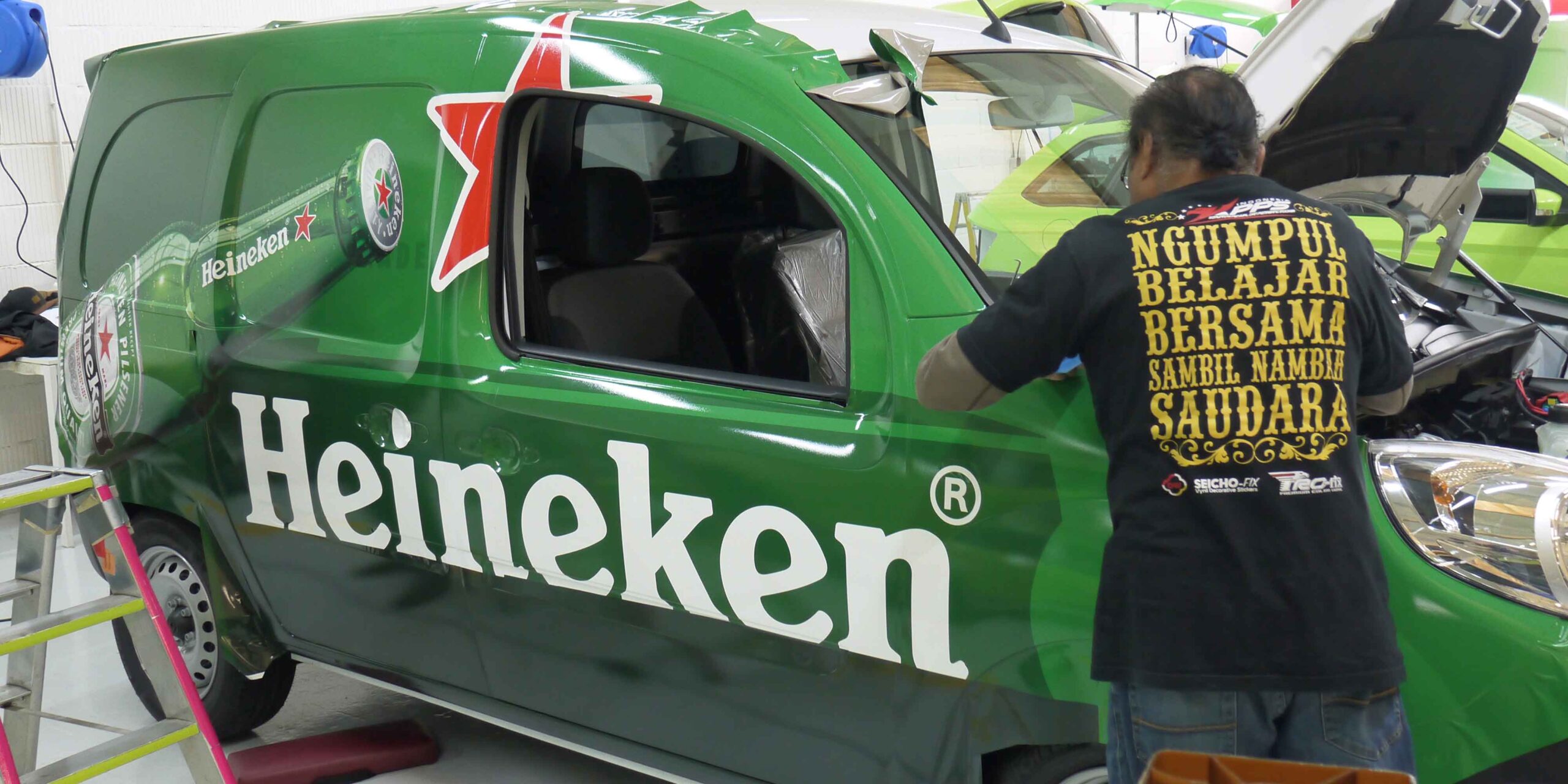
When the iconic green bottle became central to Heineken’s design approach, their European fleet of vehicles was one of the most prominent items to be rebranded. With an extensive distribution network, comprising a wide variety of vehicles types and sizes, this was quite a challenge.
We were appointed as their branding partner, to centrally co-ordinate the rewrapping of their European fleet. Through our local network, we used the latest digital technology and latest generation UV curable inks to reduce environmental impact.
Having become very familiar with the Heineken brand over the years, we continue to advise, develop and support the rollout of their fleet branding across new and replacement vehicles in Europe.
Sponsorship Support
Heineken was an official sponsor to the UEFA Champions League and we have helped to brand their event villages and to temporarily rebrand their fleet in sports livery.
Branding solutions in support of sponsorships or events is all about speed – a fast turnaround to make sure you make the most of the short ‘window of opportunity’. We used specialist graphics that can be removed easily and act swiftly, using our on-the-ground network to deliver quickly.
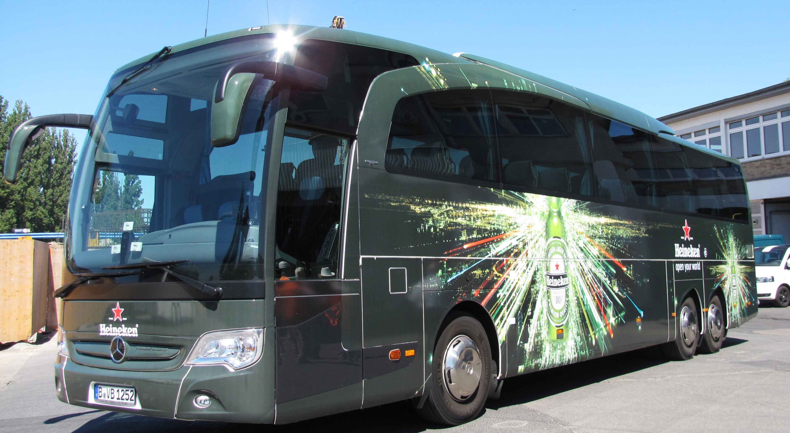
As football mania reaches fever pitch, Heineken is ready at the airport to greet and transport their VIPs and guests to the Cup Final in true style, using fully branded luxury coaches.
In Berlin we designed and delivered 20+ coaches, 8+ mini buses and 40+ Trabants.
We also helped Heineken to paint the town “Heineken green” for the final in Lisbon, Portugal.
From the airports to the city centre, we produced and installed various branded banners and signage graphics, as well as branding the Tuk Tuk taxis to carry supporters around the city.
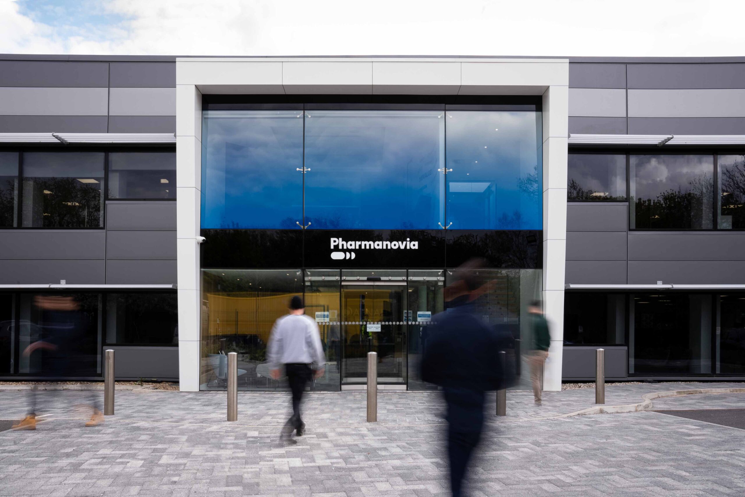
We were asked to implement a new brand identity, including communications and engagement for internal and external stakeholders.
Formerly known as Atnahs, this UK based pharma company undertook a strategic repositioning exercise which resulted in a new name and brand identity to support its strategic vision globally.
STRATEGIC REPOSITIONING
Founded in 2013, the company has grown from a small family business operating solely in the UK to a global specialty pharma business of 200+ employees, marketing 20+ brands across 140+ markets.
Detailed research and benchmarking led to the development of a new name and brand identity which better reflects their position as the original medicines specialist globally and a progressive global specialty pharma business.
The new brand identity was developed by WhyBrand.
IMPLEMENTATION PLANNING
Following sign-off of the new identity, we worked closely with the Pharmanovia team to set up a full physical audit to identify all their branded assets. Bringing together representatives from IT, HR, Finance, Marketing, Facilities and Legal, we helped to project manage the change of identity within a short timescale of just 12 weeks.
Reporting was co-ordinated through our online project management portal, accessible 24/7 and updated in real time.
'GLIMMA provided both central project management and strategic communications support for our rebrand. The team quickly put in place the right framework to identify and replace all our branded assets. At the same time they worked intuitively with all stakeholders to ensure that everyone, from staff to suppliers, understood our strategic repositioning.'
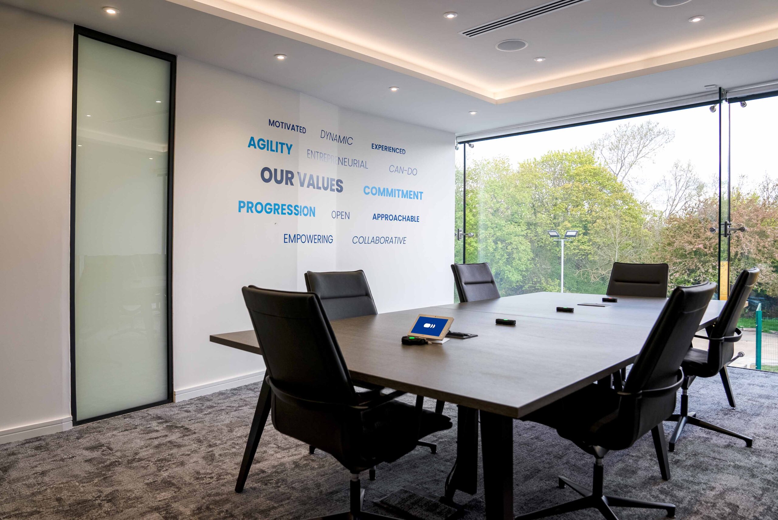
Meeting room rebranding
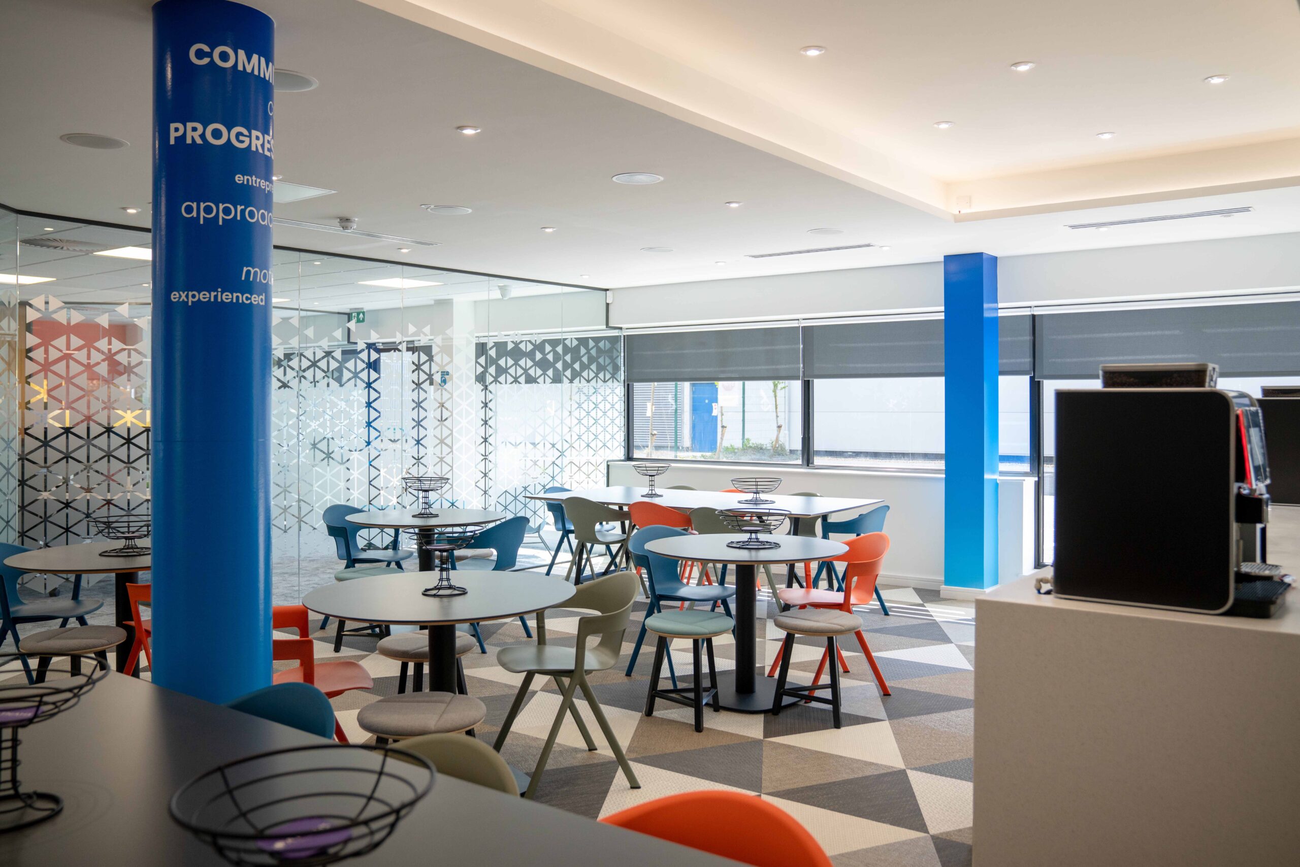
Canteen rebranding
SIGNAGE
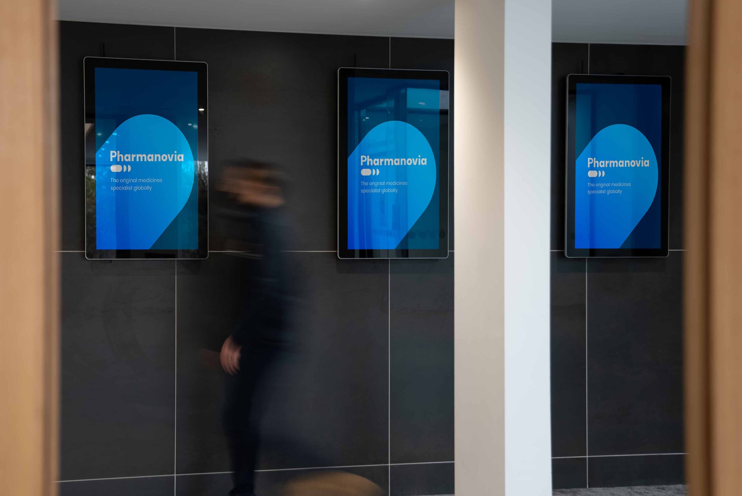
Our UK team installed new signage at their head office in Basildon, including the painting of bollards, fascia branding and a brand new lit totem.
Three new digital screens, with remote Content Management System, welcome visitors and help the company to communicate more efficiently and in real-time with employees.
WORKPLACE BRANDING
To make the new brand come to life in the workspace, we used their company values and an update-able world map to convey their new global positioning.
Given that employees have been working from home for 12 months+ due to Covid, the branding of the workplace is a key motivator as employees return to the workplace and start to feel emotionally connected to the new brand.
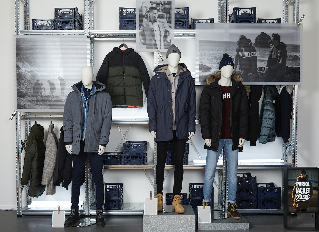
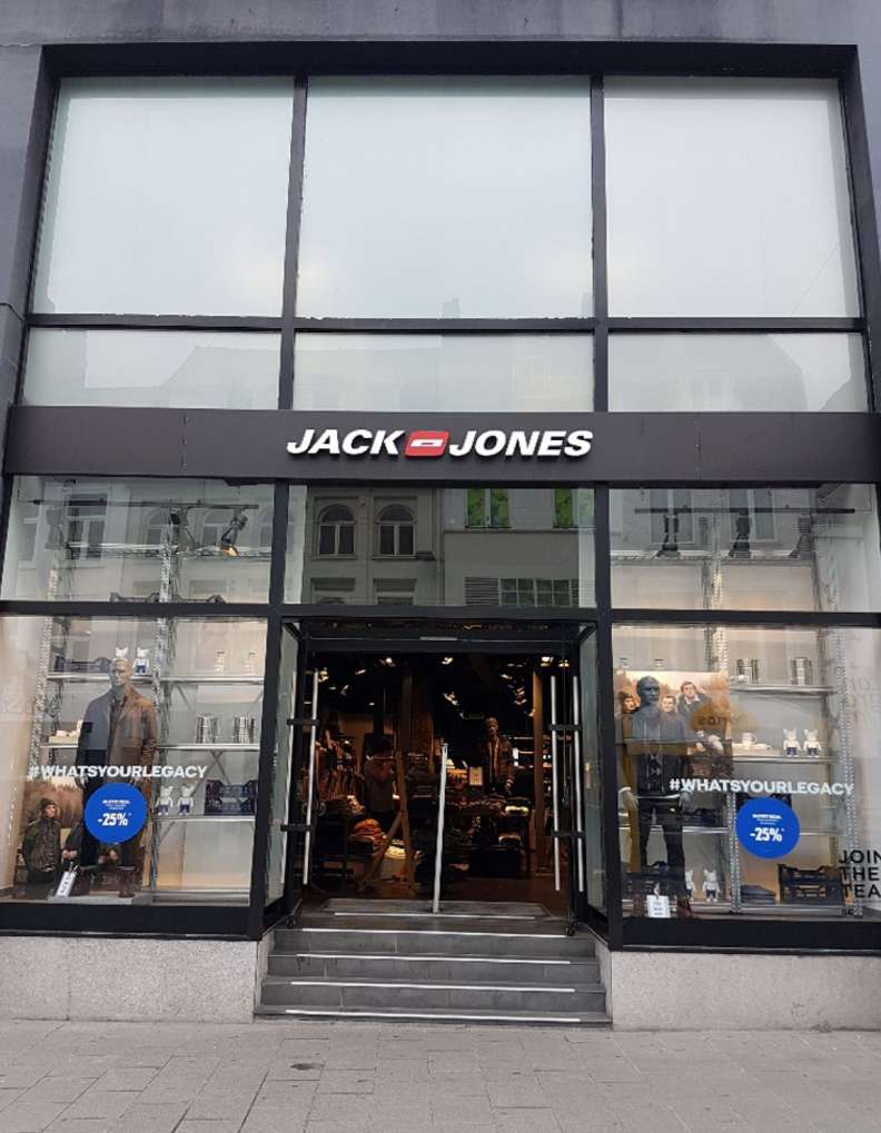
We were asked to manage the rollout of JACK & JONES’ latest window displays in over 450 stores and to create a compelling and consistent retail experience across Europe, the Middle East and Canada.
With more than 1,000 stores across 38 countries, they are one of Europe’s leading men’s fashion retailers.
DRIVING SALES THROUGH RETAIL DESIGN
Visual merchandising is key to high street sales success. The Interior Store Design team commissioned a bespoke racking system that can be used in a versatile way to display both their Spring and Summer collections in a variety of ways.
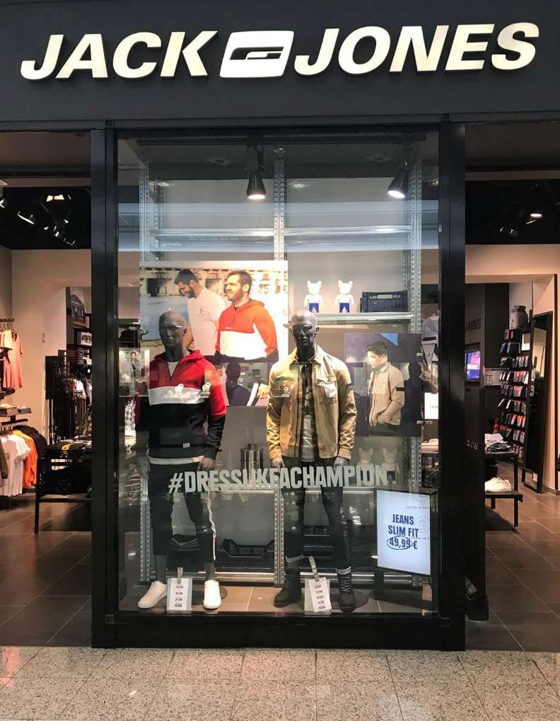
'The team at GLIMMA coordinated and installed the new racking system in 450+ retail stores globally. They successfully overcame the challenges associated with global supply chain, variances in store layouts and different cultures, delivering the entire program on time. The result is magnificent – with the support of GLIMMA we now have the perfect communications platform to attract and excite our customers.'
THE NEED FOR SPEED
Having secured the design and manufacture, JACK & JONES commissioned our team to manage the installations globally. Within two weeks of receiving the brief, our implementation team, working together with the manufacturer and in close liaison with each local store, completed the entire project in just 17 weeks.
ADAPTING THE LOCAL ENVIRONMENT TO ACHEVE GLOBAL CONSISTENCY
No store is the same – dimensions, architectural considerations, materials, local working restrictions – they all differ from store to store.
Our central project management team co-ordinated the rollout to achieve maximum cost efficiencies, using site surveys from the stores, to plan and implement the refurbishment.
This included the removal and disposal of old systems, posters and mannequins, as well as the construction and installation of the new racking system. Faced with a wide variety of window layouts and dimensions, our team often had to think on their feet to adapt the new system and make it fit-for-purpose.
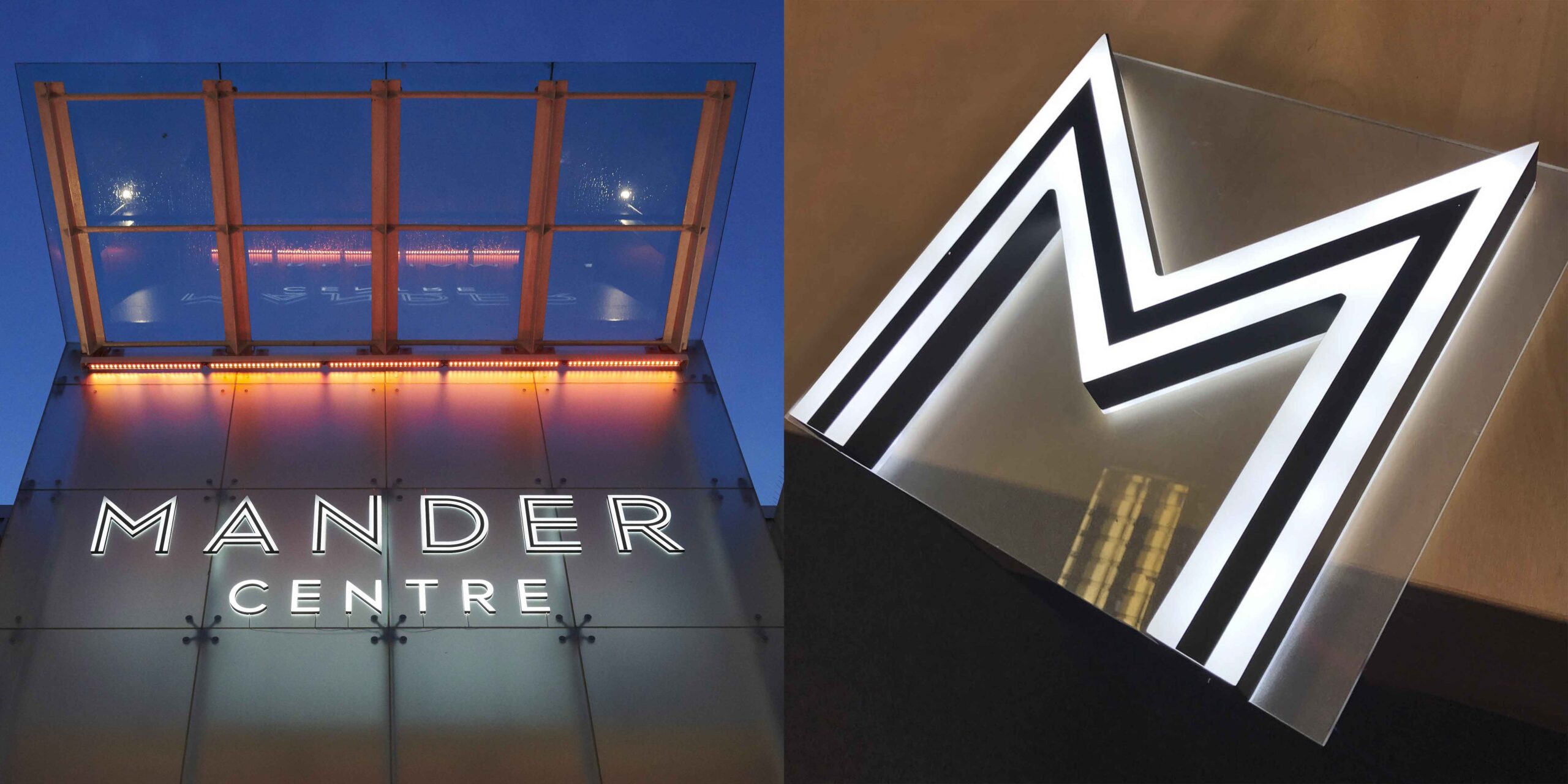
THE BRIEF
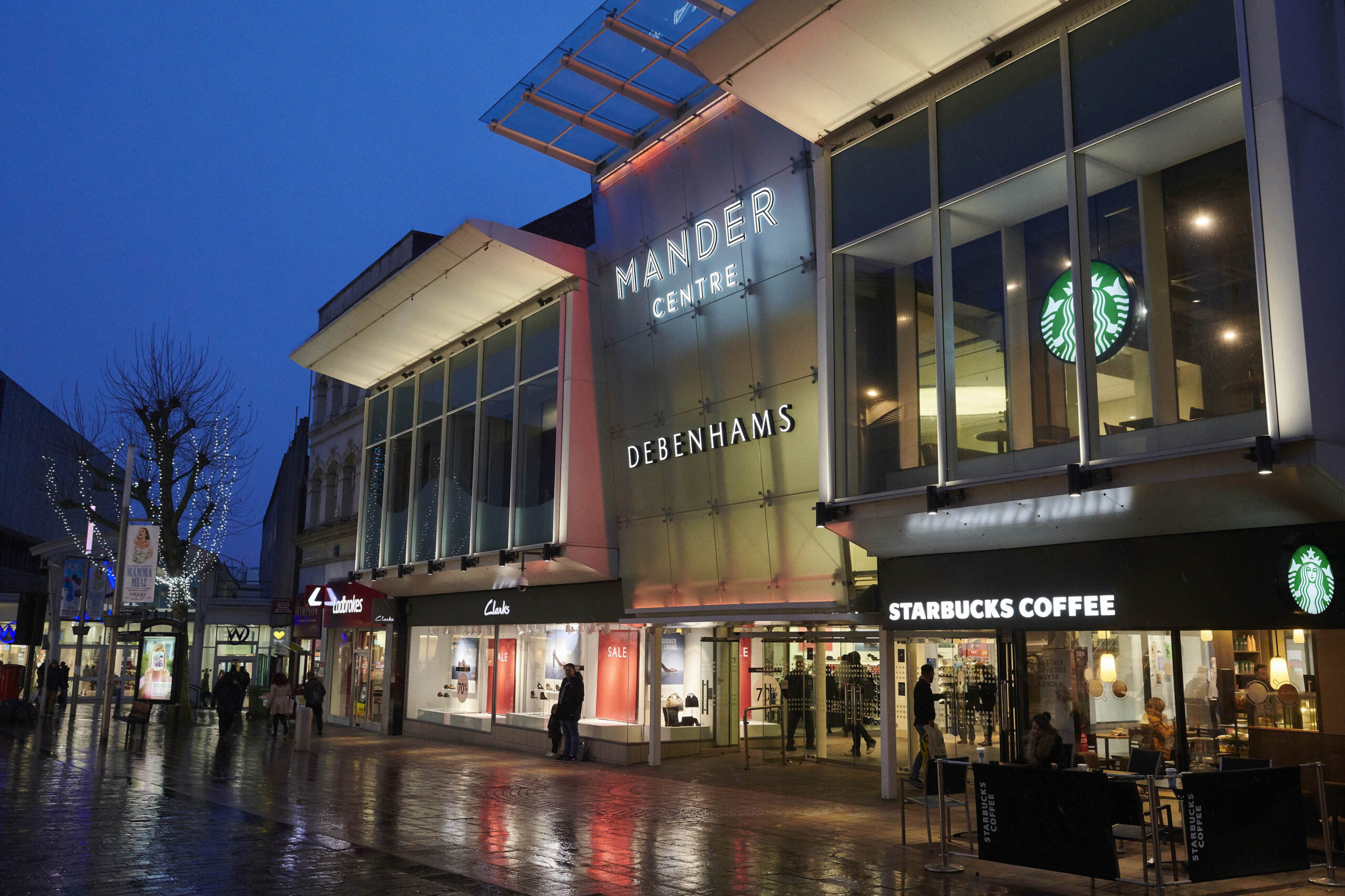
To breathe new life into the Mander Centre, a 1960s retail destination in Wolverhampton, UK. To create a new tenant mix that will attract a different profile of shopper and encourage them to stay longer.
At 52,500 m2 gross leasable area, the Mander Centre is the largest shopping centre in Wolverhampton, a lively city with a catchment of over 584,000 residents and attracting over 17 million visitors a year.
The centre was purchased by Benson Elliot in 2014. They commissioned the most significant redevelopment program to date. The £35 million investment includes a new flagship Debenhams department store of 9,400m2, along with 10 other retail stores.
Mander Centre entrance vibrant lighting scheme
The key design features are the main entrances. The introduction of new signage and a vibrant lighting scheme ensures that the centre stands out and is welcoming, attracting visitors both day and night.
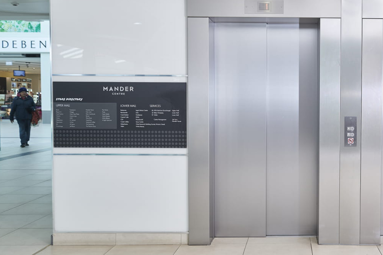
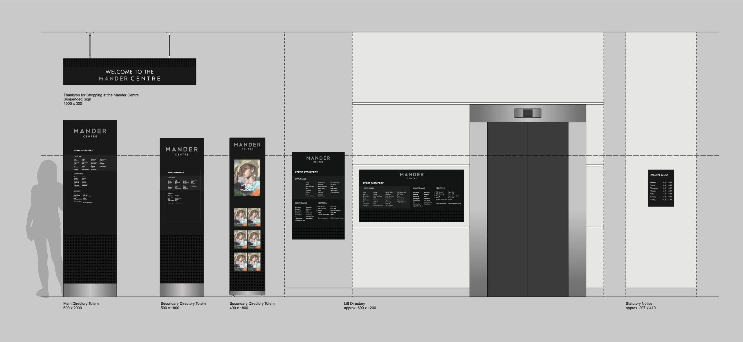
The dramatic transformation continues inside with contemporary and intuitive wayfinding signage to enhance the visitor experience, strategically located by newly installed lifts and escalators.
'The design team at GLIMMA immediately understood the brief and ran with it, producing design concepts that hit the mark with all stakeholders, from architects to the individual retailers. Their innovative ideas were readily translated into signage and lighting solutions that have dramatically transformed the Mander Centre, making it the retail destination of choice for the people of Wolverhampton.'

Contemporary and intuitive wayfinding signage to enhance the visitor experience
A customer journey with impact
These environmental enhancements have not only transformed the appearance of the centre but also helped to change shopper behavior. The customer journey is carefully managed, encouraging visitors to stay longer and enjoy the wider food and entertainment experience that the Mander Centre now has to offer.
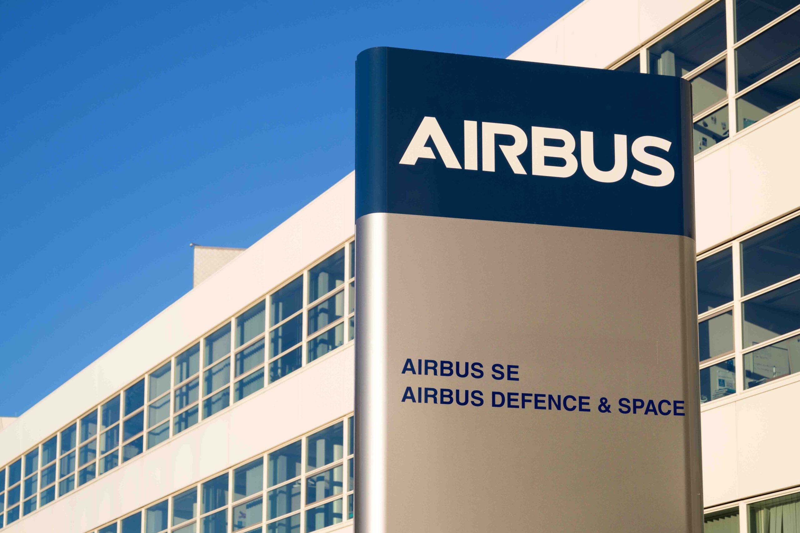
THE BRIEF
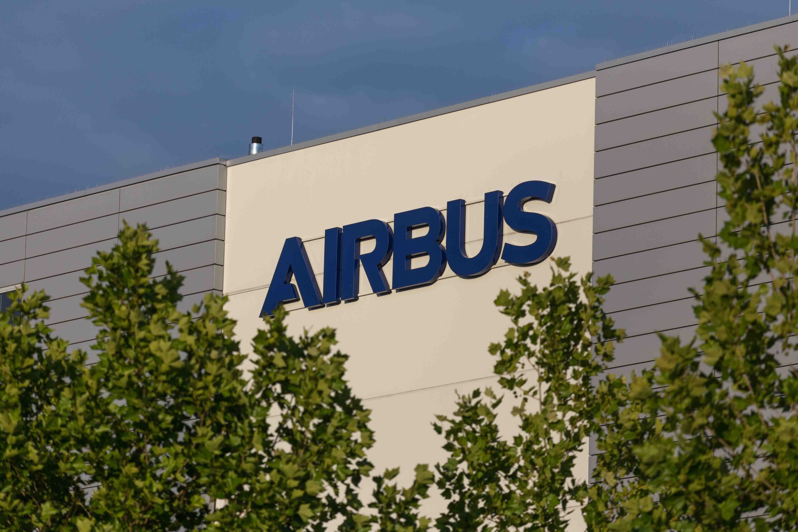
To roll out the strategic rebrand for Airbus, with a focus on signage and wayfinding, at 118 sites, across 26 countries in five continents.
THE AIRBUS GROUP
Airbus is a global leader in aeronautics, space and related services, offering the most comprehensive range of passenger airliners. It is also a European leader in tanker, combat, transport and mission aircraft, as well as one of the world’s leading space companies. In helicopters, they provide civil and military rotorcraft solutions worldwide.
'When facing a rebrand of this scale, it is often difficult to bring together the right team internally to make it happen within the timescale required. By working with GLIMMA, we were able to efficiently rollout the new signage and wayfinding branding globally. The central team brought technical knowledge and expertise. By using their extensive global network we were able to ensure that the work was completed on time and within or below budget, leaving us to get on with our day jobs.'
UTILIZING LOCAL POWER
With carbon footprint front of mind in this rebrand, we adopted a sustainable approach, opting for local production to minimize transportation costs and environmental impact.
We started by technically translating their brand guidelines, to ensure the designs and renders could be used for local tender – reducing time, manufacturing and shipping costs.
Following the success of the rebrand, we continued to work with Airbus on the rebrand of 60+ Helicopter service centers across 17 countries, this time focusing on illuminated signage solutions too.
FLEXIBLE PROJECT MANAGEMENT
Using a flexible timeline, we adopted a phased approach, working with the Airbus branding and facility management teams to identify priority sites and ensure minimum disruption to day to day operations.
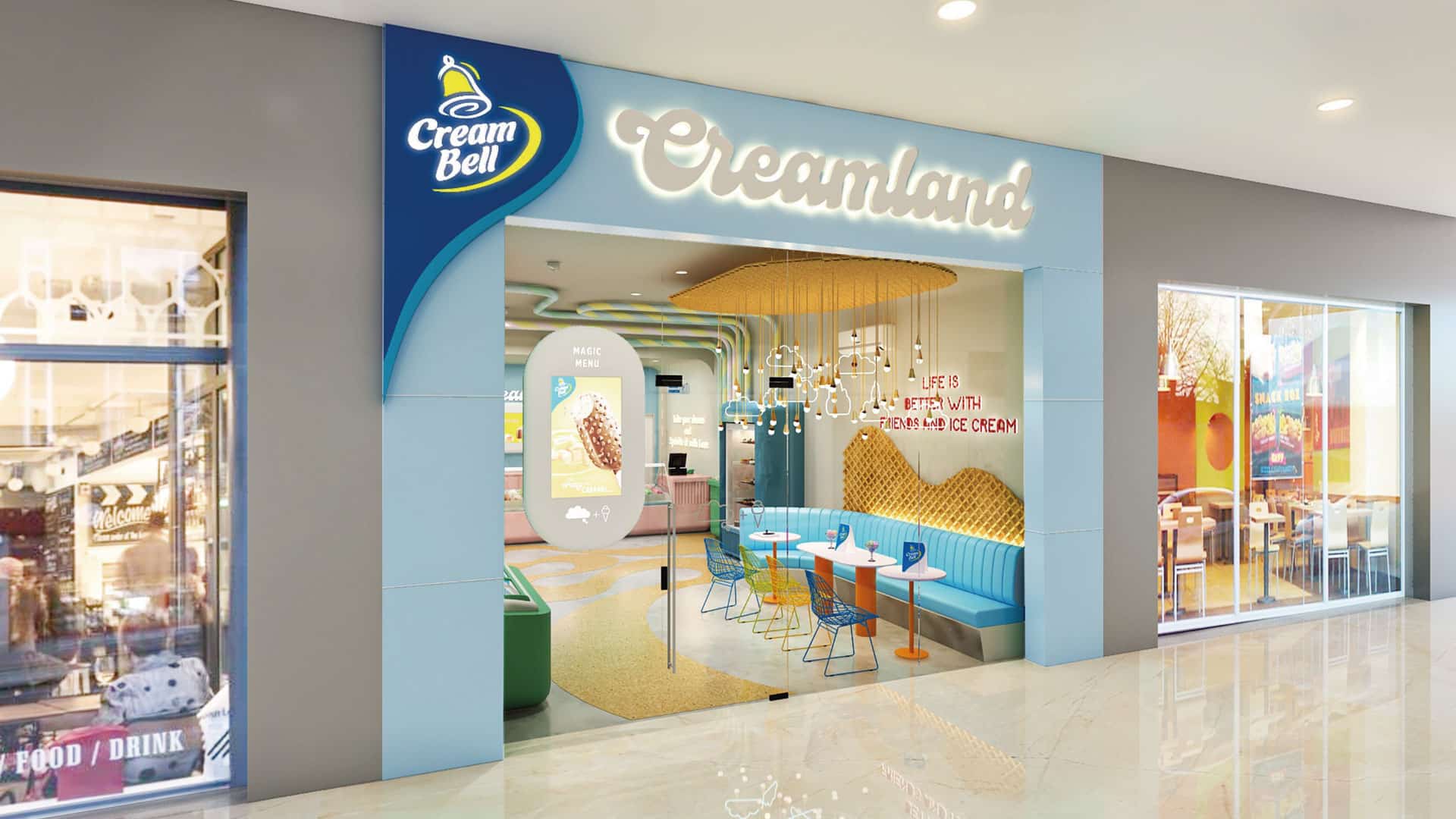
MAGNIFYING THE ICE CREAM EXPERIENCE
Creambell Ice Creams has a national presence with a disproportionate awareness and equity in North India. GLIMMA’S objective was to celebrate and magnify the ice cream experience through their parlors by creating fun & excitement that is driven through design and to design a unique visual identity for Cream Bell Parlors that will not only draw the consumers in but also set the brand distinctly apart from its competitors.
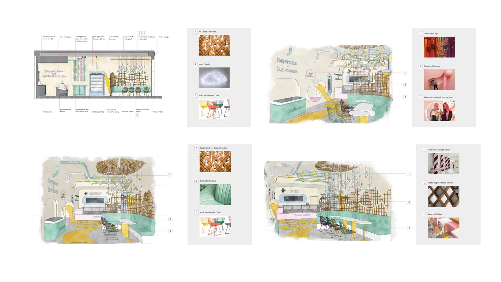
Interior architecture & design sketches
STORE CONCEPT– “Life is Better with Friends and Ice Cream”
With a concept routed in the simple enjoyment we experience when eating an ice cream, instilled with memories of childhood, and the excitement and joy of the discovery of something new, Cream Bell ”CreamLand” provides a space where you can re-engage with that childlike wonder and discover the many flavors of Cream Bell.
Taking cues from the wave of experiential venues and the rise of gamification in the retail playground along with the ‘on trend’ design styling from the latest contemporary sweet treat retailers, the interior offers a sense of fun and curiosity with a bright internal palette, coupled with simple ‘soft’ and oversized forms to create a moment of childlike escapism balanced with a contemporary edge.
![3122-GLIMMA[100]](https://glimma.com/wp-content/uploads/2022/10/3122-GLIMMA100.jpg)
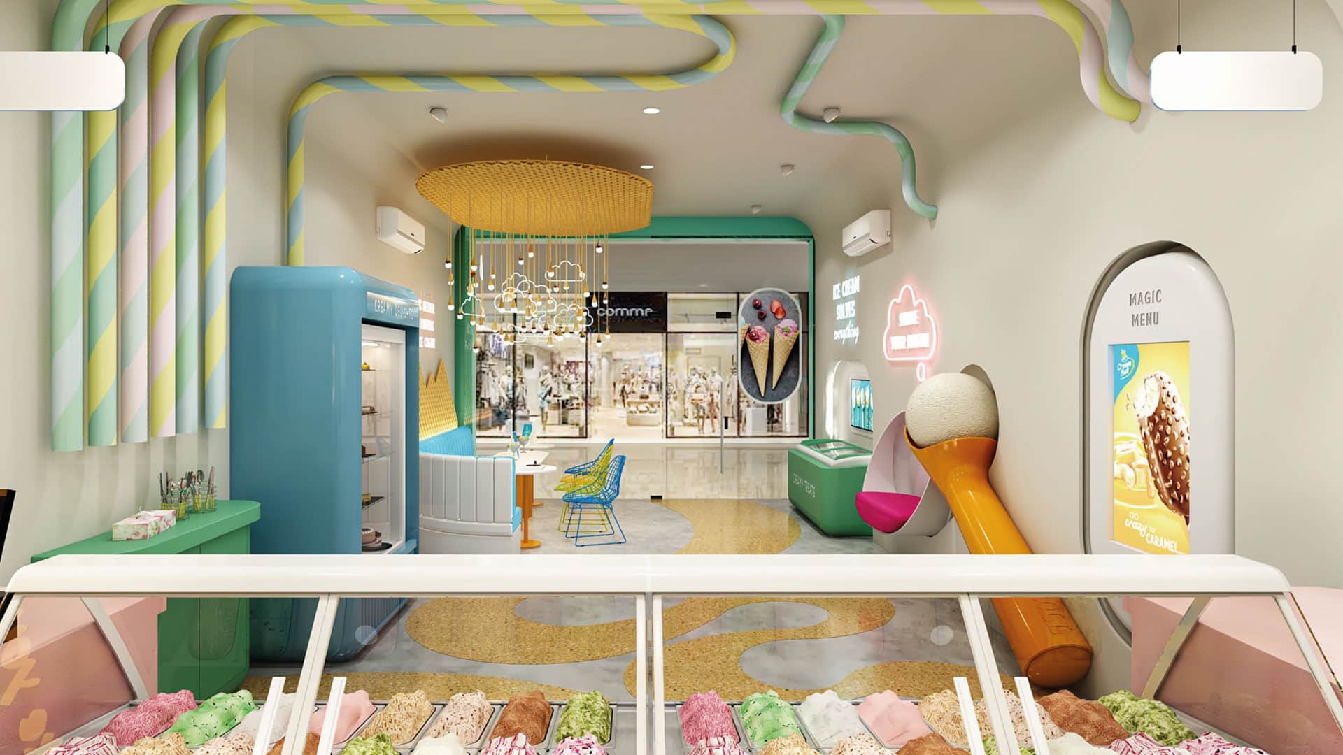
The interior palette was inspired by the colors and textures of the desserts themselves, the softer forms, the vibrant tones tempered by hues of vanilla and creams, with warm tones of the waffle, its regimented pattern rolled or fractured in to shards.
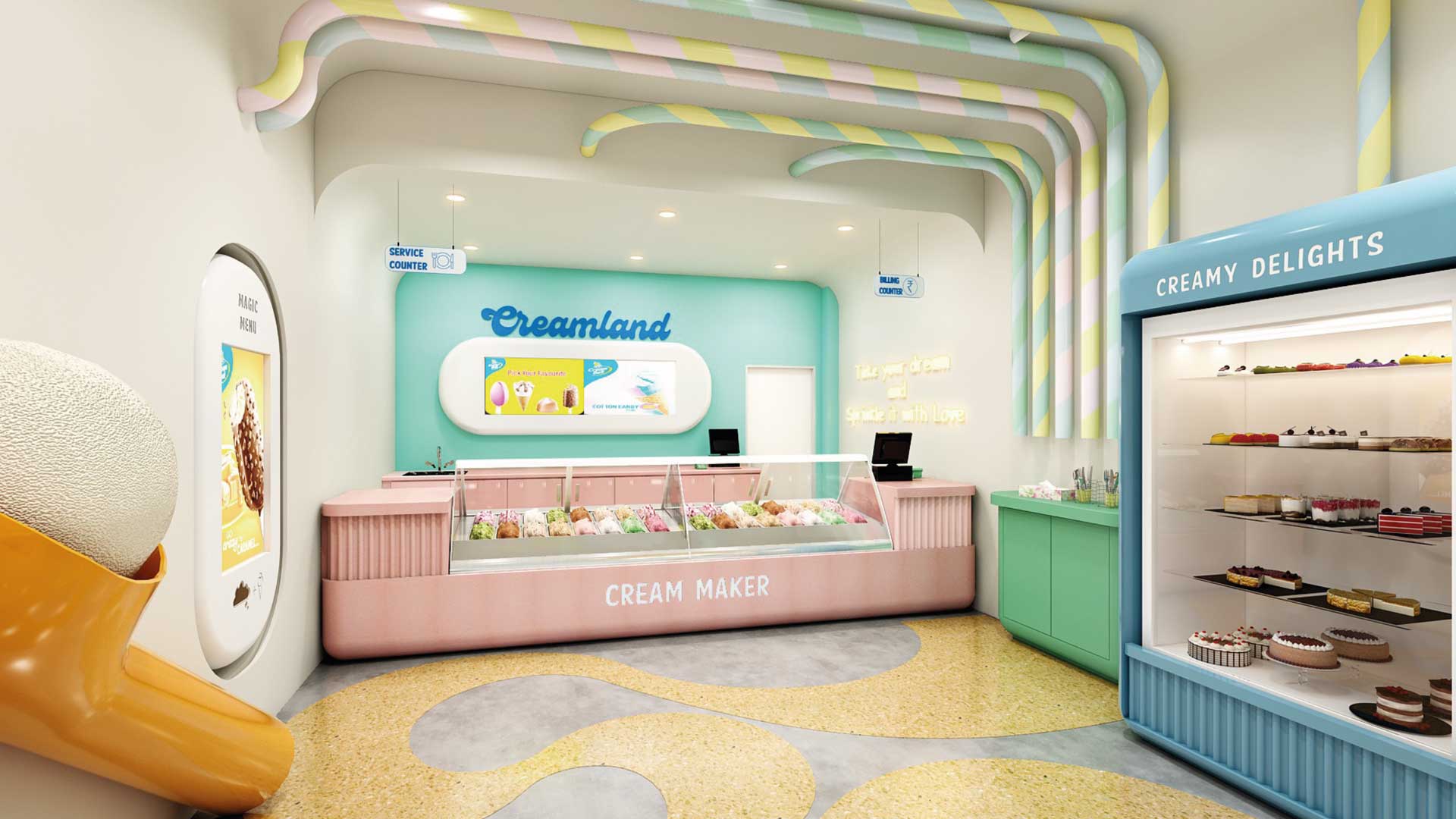
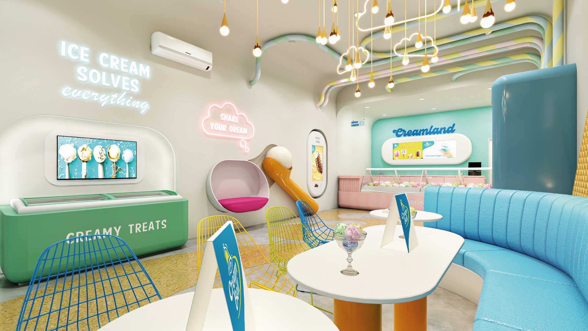
GLIMMA DELIVERED THE FOLLOWING:
1. Brand name & identity. 2. Outlet Space Design – Interiors, graphics, colors etc. 3. Signage 4. Uniforms design for crew members 5. Menu Board 6. Freezer Branding 7. Scoopers & Accessories 8. Franchisee Guide Book 9. Leaflet/Insert design 10. Offer design 11. Special event collaterals design 12. Menu Card
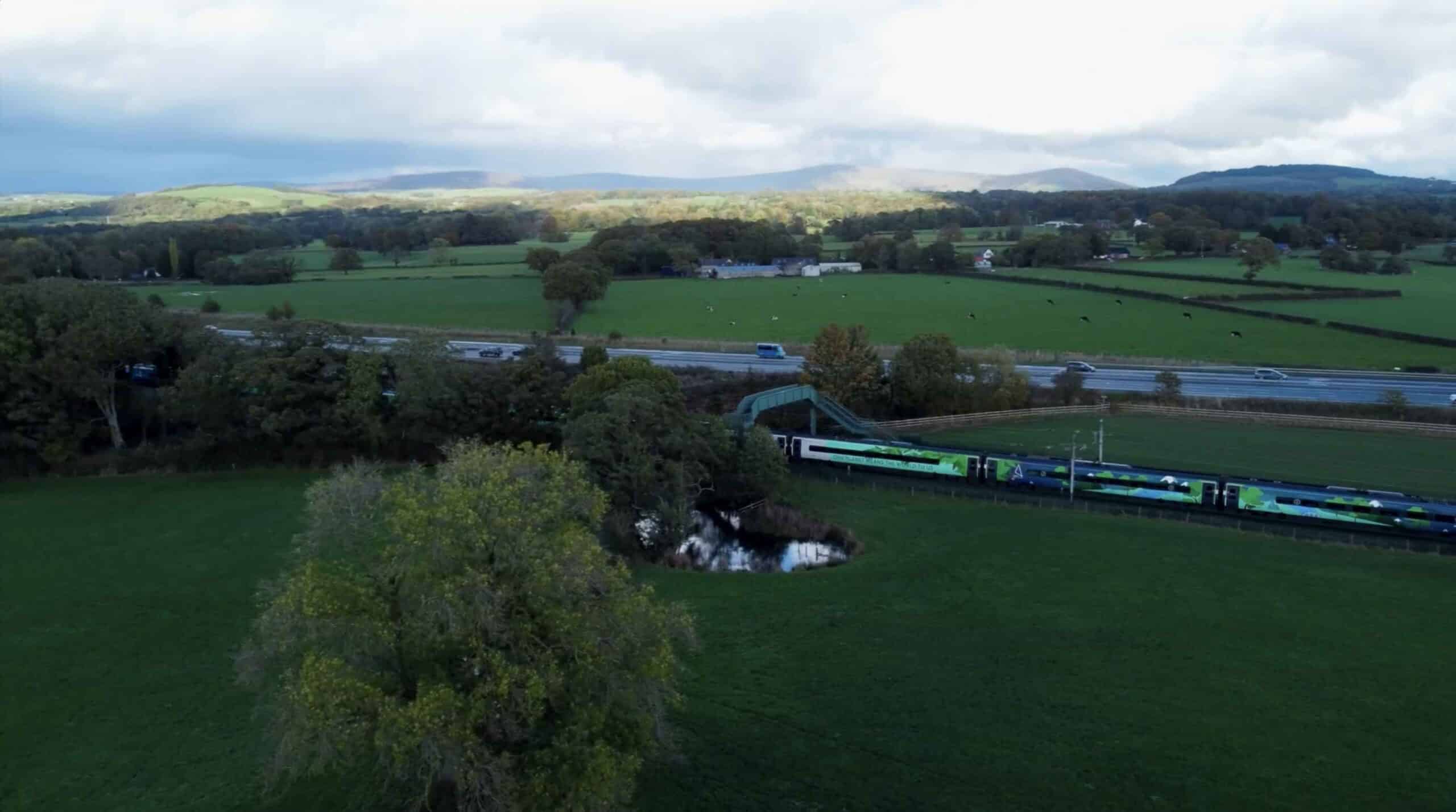
Avanti West Coast provide the principal long-distance passenger services on the West Coast Main Line between London, the West Midlands, North West England, North Wales and Scotland. Its services connect six of the largest cities in the UK: London, Birmingham, Liverpool, Manchester, Glasgow and Edinburgh, which have a combined metropolitan population of over 18 million.
Watch how our brand partner delivered a comprehensive rebrand across the trains.
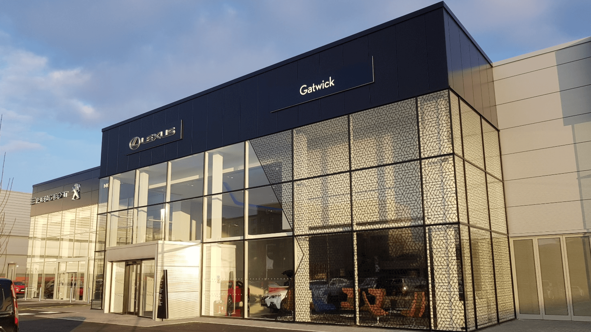
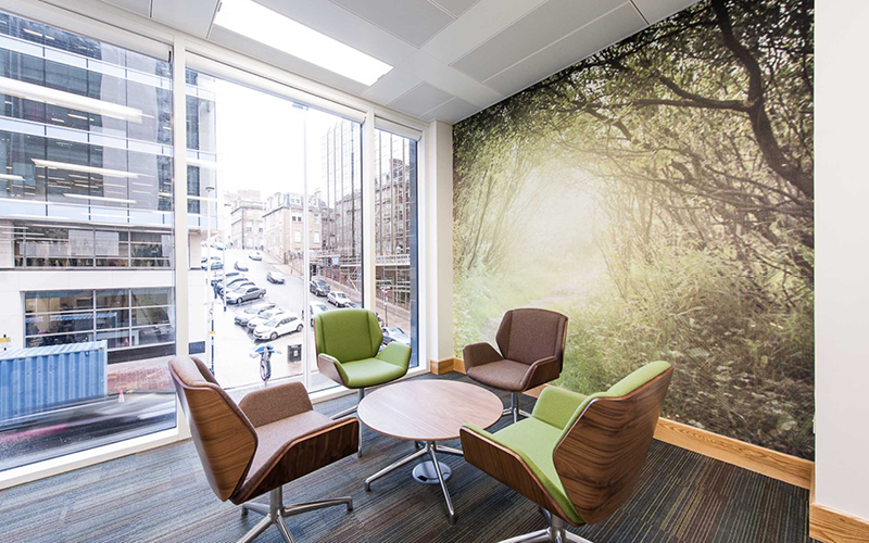
Lexus has consistently pursued its goal to build the world’s best cars, reflecting their brand values of design excellence and luxury.
This is achieved through the careful design and engineering of both their vehicles themselves, and through the creation of exceptional customer experiences with their dealership network.
One of our aims was to make the branded environments more resilient and robust.
By reviewing many of the materials that were originally specified, we achieved this. Thanks to our buying power, we also delivered considerable cost savings.
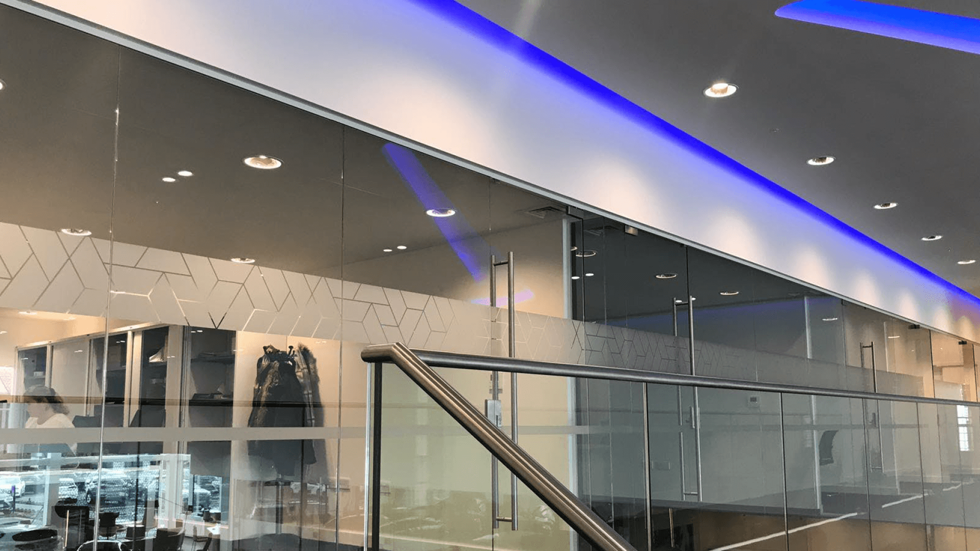
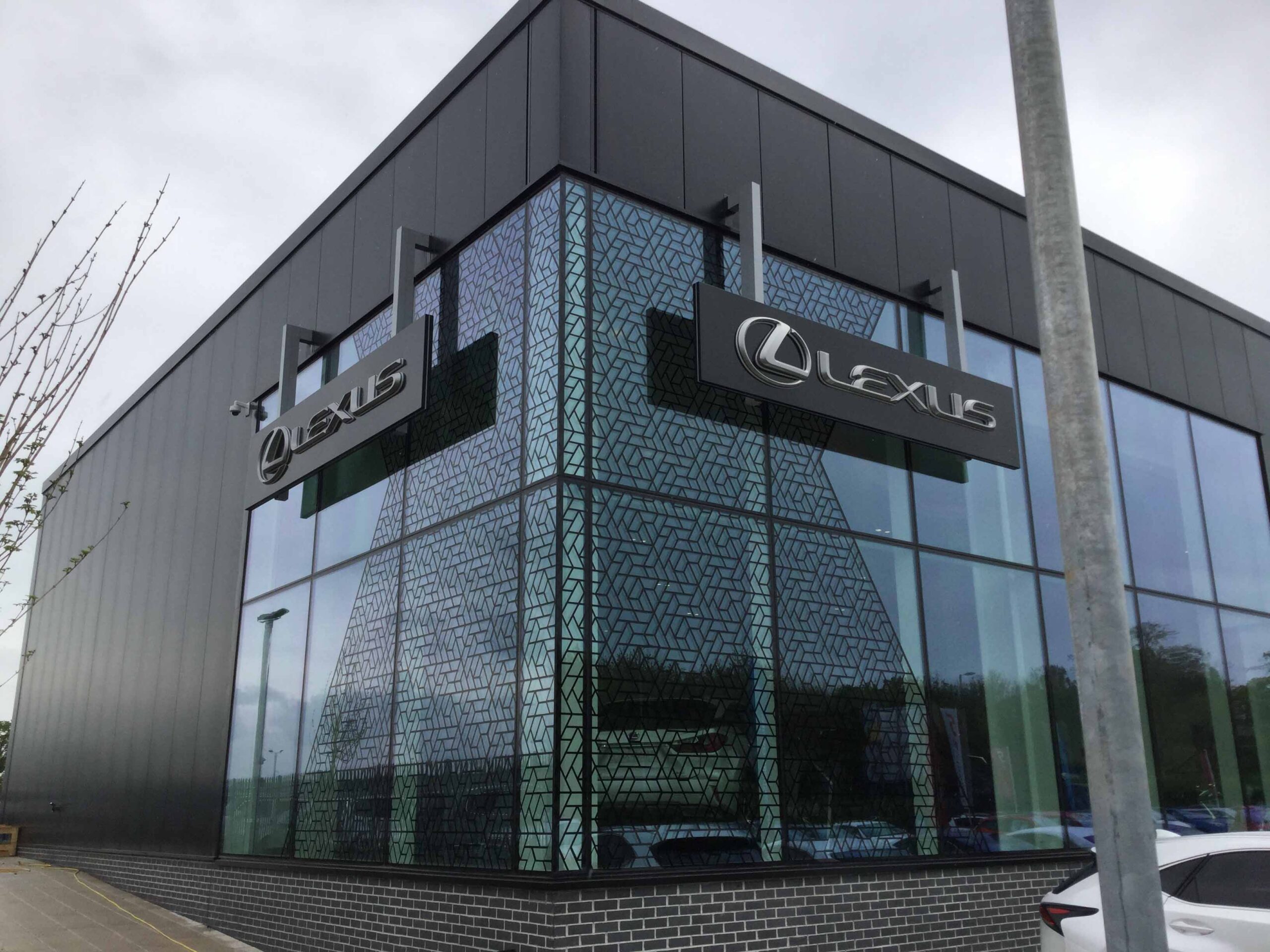
Flagship sites in Cardiff, Exeter and Gatwick were more heavily branded and included both internal and external glazing
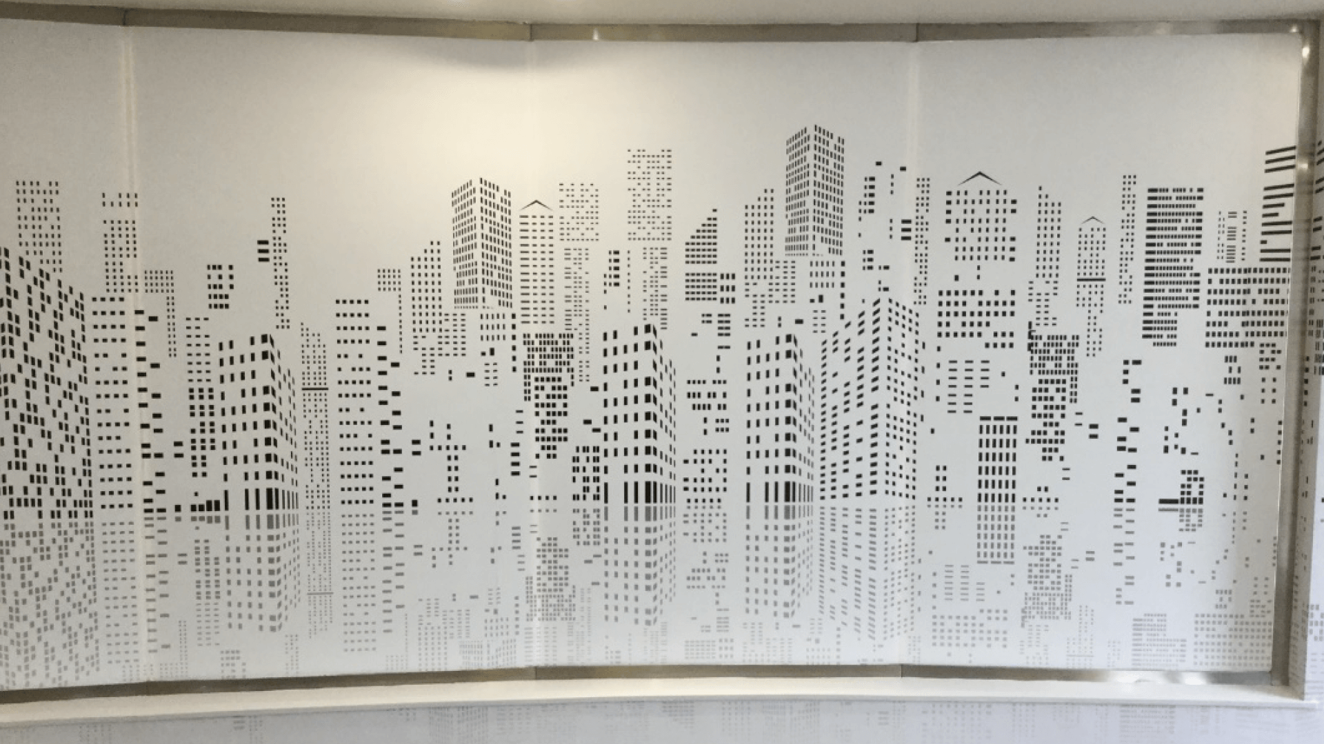
The cityscape graphics helped to reinforce Lexus’s brand values
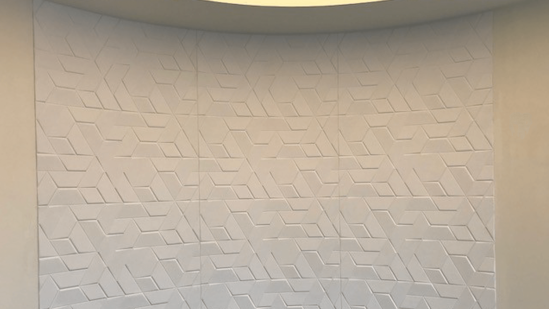
3D wallpaper creates texture and depth
We designed, manufactured and installed the highest quality graphics to reflect their premium market position.
This included:
The branding program was initially rolled out across ten dealerships in the UK, Norway and Spain. Following successful implementation, it was extended to a nationwide program across the UK, including 20 new sites and 20 refurbished sites.
The customer-centric approach to dealership design is evident, with graphics used to designate different customer zones to meet the needs of a variety of customer groups. We also installed and laid out furniture to facilitate the designated customer journey.
'Client feedback cited our personal touch as one of the biggest success factors in this brand rollout. Attention to detail was our mantra throughout - we provided the most detailed instructions to installers and were on site for every installation to ensure the highest quality control. It's an absolute pleasure to work with Lexus.'