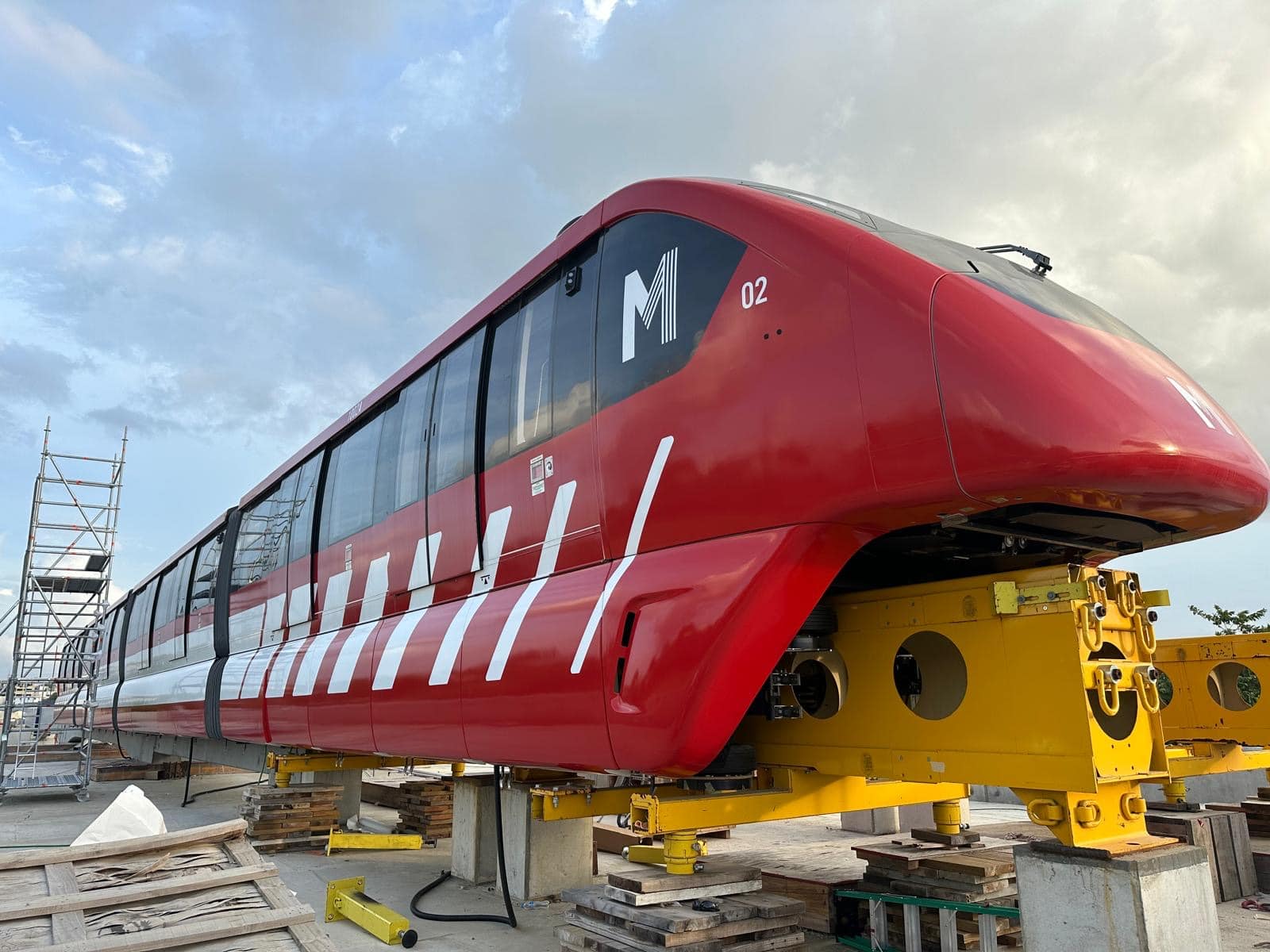
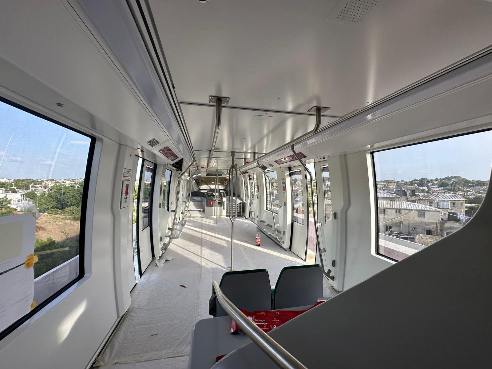
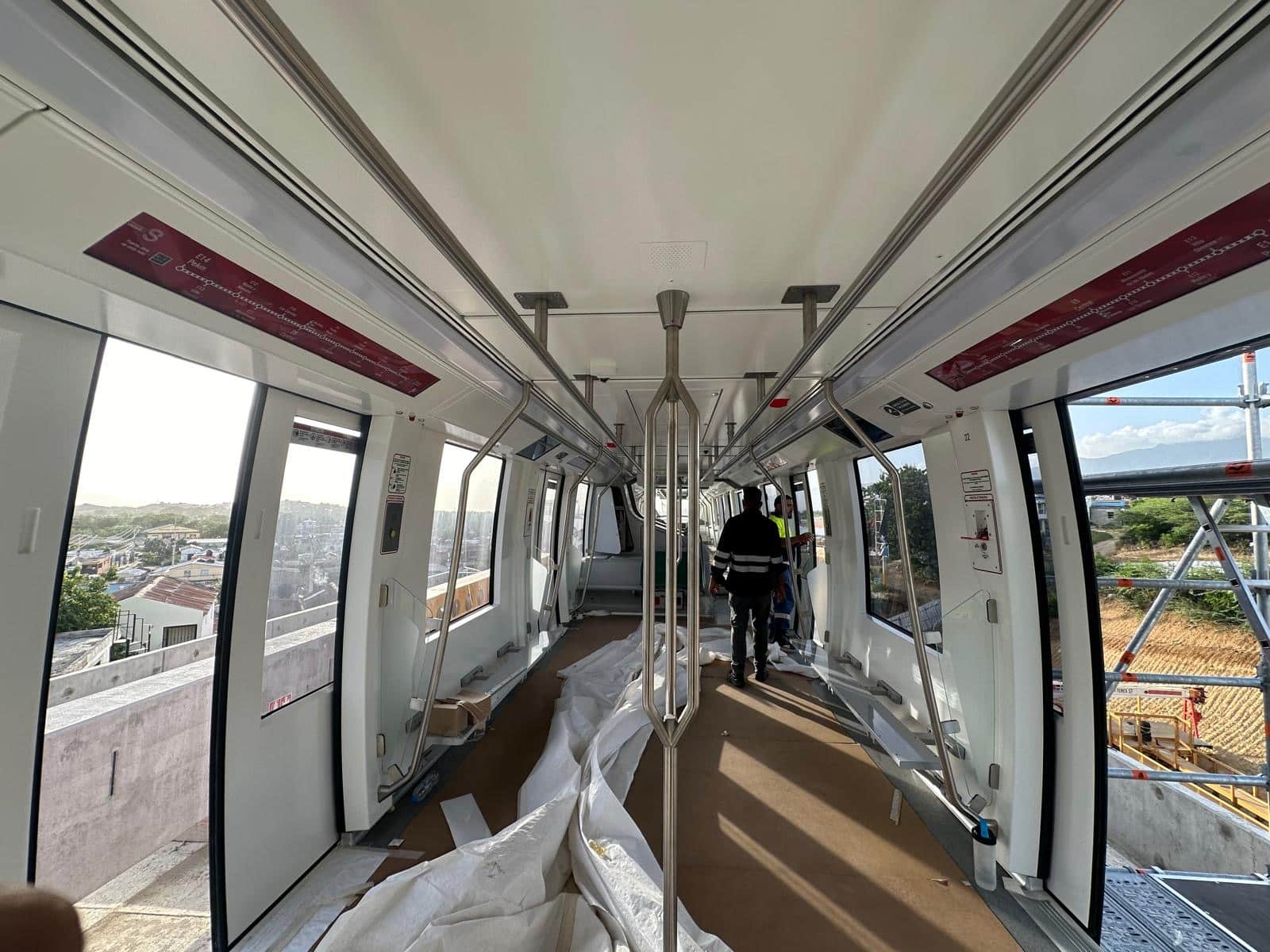
GLIMMA Americas successfully delivered the branding of a new 4-car Alstom train in the Dominican Republic, providing a comprehensive solution that included full vinyl wraps, branded graphics, and essential safety signage.
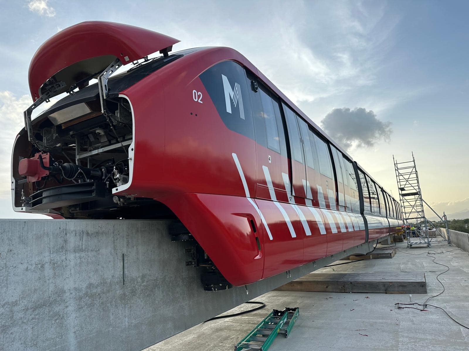
The project presented several unique challenges, with each of the four rail cars stationed on a platform with limited access, requiring our installation team to work in open, conditions navigating heat, wind and dust.
High temperatures posed an additional layer of complexity. Heat affects vinyl performance and can make application significantly more difficult, especially when working with large-format graphics that demand perfect alignment and durability. GLIMMA’s installation team used their technical expertise and extensive experience to navigate these challenges and maintain consistent quality throughout.
GLIMMA excels in global coordination thanks to our far-reaching relationships and skilled bilingual team who have a deep knowledge of branding and environmental installation challenges. Seamless communication was maintained across all stakeholders, from local ground crews in the Dominican Republic to client teams based in the U.S. and the U.K, ensuring alignment across all phases of the project.
By working closely with Alstom and project managers on both sides of the Atlantic, GLIMMA was able to coordinate timelines, align on brand specifications, and adapt swiftly to onsite variables.
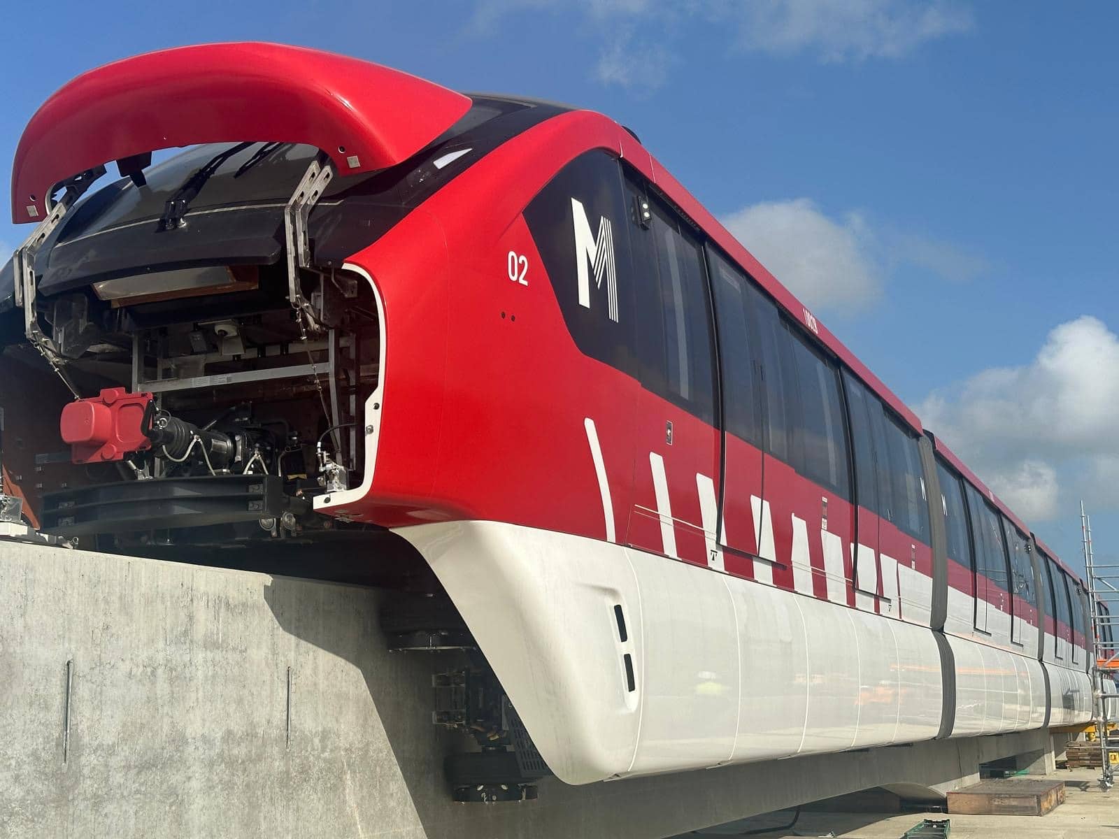
Despite the logistical constraints and environmental challenges, the team delivered the project on time, with no compromise on safety or visual impact. The final result reflects Alstom’s brand identity with clarity and consistency, while meeting all operational and regulatory requirements for rail signage.
This project demonstrates GLIMMA’s ability to deliver high-quality, branded environments – even in remote or technically demanding locations. It’s a clear example of how our global reach, local insight, and flexible approach continue to add value for our clients in the transport and infrastructure sectors.
The Brief
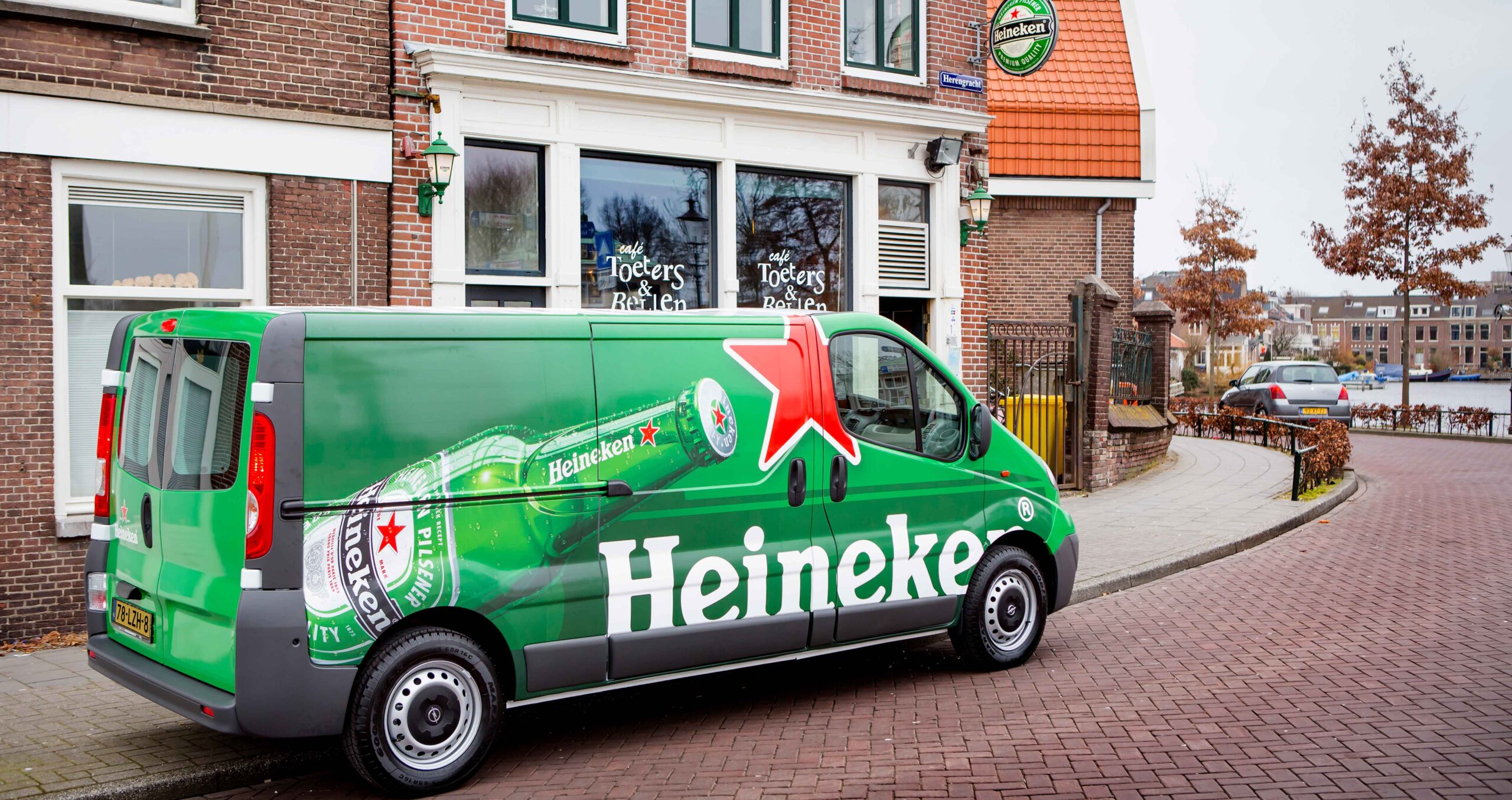
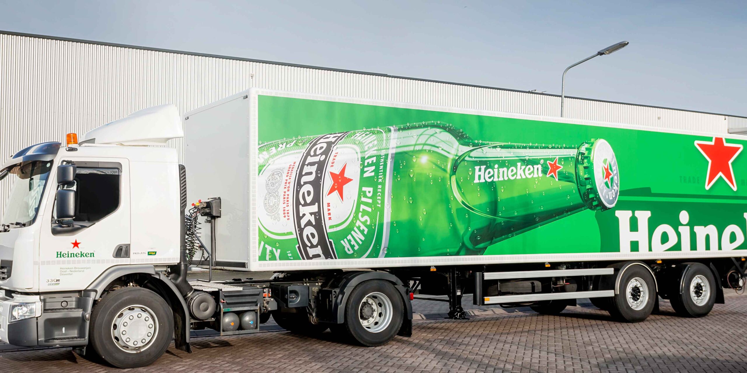
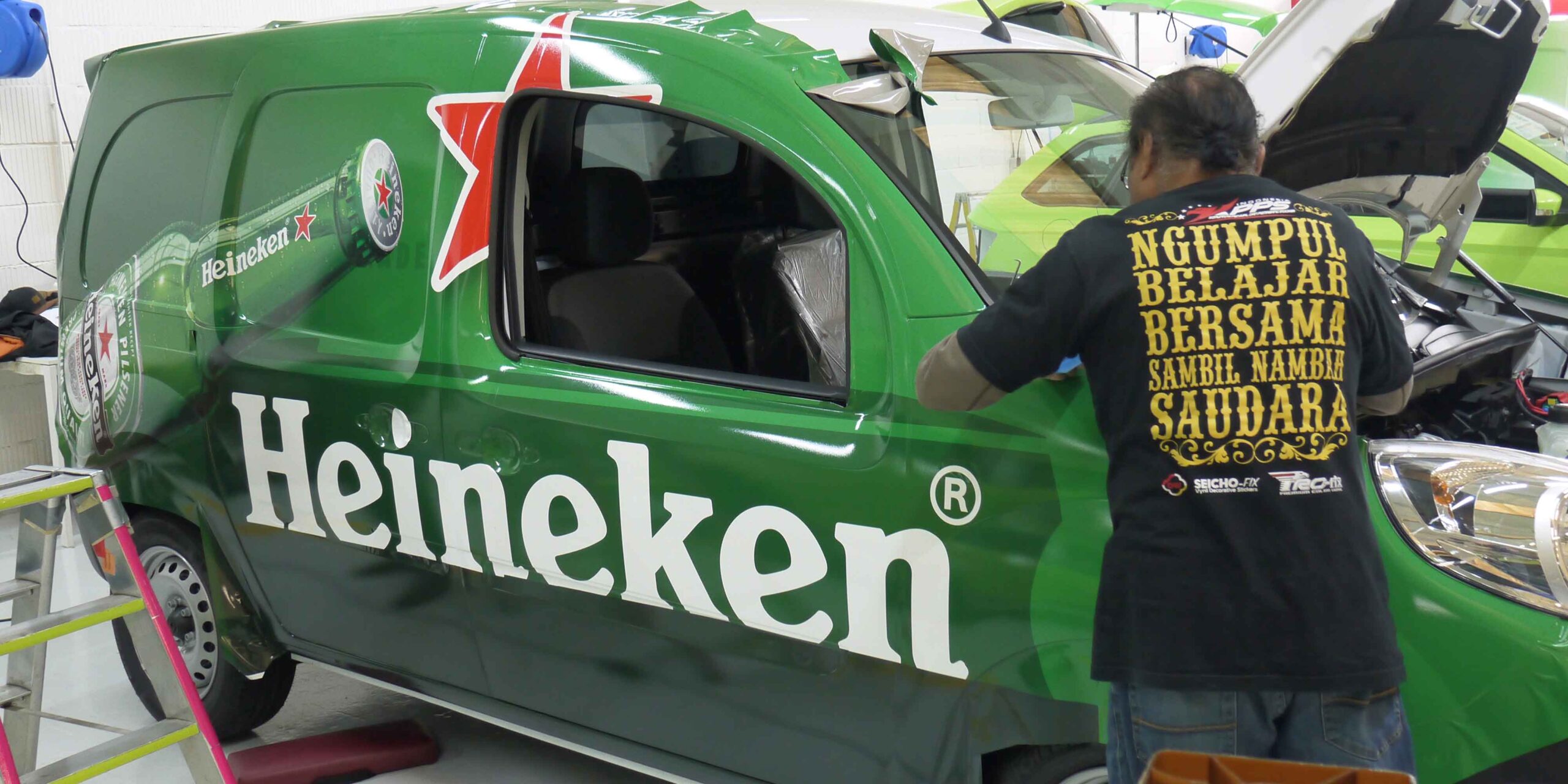
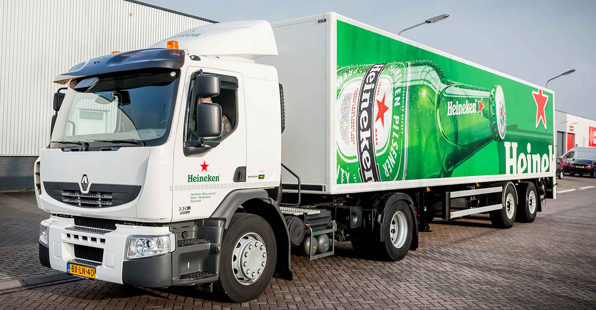
A long-standing client; we’ve worked with Heineken over many years to deliver various branding programs, including a rebrand and to support their sponsorship programs.
Fleet Rebrand
When the iconic green bottle became central to Heineken’s design approach, their European fleet of vehicles was one of the most prominent items to be rebranded. With an extensive distribution network, comprising a wide variety of vehicles types and sizes, this was quite a challenge.
We were appointed as their branding partner, to centrally co-ordinate the rewrapping of their European fleet. Through our local network, we used the latest digital technology and latest generation UV curable inks to reduce environmental impact.
Having become very familiar with the Heineken brand over the years, we continue to advise, develop and support the rollout of their fleet branding across new and replacement vehicles in Europe.
Sponsorship Support
Heineken was an official sponsor to the UEFA Champions League and we have helped to brand their event villages and to temporarily rebrand their fleet in sports livery.
Branding solutions in support of sponsorships or events is all about speed – a fast turnaround to make sure you make the most of the short ‘window of opportunity’. We used specialist graphics that can be removed easily and act swiftly, using our on-the-ground network to deliver quickly.
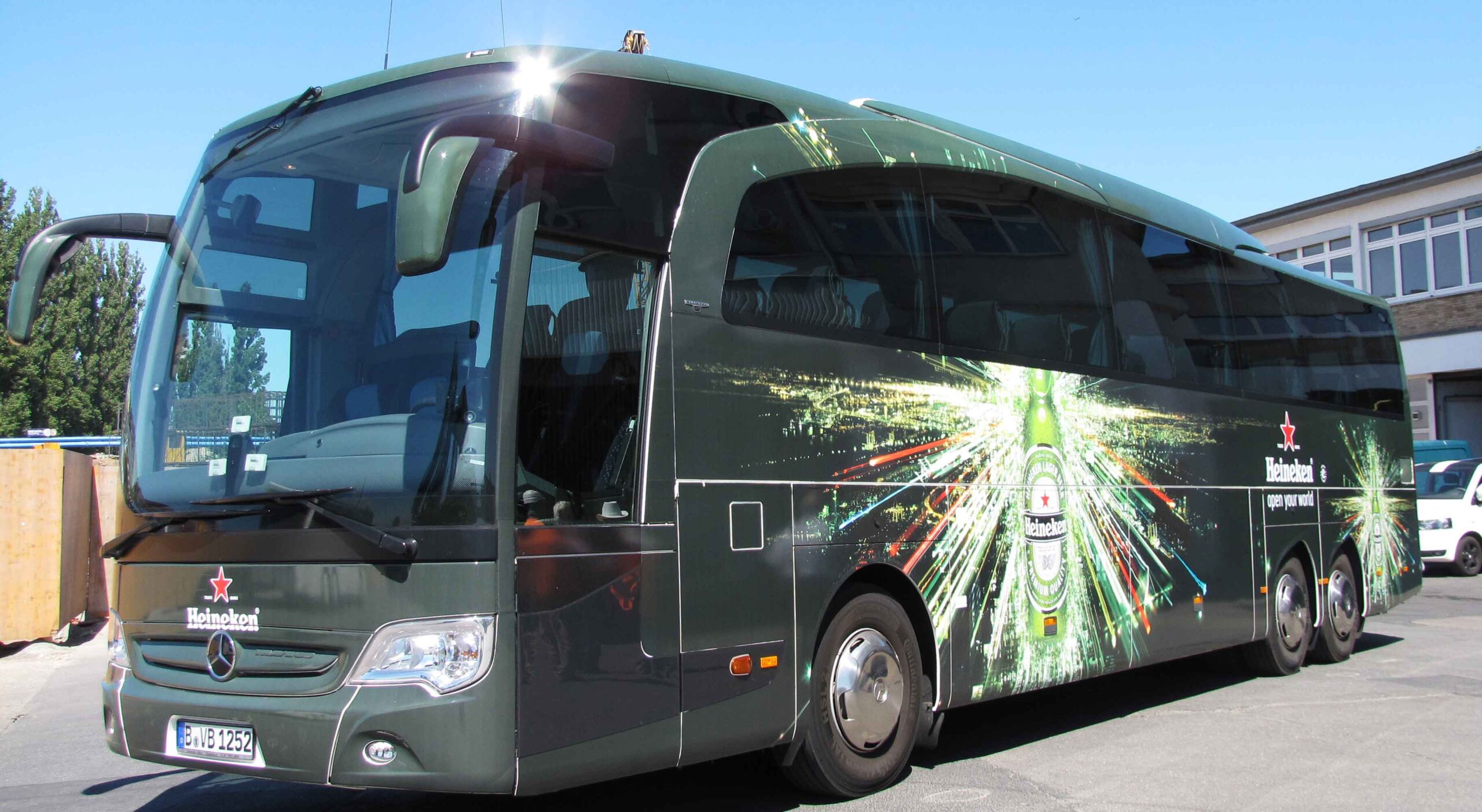
As football mania reaches fever pitch, Heineken is ready at the airport to greet and transport their VIPs and guests to the Cup Final in true style, using fully branded luxury coaches.
In Berlin we designed and delivered 20+ coaches, 8+ mini buses and 40+ Trabants.
We also helped Heineken to paint the town “Heineken green” for the final in Lisbon, Portugal.
From the airports to the city centre, we produced and installed various branded banners and signage graphics, as well as branding the Tuk Tuk taxis to carry supporters around the city.
THE BRIEF
To roll out the strategic rebrand for Airbus, with a focus on signage and wayfinding, at 118 sites, across 26 countries in five continents.
THE AIRBUS GROUP
Airbus is a global leader in aeronautics, space and related services, offering the most comprehensive range of passenger airliners. It is also a European leader in tanker, combat, transport and mission aircraft, as well as one of the world’s leading space companies. In helicopters, they provide civil and military rotorcraft solutions worldwide.
'When facing a rebrand of this scale, it is often difficult to bring together the right team internally to make it happen within the timescale required. By working with GLIMMA, we were able to efficiently rollout the new signage and wayfinding branding globally. The central team brought technical knowledge and expertise. By using their extensive global network we were able to ensure that the work was completed on time and within or below budget, leaving us to get on with our day jobs.'
UTILIZING LOCAL POWER
With carbon footprint front of mind in this rebrand, we adopted a sustainable approach, opting for local production to minimize transportation costs and environmental impact.
We started by technically translating their brand guidelines, to ensure the designs and renders could be used for local tender – reducing time, manufacturing and shipping costs.
Following the success of the rebrand, we continued to work with Airbus on the rebrand of 60+ Helicopter service centers across 17 countries, this time focusing on illuminated signage solutions too.
FLEXIBLE PROJECT MANAGEMENT
Using a flexible timeline, we adopted a phased approach, working with the Airbus branding and facility management teams to identify priority sites and ensure minimum disruption to day to day operations.
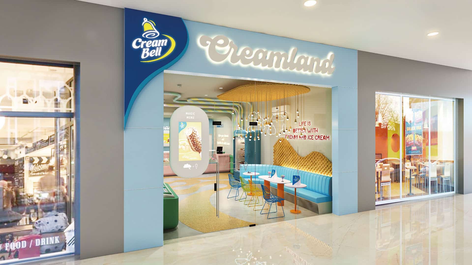
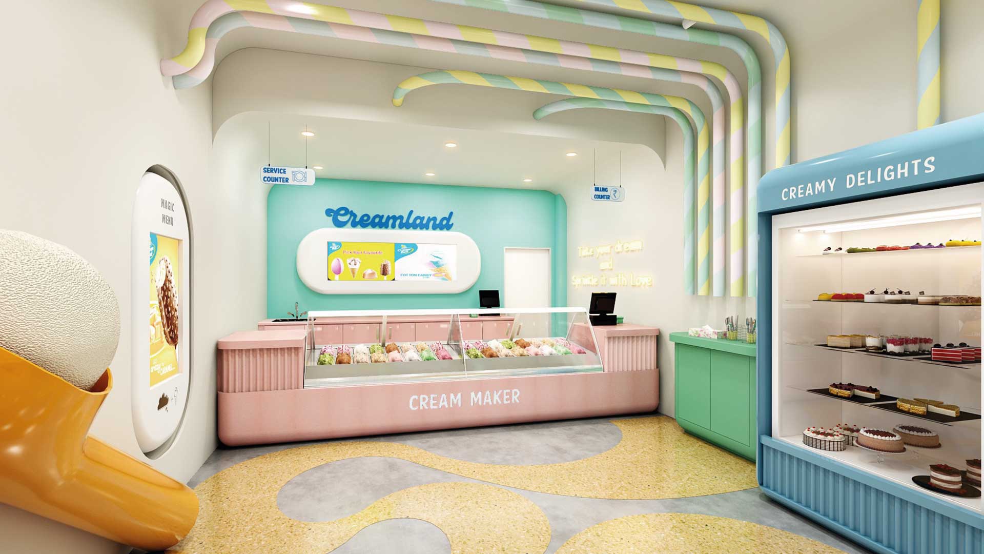
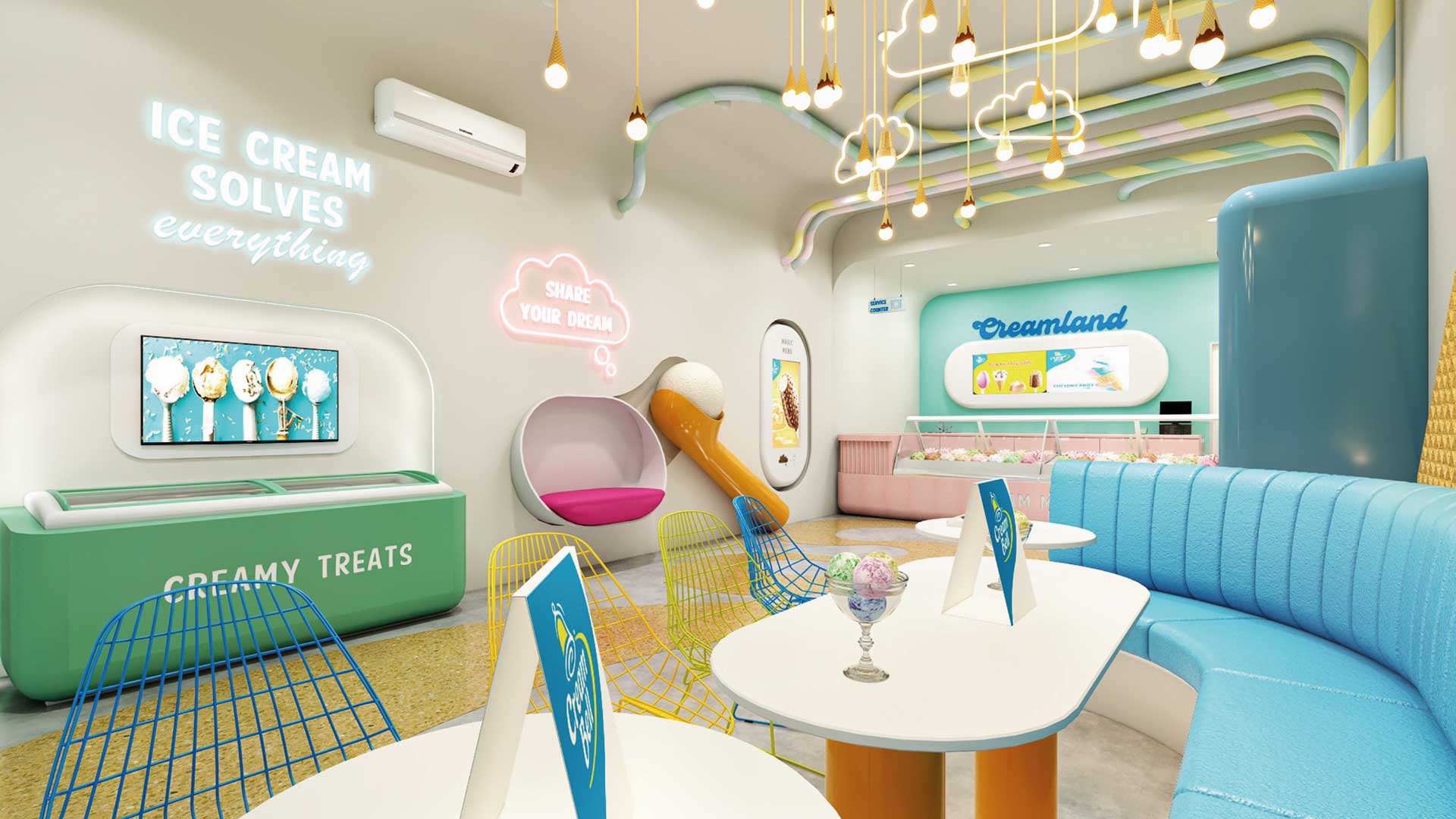
MAGNIFYING THE ICE CREAM EXPERIENCE
Creambell Ice Creams has a national presence with a disproportionate awareness and equity in North India. GLIMMA’S objective was to celebrate and magnify the ice cream experience through their parlors by creating fun & excitement that is driven through design and to design a unique visual identity for Cream Bell Parlors that will not only draw the consumers in but also set the brand distinctly apart from its competitors.
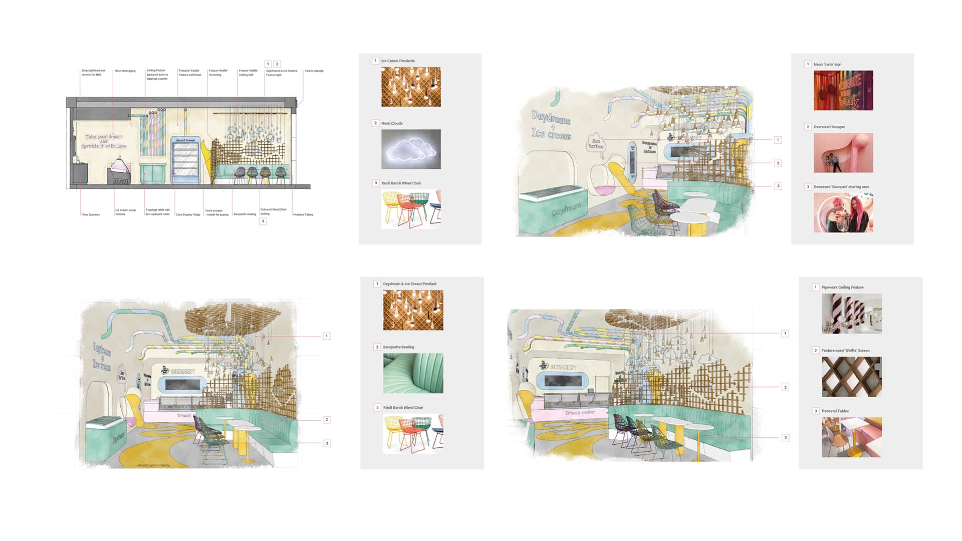
Interior architecture & design sketches
STORE CONCEPT– “Life is Better with Friends and Ice Cream”
With a concept routed in the simple enjoyment we experience when eating an ice cream, instilled with memories of childhood, and the excitement and joy of the discovery of something new, Cream Bell ”CreamLand” provides a space where you can re-engage with that childlike wonder and discover the many flavors of Cream Bell.
Taking cues from the wave of experiential venues and the rise of gamification in the retail playground along with the ‘on trend’ design styling from the latest contemporary sweet treat retailers, the interior offers a sense of fun and curiosity with a bright internal palette, coupled with simple ‘soft’ and oversized forms to create a moment of childlike escapism balanced with a contemporary edge.
![3122-GLIMMA[100]](https://glimma.com/wp-content/uploads/2022/10/3122-GLIMMA100.jpg)
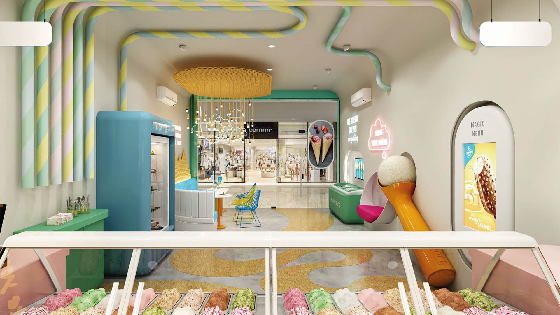
The interior palette was inspired by the colors and textures of the desserts themselves, the softer forms, the vibrant tones tempered by hues of vanilla and creams, with warm tones of the waffle, its regimented pattern rolled or fractured in to shards.
GLIMMA DELIVERED THE FOLLOWING:
1. Brand name & identity. 2. Outlet Space Design – Interiors, graphics, colors etc. 3. Signage 4. Uniforms design for crew members 5. Menu Board 6. Freezer Branding 7. Scoopers & Accessories 8. Franchisee Guide Book 9. Leaflet/Insert design 10. Offer design 11. Special event collaterals design 12. Menu Card