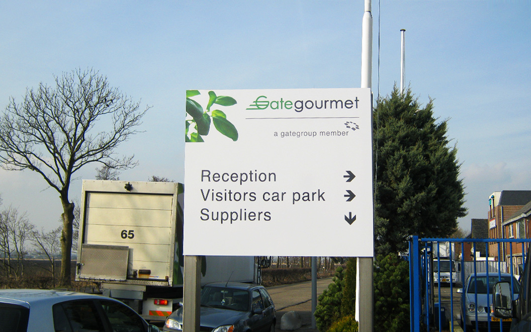
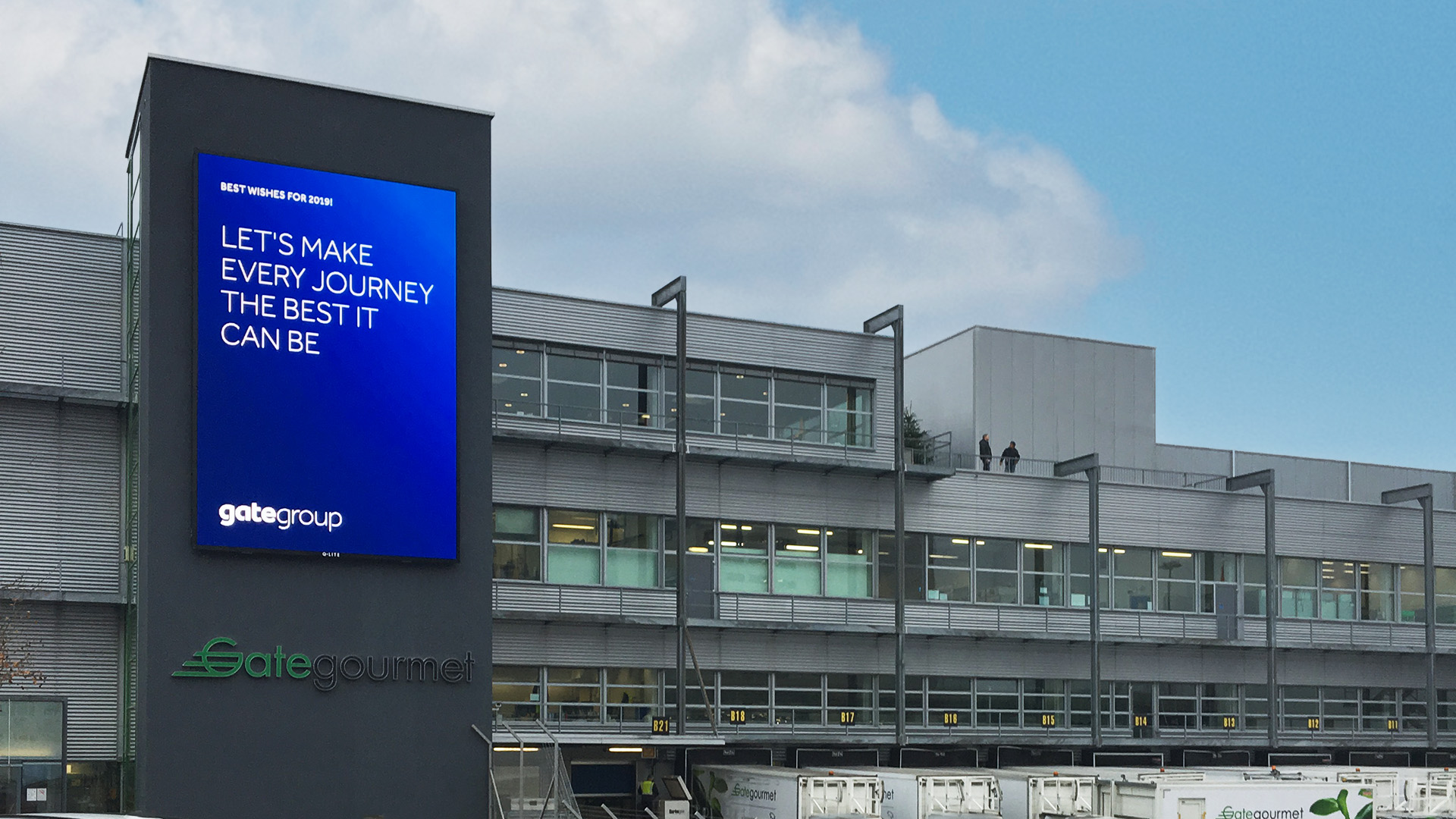
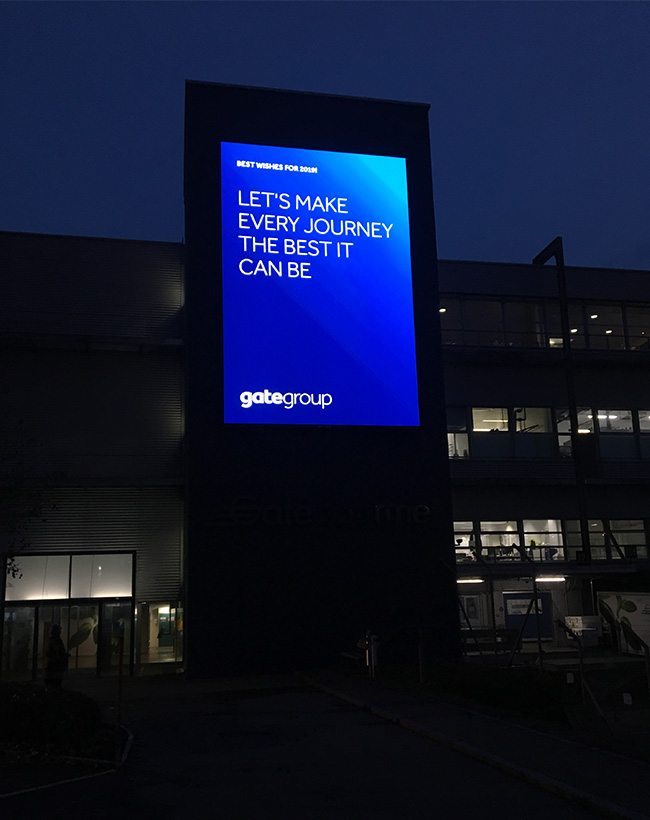
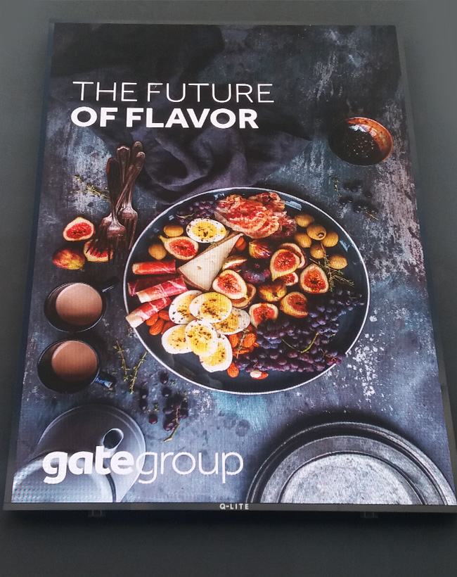
Our partnership with Gategroup (Gate Gourmet) dates back to 2007, and as proud partners with GLIMMA’s global network, we have successfully rebranded over 1,500 high-loader trucks across the world since then. Our collaboration with the Swiss onboard catering company has also extended to workplace branding projects in Europe and Latin America, including noteworthy exterior signage installations at London Heathrow and Zürich CH airports (where Gategroup’s headquarters are situated). One of our proudest achievements was delivering a large LED screen (670x1000cm) with a cloud-controlled media player platform, enabling Gate Gourmet HQ to have full, 24/7 access to updating the display.
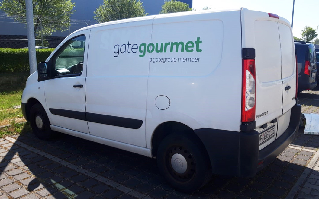
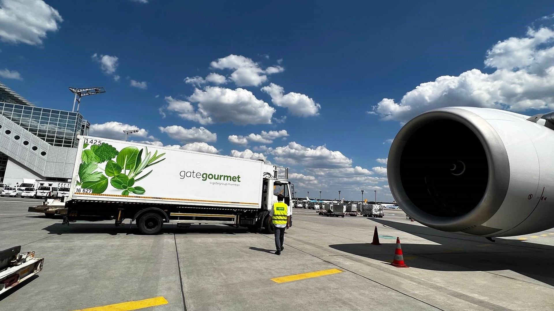
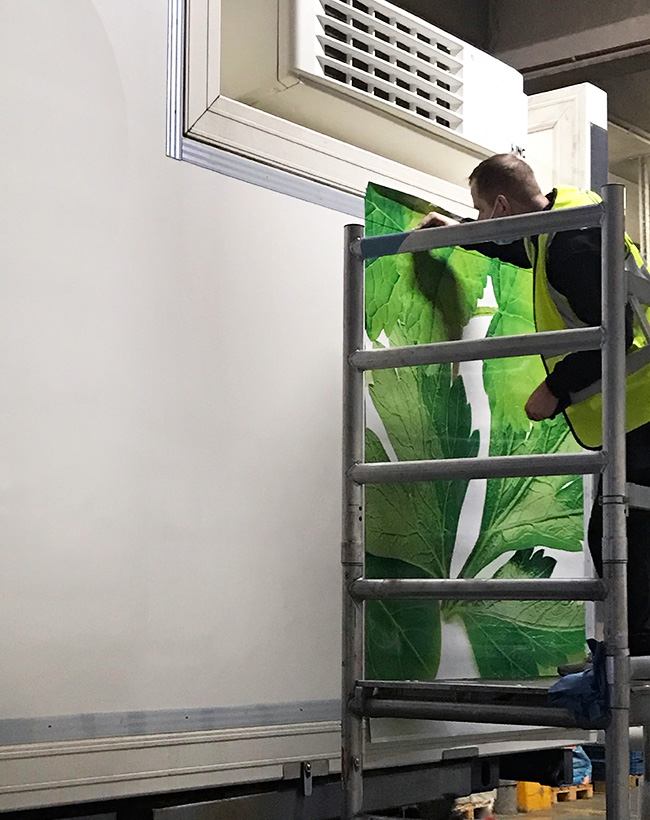
Not only has GLIMMA worked with Gate Gourmet on their signage rebrands, but we have also assisted in rebranding hundreds of vehicles when the company acquired Lufthansa’s aviation catering operation in Europe. In a remarkable feat, GLIMMA managed the rebranding of over 500 high-loader trucks, vans, and cars across Germany, Switzerland, the Netherlands, Belgium, and Spain – a mammoth task accomplished in under 10 months, starting in October 2021. The project involved close collaboration with the global company and its management at numerous Gate Gourmet kitchen units throughout Europe. GLIMMA centralized and oversaw prototyping, production, removal of old LSG Sky Chefs branding, new Gate Gourmet branding installation, vehicle transportation, and a variety of additional services (i.e., spot repair on lightly damaged truck bodies) – with the help of our expert European gold partner network.
To provide the Gate Gourmet fleet managers with real-time insights into the de-installation process and the required spot repairs on truck bodies, we utilized our dedicated online platform, BrandEye. Our unique platform allowed de-installers to report their work directly from their mobile phones to the central GLIMMA portal. As a result, Gate Gourmet’s management gained an instant overview of the entire rebranding process that wouldn’t have been possible without BrandEye.
Even today, we are actively engaged in a new project for Gate Gourmet, encompassing the branding of new trucks supplied by the company’s trusted truck suppliers in Germany and Northern Ireland, along with additional truck rebranding work in Switzerland. We have also ensured seamless brand maintenance through BrandEye’s bespoke ‘brand asset store’, offering Gate Gourmet the ability to promptly repair damaged branding across their global fleet.
As we embark on this journey of transformation with Gate Gourmet, we remain steadfast in our commitment to excellence, empowering them with effective brand management solutions that elevate their fleet’s visual impact across the globe.
The Brief
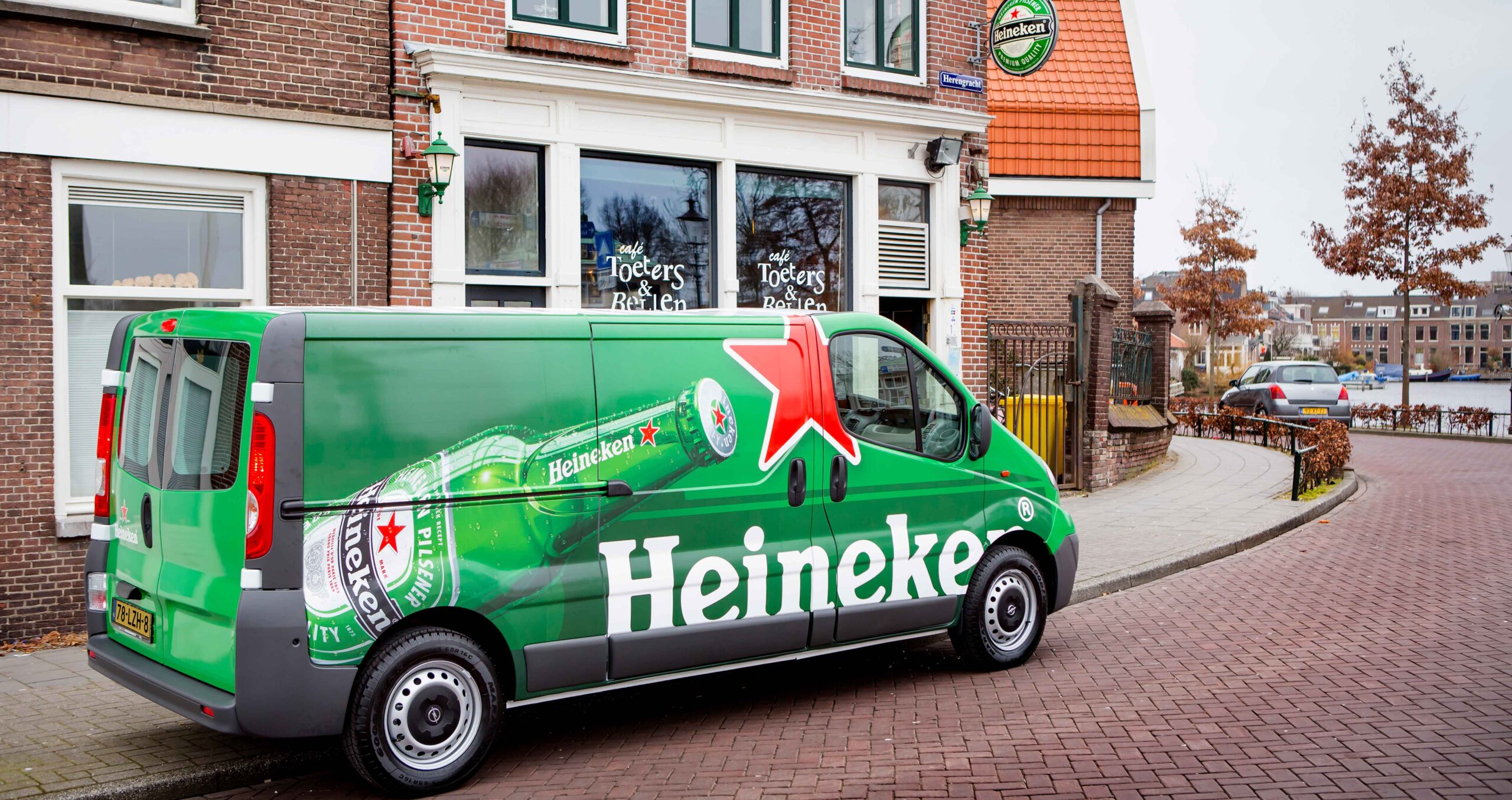
A long-standing client; we’ve worked with Heineken over many years to deliver various branding programs, including a rebrand and to support their sponsorship programs.
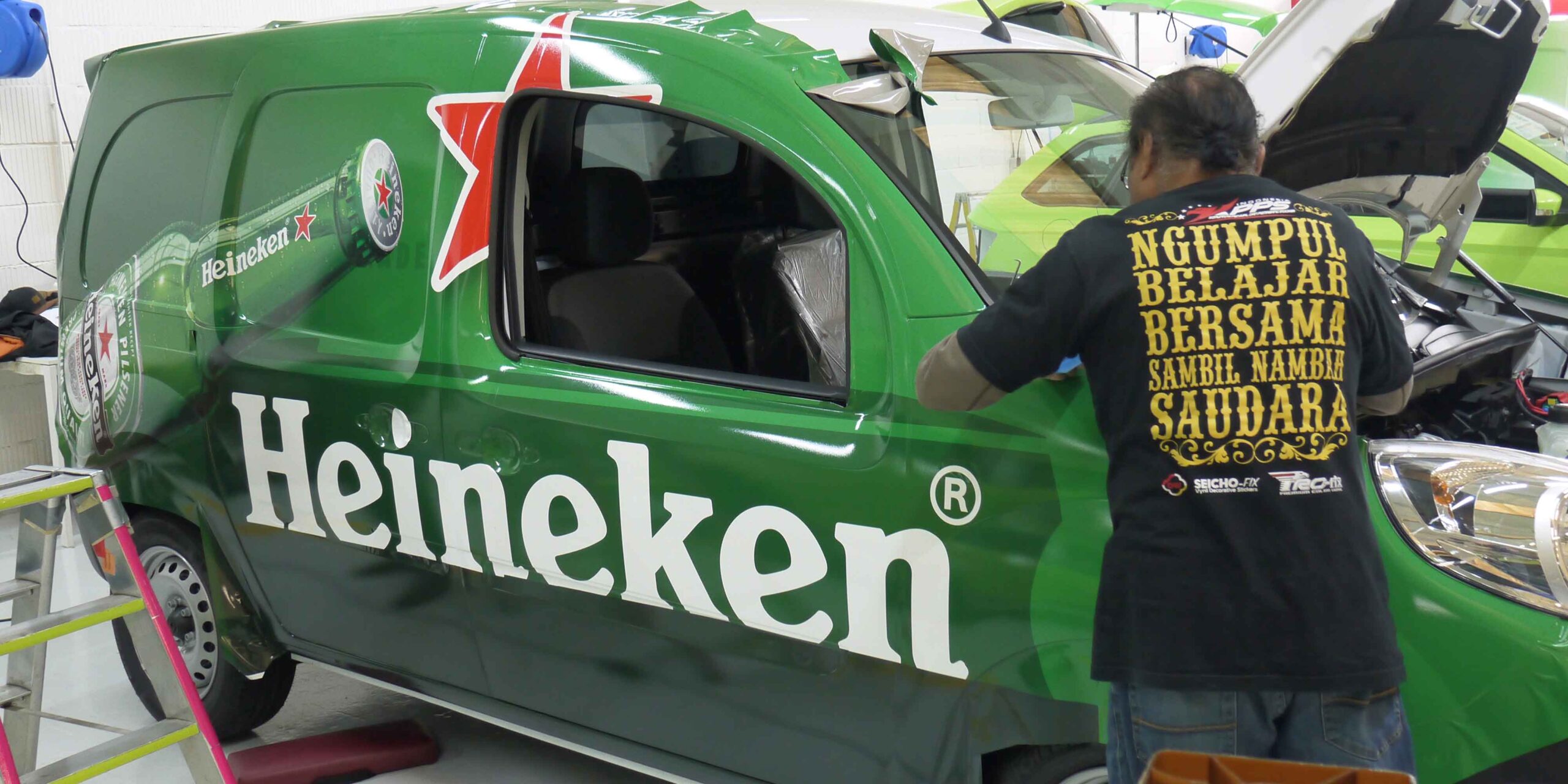
Fleet Rebrand
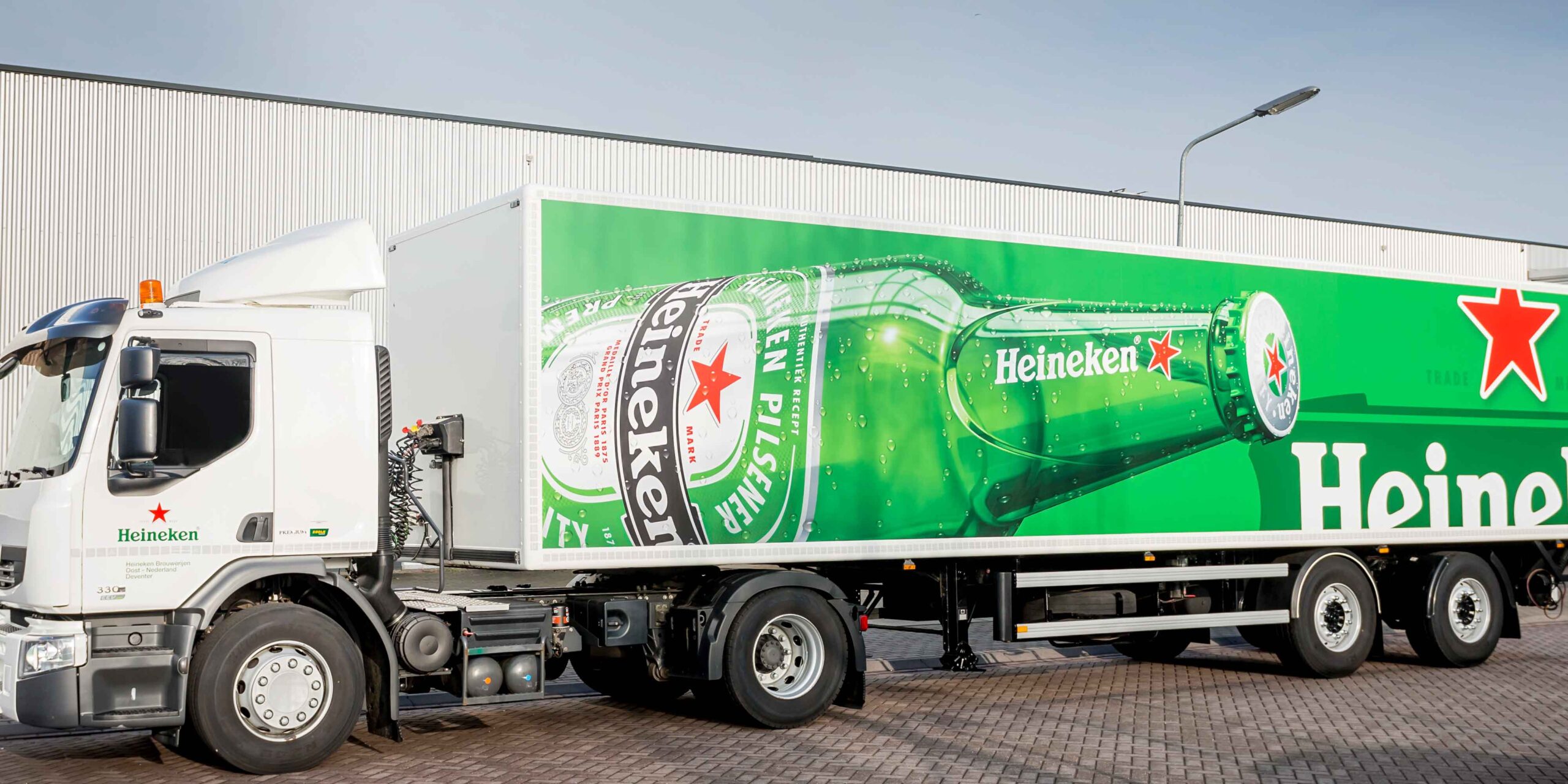
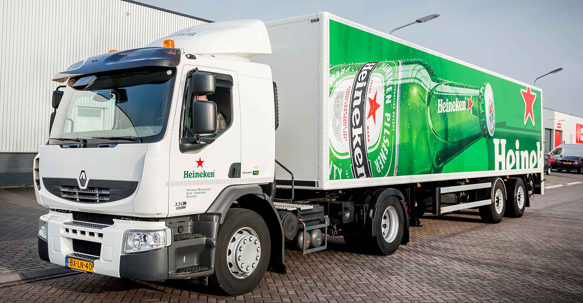
When the iconic green bottle became central to Heineken’s design approach, their European fleet of vehicles was one of the most prominent items to be rebranded. With an extensive distribution network, comprising a wide variety of vehicles types and sizes, this was quite a challenge.
We were appointed as their branding partner, to centrally co-ordinate the rewrapping of their European fleet. Through our local network, we used the latest digital technology and latest generation UV curable inks to reduce environmental impact.
Having become very familiar with the Heineken brand over the years, we continue to advise, develop and support the rollout of their fleet branding across new and replacement vehicles in Europe.
Sponsorship Support
Heineken was an official sponsor to the UEFA Champions League and we have helped to brand their event villages and to temporarily rebrand their fleet in sports livery.
Branding solutions in support of sponsorships or events is all about speed – a fast turnaround to make sure you make the most of the short ‘window of opportunity’. We used specialist graphics that can be removed easily and act swiftly, using our on-the-ground network to deliver quickly.
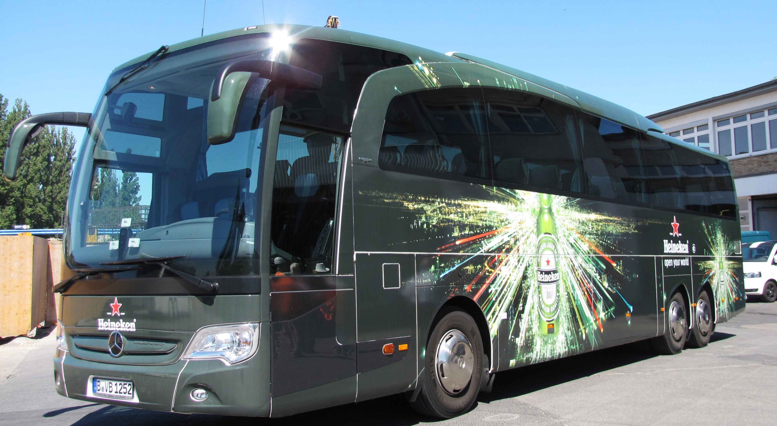
As football mania reaches fever pitch, Heineken is ready at the airport to greet and transport their VIPs and guests to the Cup Final in true style, using fully branded luxury coaches.
In Berlin we designed and delivered 20+ coaches, 8+ mini buses and 40+ Trabants.
We also helped Heineken to paint the town “Heineken green” for the final in Lisbon, Portugal.
From the airports to the city centre, we produced and installed various branded banners and signage graphics, as well as branding the Tuk Tuk taxis to carry supporters around the city.
THE BRIEF
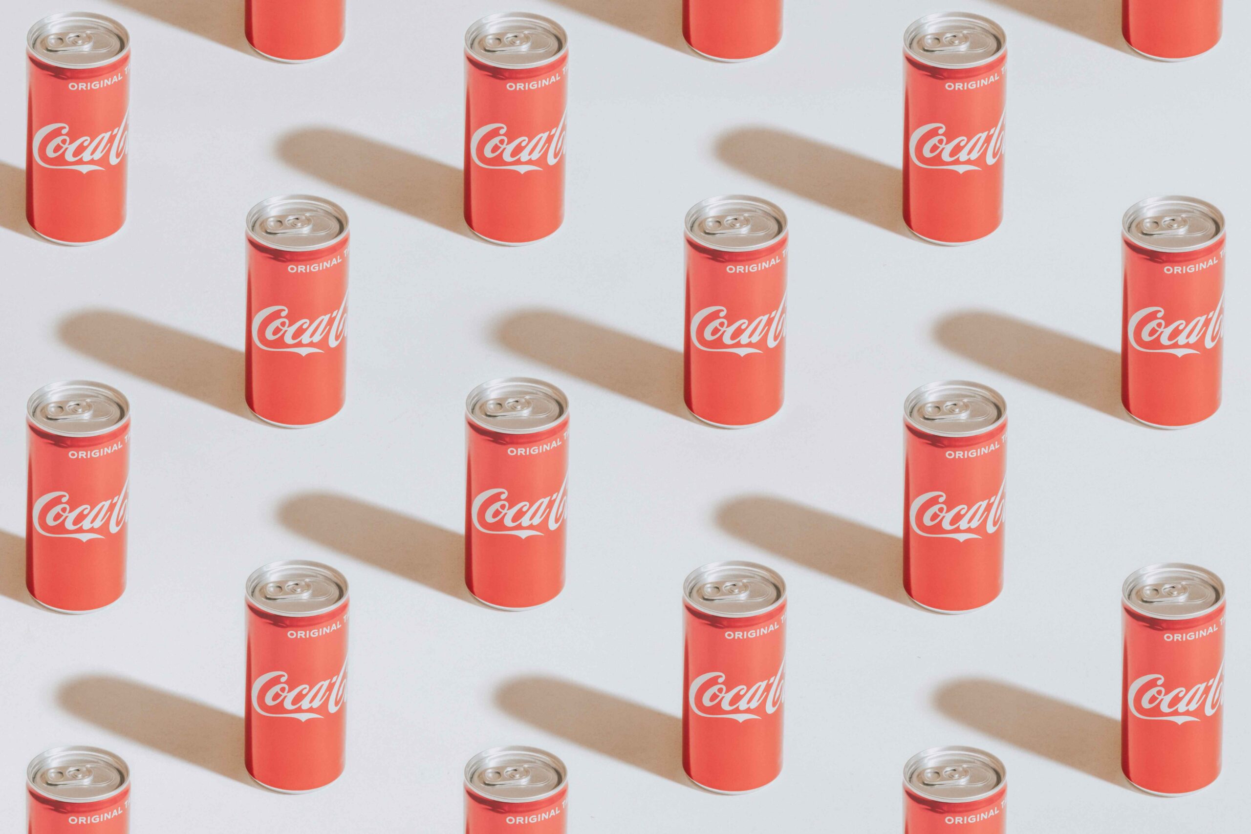
Glimma was asked to rebrand and refurbish the reception area at the head office of Coca-Cola HBC.
As the largest Coca-Cola bottling company in Europe, they operate two plants in Hungary, employing in excess of 1,000 people.
'The GLIMMA team came up with comprehensive branding solutions for our office refurbishment, creating a vibrant and cohesive welcome space. From large scale graphics to finer details such as choice of furniture, the thought that has gone into the design and execution has been impressive at every stage.'
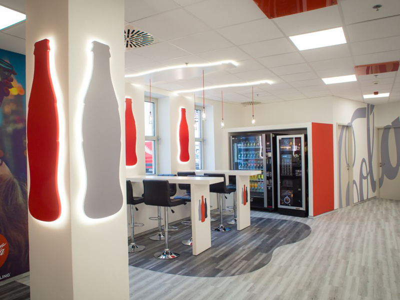
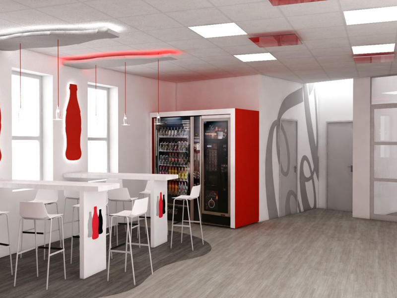
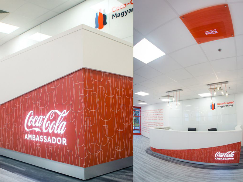
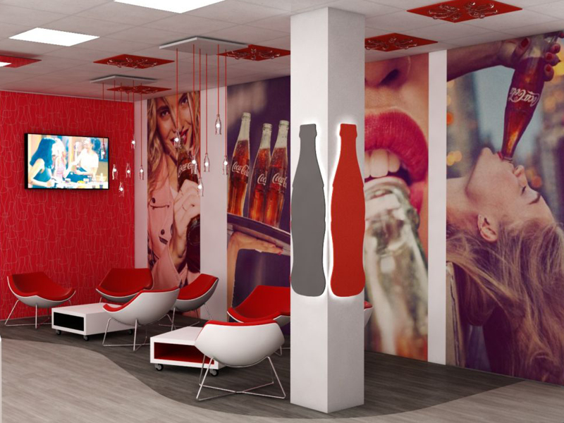
WORKPLACE BRANDING — DELIVERING THE EMPLOYER BRANDING
This workplace rebrand was part of a renovation program which also included the factory.
The design centers around the classic Coca-Cola bottle shape. With this central theme, we adopted a holistic approach to create an immersive environment for employees. We helped to design, specify, source and install on-brand items to create a positive employee experience :
— Seating
— Reception furniture
— Flooring
— Lighting
— Vinyl wall decoration
— A custom-made bar
— Digital Signage
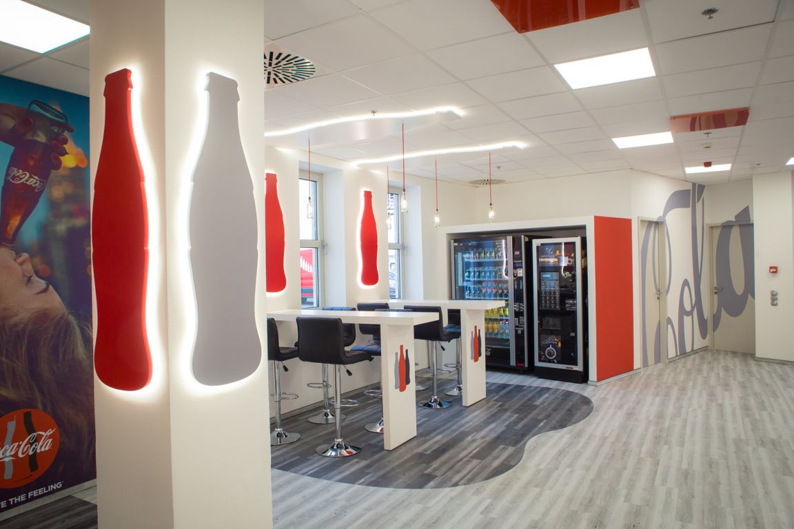
The 80m2 reception is the welcome and transit area for more than 500 employees and visitors daily.
From brief to installation, the refurbishment was delivered within 4 weeks. To minimize disruption we completed the installation within two days.
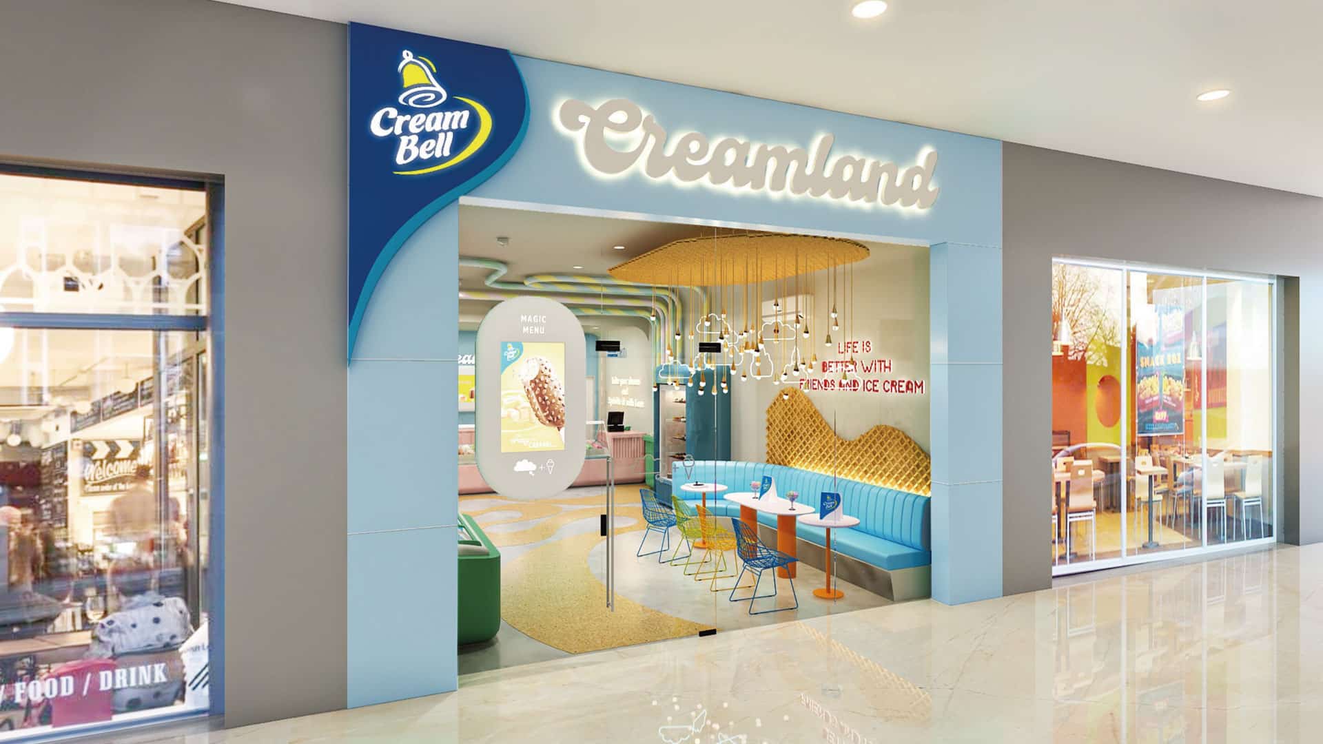
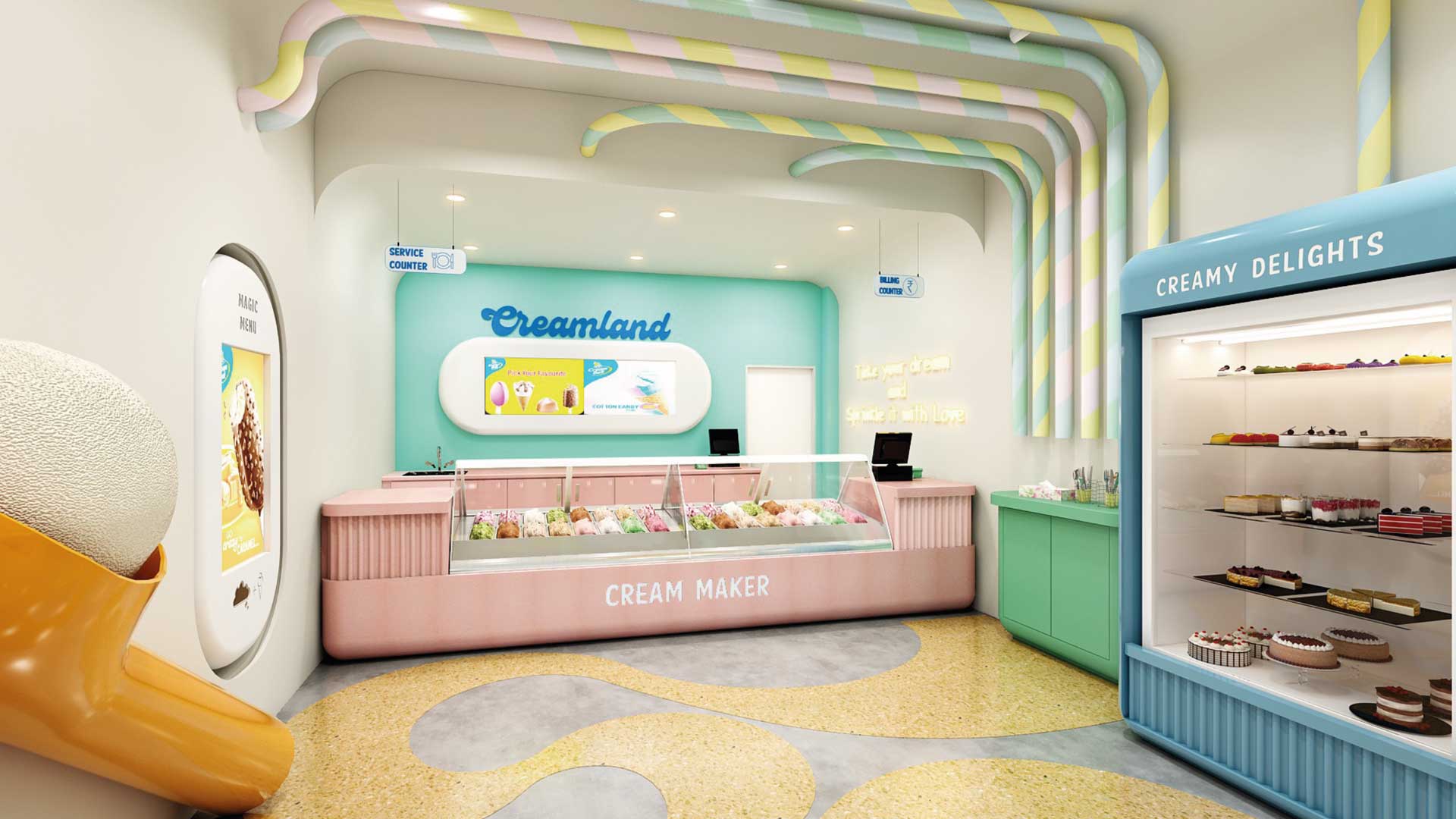
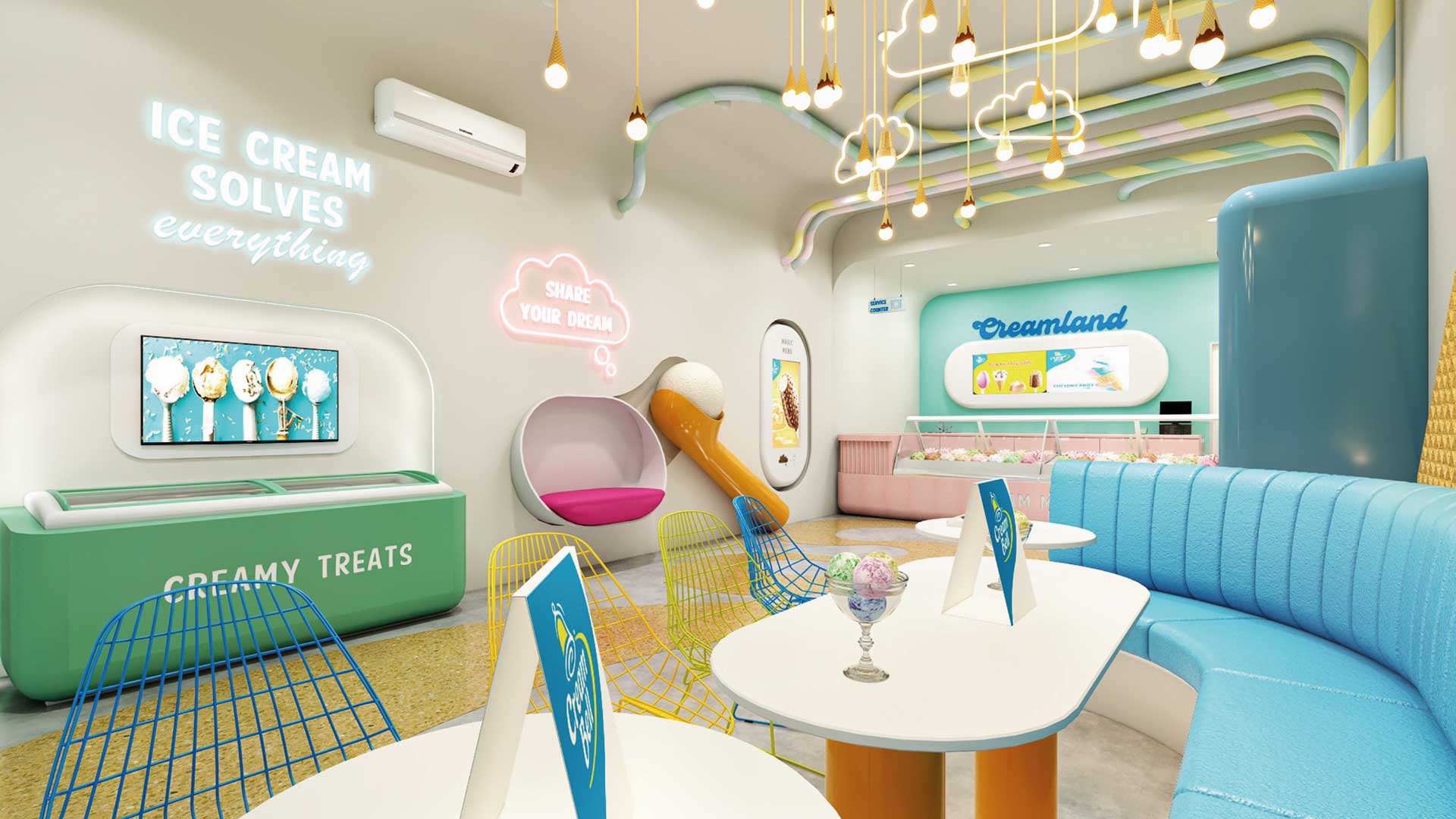
MAGNIFYING THE ICE CREAM EXPERIENCE
Creambell Ice Creams has a national presence with a disproportionate awareness and equity in North India. GLIMMA’S objective was to celebrate and magnify the ice cream experience through their parlors by creating fun & excitement that is driven through design and to design a unique visual identity for Cream Bell Parlors that will not only draw the consumers in but also set the brand distinctly apart from its competitors.
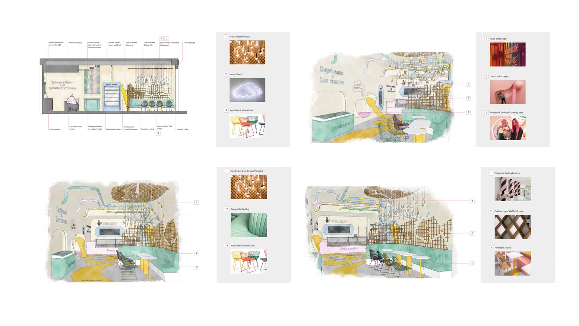
Interior architecture & design sketches
STORE CONCEPT– “Life is Better with Friends and Ice Cream”
With a concept routed in the simple enjoyment we experience when eating an ice cream, instilled with memories of childhood, and the excitement and joy of the discovery of something new, Cream Bell ”CreamLand” provides a space where you can re-engage with that childlike wonder and discover the many flavors of Cream Bell.
Taking cues from the wave of experiential venues and the rise of gamification in the retail playground along with the ‘on trend’ design styling from the latest contemporary sweet treat retailers, the interior offers a sense of fun and curiosity with a bright internal palette, coupled with simple ‘soft’ and oversized forms to create a moment of childlike escapism balanced with a contemporary edge.
![3122-GLIMMA[100]](https://glimma.com/wp-content/uploads/2022/10/3122-GLIMMA100.jpg)
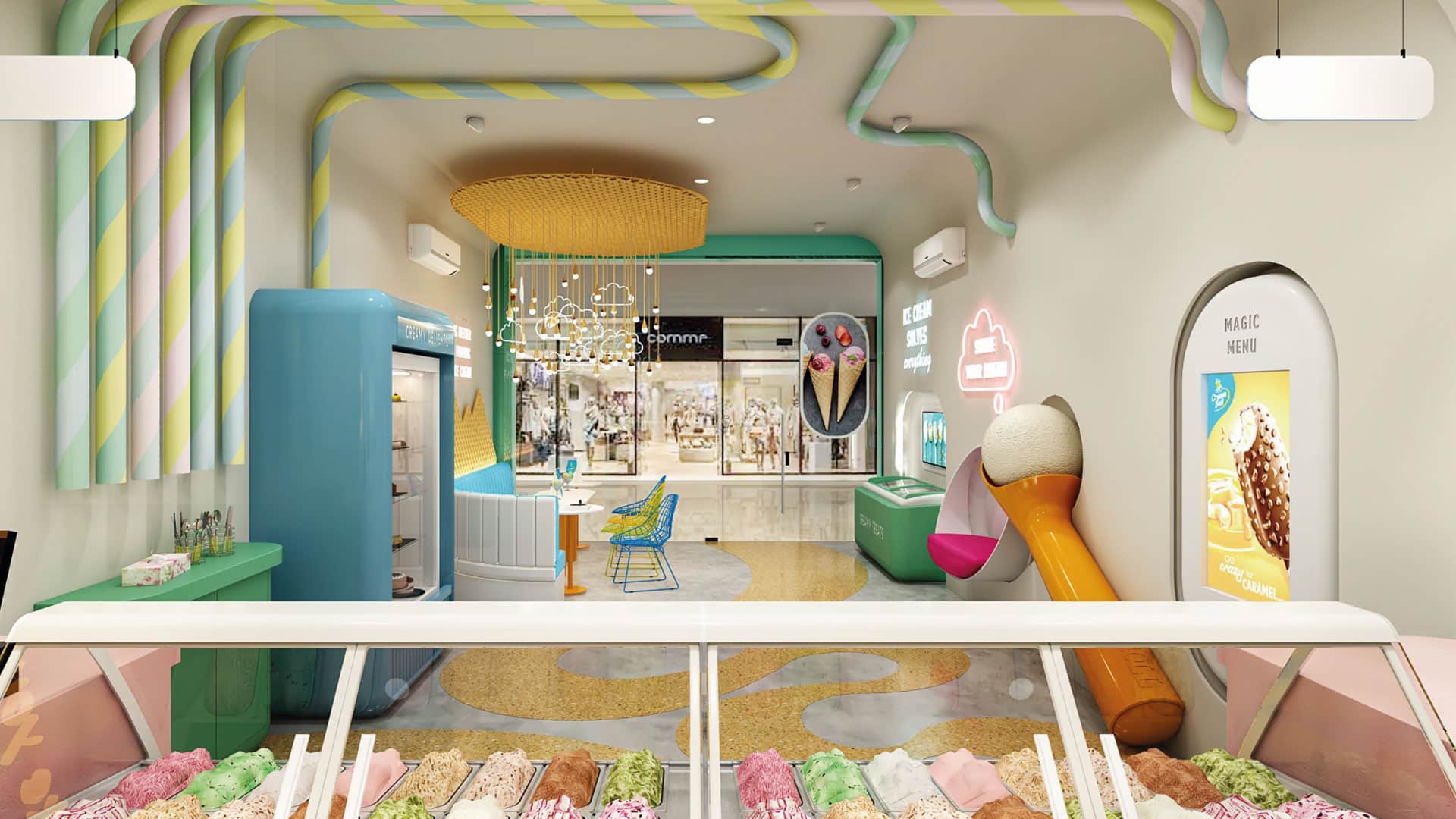
The interior palette was inspired by the colors and textures of the desserts themselves, the softer forms, the vibrant tones tempered by hues of vanilla and creams, with warm tones of the waffle, its regimented pattern rolled or fractured in to shards.
GLIMMA DELIVERED THE FOLLOWING:
1. Brand name & identity. 2. Outlet Space Design – Interiors, graphics, colors etc. 3. Signage 4. Uniforms design for crew members 5. Menu Board 6. Freezer Branding 7. Scoopers & Accessories 8. Franchisee Guide Book 9. Leaflet/Insert design 10. Offer design 11. Special event collaterals design 12. Menu Card